Custom Component
ToolJet allows you to create your own React component using the Custom Component, providing greater flexibility and customization for your application. The Custom Component has two main properties:
- Data: Used to pass data or query names to the component. These queries can be triggered from inside the component.
- Code: Used to write the React code for the Custom Component. ToolJet offers two built-in functions to interact with the component: Update Data function and Run Query function.
Data
Data can be passed to a custom component using the Data field. The data should be structured as an object or an array of objects. Query name can also be passed through this field to trigger queries using the custom component.
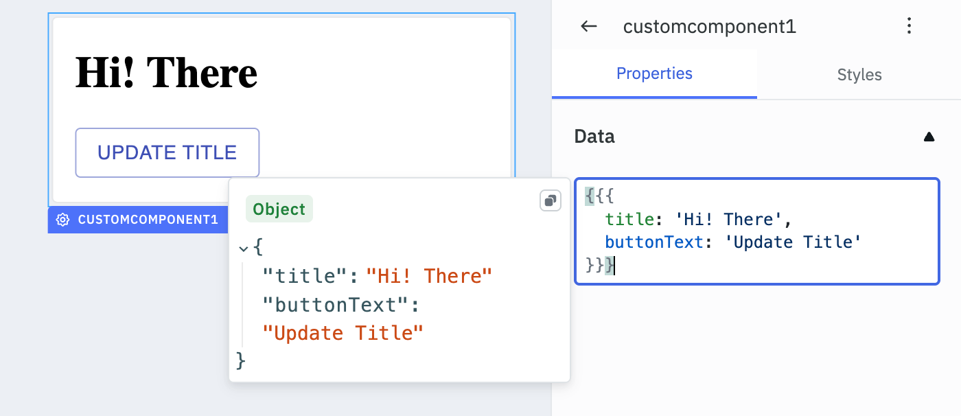
Example:
{{{
    title: 'Hi! There',
    buttonText: 'Update Title',
    queryName: 'fetchData'
}}}
OR
{{{
    images: [
	  { "url" : "https://reqres.in/img/faces/7-image.jpg", "title" : "Olivia"},
	  { "url" : "https://reqres.in/img/faces/5-image.jpg", "title" : "Liam"},
	  { "url" : "https://reqres.in/img/faces/3-image.jpg", "title" : "Sophia"}
    ]
}}}
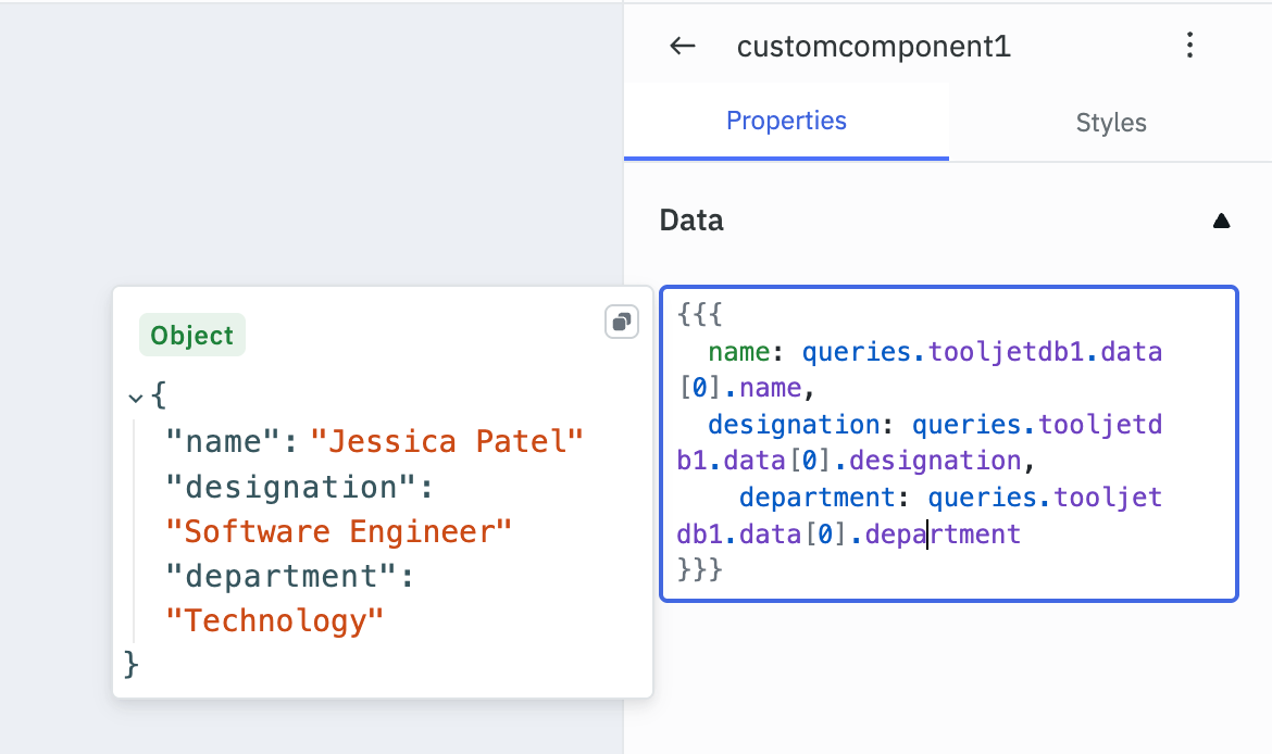
Passing Data Through Query
Data fetched from a query can also be passed to the Custom Component in the data object.
Code
The React code for a Custom Component can be added in the Code field. You can interact with the application through the custom component using the following parameter and in-built functions.
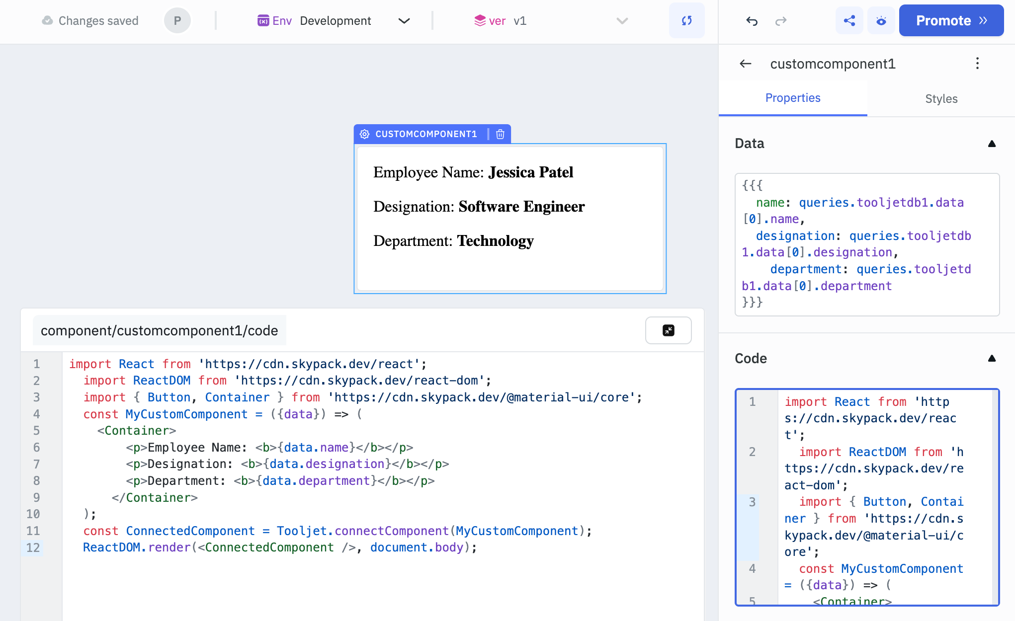
Data Parameter
To access the data passed through the data field, define the data parameter to the MyCustomComponent funtion.
Example
import React from "https://cdn.jsdelivr.net/npm/[email protected]/+esm";
import ReactDOM from "https://cdn.jsdelivr.net/npm/[email protected]/+esm";
import Container from "https://cdn.jsdelivr.net/npm/@material-ui/[email protected]/Container/+esm";

const MyCustomComponent = ({data}) => (
  <Container>
      <p>Employee Name: <b>{data.name}</b></p>
      <p>Designation: <b>{data.designation}</b></p>
      <p>Department: <b>{data.department}</b></p>
    </Container>
);

const ConnectedComponent = Tooljet.connectComponent(MyCustomComponent);
ReactDOM.render(<ConnectedComponent />, document.body);
While named imports from @material-ui/core/+esm may work in simple cases, they can break in more complex scenarios due to incomplete ESM support in Material UI v4. If you encounter issues, try importing components individually.
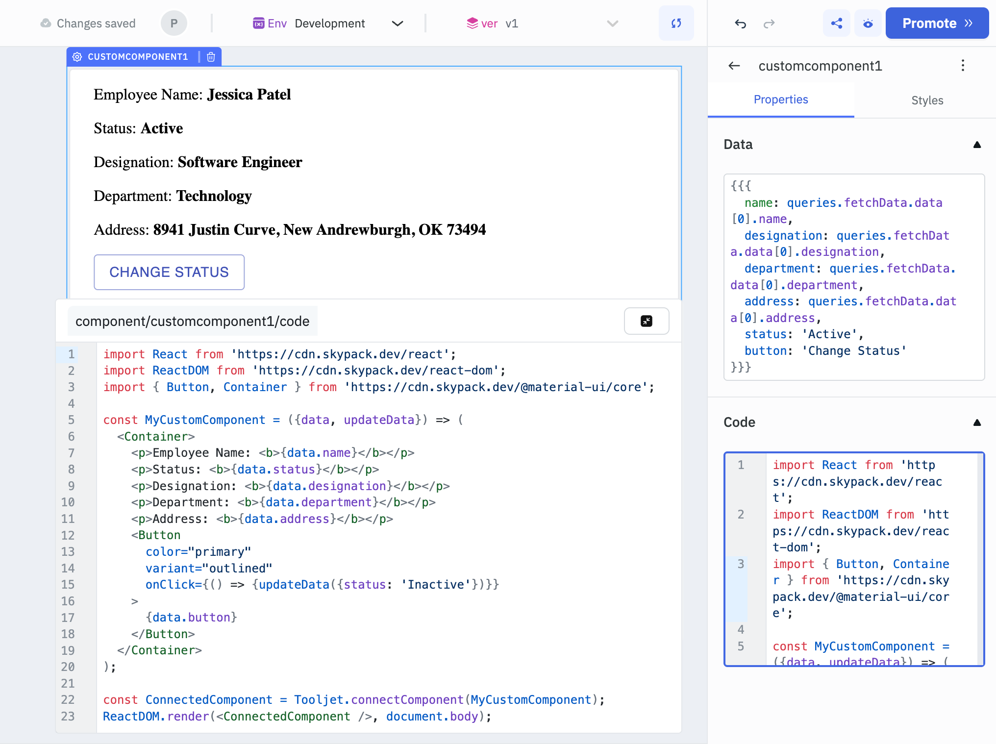
Update Data Function
To update the data in the data object, you can use the in-built updateData function.
Example
import React from "https://cdn.jsdelivr.net/npm/[email protected]/+esm";
import ReactDOM from "https://cdn.jsdelivr.net/npm/[email protected]/+esm";
import Button from "https://cdn.jsdelivr.net/npm/@material-ui/[email protected]/Button/+esm";
import Container from "https://cdn.jsdelivr.net/npm/@material-ui/[email protected]/Container/+esm";

const MyCustomComponent = ({data, updateData}) => (
  <Container>
    <p>Employee Name: <b>{data.name}</b></p>
    <p>Status: <b>{data.status}</b></p>
    <Button
      color="primary"
      variant="outlined"
      onClick={() => {updateData({status: 'Inactive'})}}
    >
      {data.button}
    </Button>
  </Container>
);

const ConnectedComponent = Tooljet.connectComponent(MyCustomComponent);
ReactDOM.render(<ConnectedComponent />, document.body);
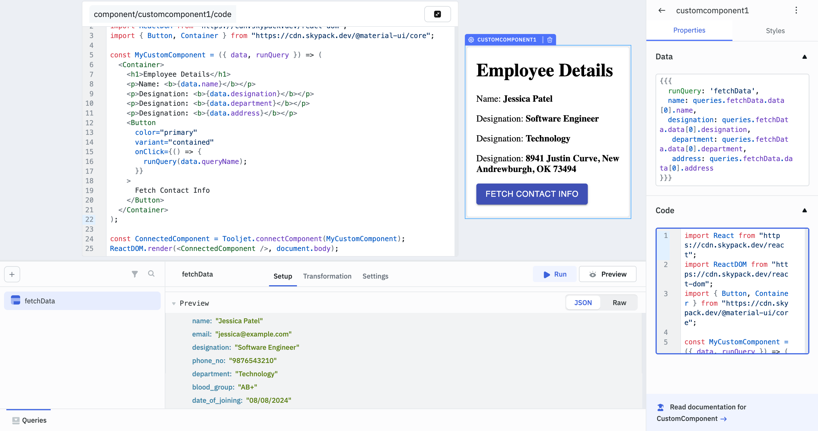
Run Query Function
Custom Component in ToolJet can be used to trigger queries. You can specify the query name in the data field. Use the in-built runQuery function to execute the query dynamically from within the Custom Component.
Example
import React from "https://cdn.jsdelivr.net/npm/[email protected]/+esm";
import ReactDOM from "https://cdn.jsdelivr.net/npm/[email protected]/+esm";
import Button from "https://cdn.jsdelivr.net/npm/@material-ui/[email protected]/Button/+esm";
import Container from "https://cdn.jsdelivr.net/npm/@material-ui/[email protected]/Container/+esm";

const MyCustomComponent = ({ data, runQuery }) => (
  <Container>
    <h1>Employee Details</h1>
    <p>Name: <b>{data.name}</b></p>
    <p>Designation: <b>{data.designation}</b></p>
    <p>Department: <b>{data.department}</b></p>
    <p>Address: <b>{data.address}</b></p>
    <Button
      color="primary"
      variant="contained"
      onClick={() => {
        runQuery(data.queryName);
      }}
    >
      Fetch Contact Info
    </Button>
  </Container>
);

const ConnectedComponent = Tooljet.connectComponent(MyCustomComponent);
ReactDOM.render(<ConnectedComponent />, document.body);
);

const ConnectedComponent = Tooljet.connectComponent(MyCustomComponent);
ReactDOM.render(<ConnectedComponent />, document.body);
Styles
Container
Property | Description | Configuration Options |
|---|---|---|
| Visibility | Controls component visibility. | Toggle on or off, or set programmatically using fx. |
| Border color | Sets the border color of the component. | Select a color from the color picker or set it programmatically using fx. |
| Border radius | Sets the corner radius of the component. | Enter a numeric value (default: 6) or set it programmatically using fx. |
| Box shadow | Sets the box shadow properties of the component. | Select the box shadow color and adjust related properties or set it programmatically using fx. |
Any property having fx button next to its field can be programmatically configured.