Button Group
The Button Group component is used to group a series of buttons together in a single line. It is used to group related buttons.
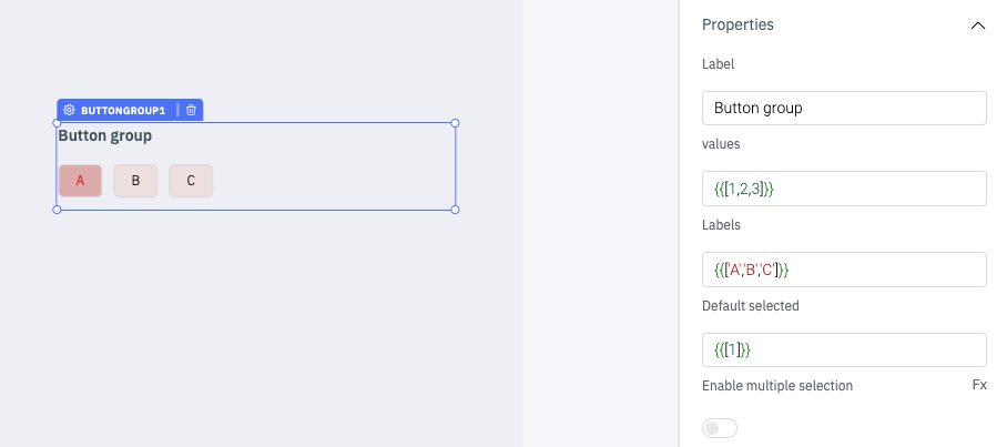
Properties
Properties | Description | Expected Value |
|---|---|---|
| label | Sets the title of the button-group. | Any String value: Select the options or {{queries.queryname.data.text}}. |
| values | Sets the values of the Button Group items. | Array of strings and numbers: {{[1,2,3]}}. |
| Labels | Sets the labels of the Button Group items. | Array of strings and numbers: {{['A','B','C']}}. |
| Default selected | Sets the initial selected values. | Array of strings and numbers: {{[1]}} will select the first button by default. |
| Enable multiple selection | Toggle on or off to enable multiple selection. | Boolean value: {{true}} or {{false}}. |
Events
Events | Description |
|---|---|
| On click | Triggers whenever the user clicks on the button in the Button Group. |
info
Check Action Reference docs to get the detailed information about all the Actions.
Component Specific Actions (CSA)
There are currently no CSA (Component-Specific Actions) implemented to regulate or control the button-group component.
Exposed Variables
Variable | Description | How To Access |
|---|---|---|
| selected | Holds the currently selected button value as an array of objects. | Accessible dynamically with JS (for e.g., {{components.buttongroup1.selected[0]}} or {{components.buttongroup1.selected}}). |
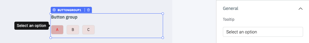
General
Tooltip
A Tooltip is often used to display additional information when the user hovers the mouse pointer over the component. Once a value is set for Tooltip, hovering over the element will display the specified string as the tooltip text.
Devices
Property | Description | Expected Value |
|---|---|---|
| Show on desktop | Makes the component visible in desktop view. | You can set it with the toggle button or dynamically configure the value by clicking on fx and entering a logical expression. |
| Show on mobile | Makes the component visible in mobile view. | You can set it with the toggle button or dynamically configure the value by clicking on fx and entering a logical expression. |
Styles
Style | Description | Expected Value |
|---|---|---|
| Background color | Set a background color for the buttons in buttons group. | Choose a color from the picker or enter the Hex color code. ex: #000000. |
| Text color | Set a text color for the buttons in buttons group. | Choose a color from the picker or enter the Hex color code. ex: #000000. |
| Visibility | Make the component visible or hidden. | {{true}} or {{false}}, By default, its value is set to {{true}}. |
| Disable | Disable the component. | {{true}} or {{false}}, By default, its value is set to {{false}}. |
| Border radius. | Add a border radius to the buttons in the component using this property. | Any numerical value from 0 to 100. |
| Selected text color | Use this property to modify the text color of selected button. | Choose a color from the picker or enter the Hex color code. ex: #000000. |
| Selected background color | Use this property to modify the background color of selected button. | Choose a color from the picker or enter the Hex color code. ex: #000000. |
| Box shadow | Sets the add shadow effects around a component's frame. You can specify the horizontal and vertical offsets(through X and Y sliders), blur and spread radius, and color of the shadow. | Values that represent X, Y, blur, spread, and color. Example: 9px 11px 5px 5px #00000040. |