Generate Form
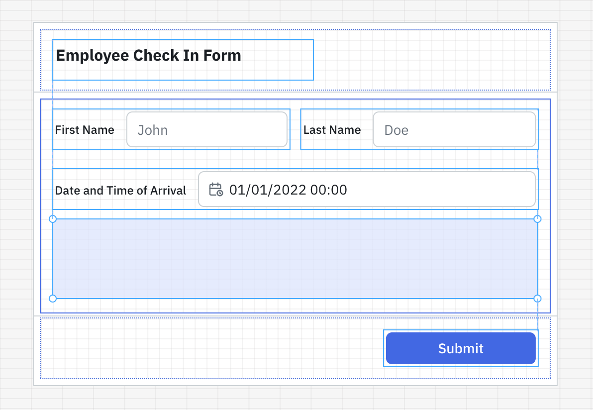
The Form component in ToolJet allows you to group multiple input fields together and manage them as a single unit. It simplifies data collection, validation, and submission workflows by bundling all form-related components and logic in one place.
Components like Kanban, Calendar, Container, ListView, Tabs, and Form can't be dropped inside the Form component.
This guide covers the different ways to generate a form in ToolJet. For detailed information on properties, CSAs, and schema customization, refer to the following guides:
Generating Form
In ToolJet, you can generate a Form using any of the following methods:
- Using JSON Schema
- Using Raw JSON
- Using Query Output
- Using Form Property Panel
- By Dragging Components into the Form
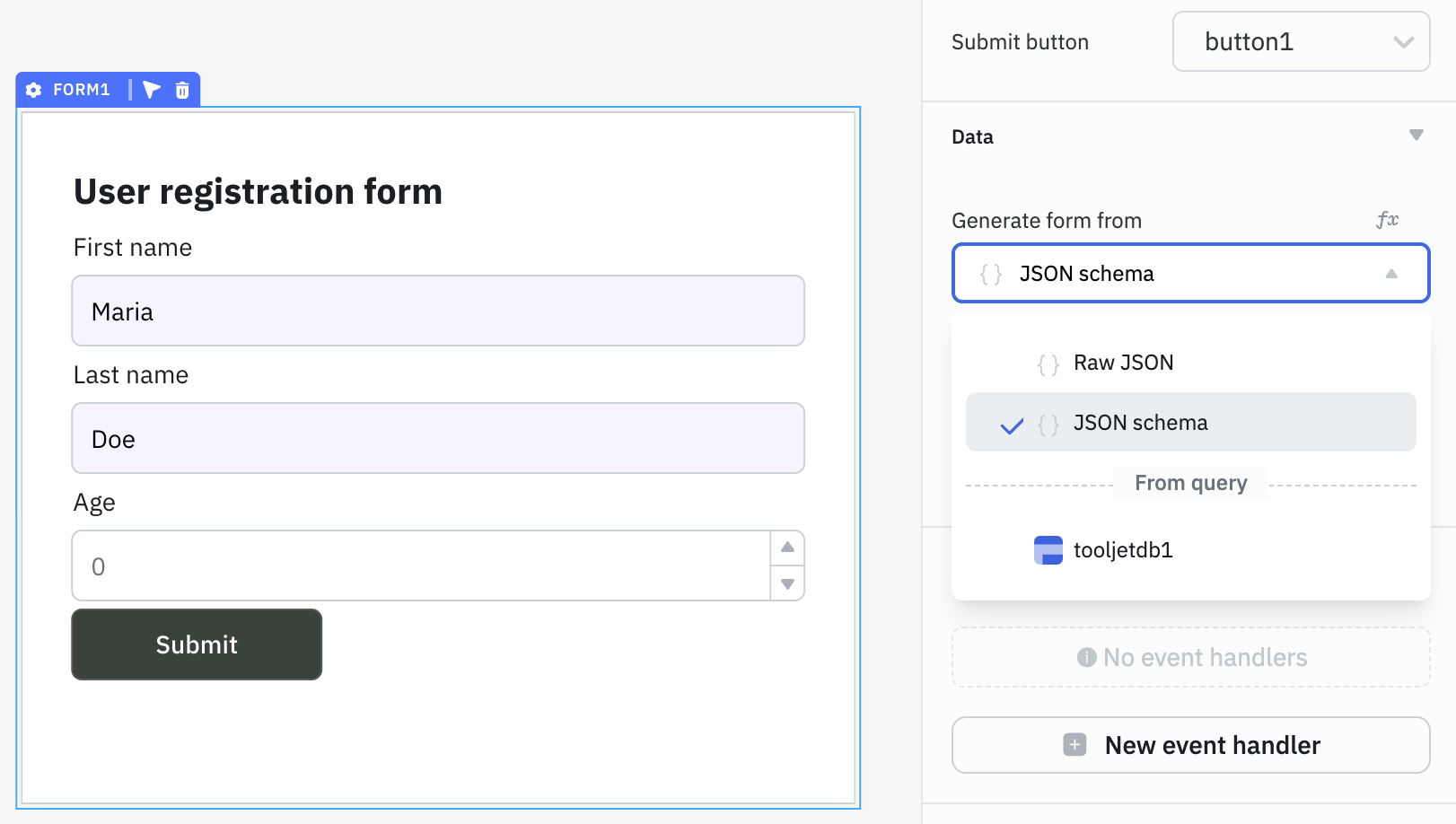
Using JSON Schema
Using JSON Schema, you can build dynamic forms that automatically update their structure (fields, styles, etc.) based on different conditions.
For example, if you're creating an onboarding form where fields like Name, Email, or Department change based on team input or API responses, JSON Schema helps you generate the entire form without manually adding each field. This is especially useful in admin panels or internal tools where form can change frequently.
To use JSON Schema, select JSON Schema from the Generate form from dropdown in the form’s property panel. Then, provide a JSON object containing title, properties, and submitButton in the following format:
{{{
  "title": " ", // Provide title for Form

  "properties": {

  }, // Provide schema of the components that will be inside the form

  "submitButton": {

  } // Provide schema of the submit button
}}}
Key | Description |
|---|---|
| title | Specifies the title of the form. |
| properties | Defines the schema of the form fields (components to be rendered in the form). |
| submitButton | Defines the schema and behavior of the form’s submit button. |
Refer to the Custom Schema guide for schema examples of commonly used components.
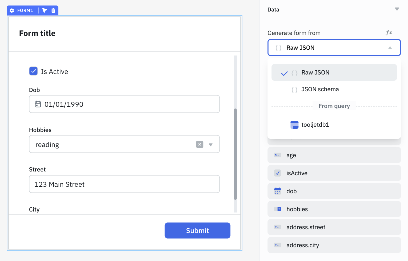
Using Raw JSON
With Raw JSON, you can generate a form by simply passing a JSON object with key–value pairs. ToolJet automatically detects the field types and generates the corresponding input components.
For example, if a value is a string, it renders a text input; for a boolean, it renders a checkbox; for arrays, and so on. This method is useful when you already have sample data (from an API or static object) and want to quickly generate a form.
To use Raw JSON, select Raw JSON from the Generate form from dropdown in the form’s property panel. After entering the JSON object, you can manage the input fields directly from the form's property panel, including customizing the input type, label, placeholder, default value, and more.
Example JSON Object:
{
    "name":"John Doe",
    "age":35,
    "isActive":true,
    "dob":"01-01-1990",
    "hobbies":[
        "reading","gaming","cycling"
    ],
    "address":{
        "street":"123 Main Street",
        "city":"New York"
    }
}
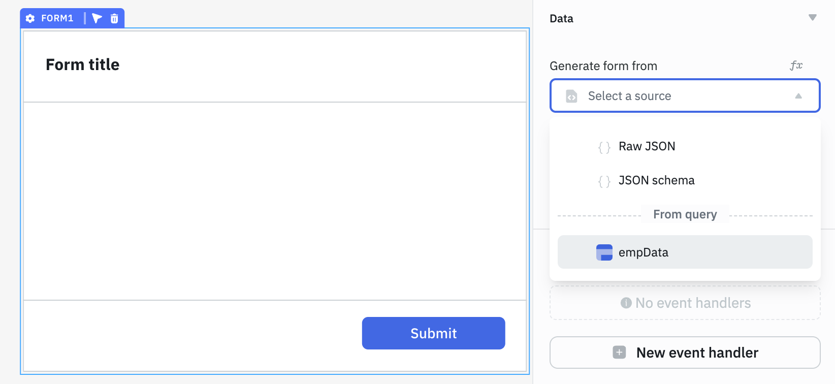
Using Query Output
You can generate form using the output of a query (for example, fetching user details from an API or database). ToolJet reads the structure of the query response and automatically creates input fields based on the returned key–value pairs.
Let's say you have a query output in the following format:
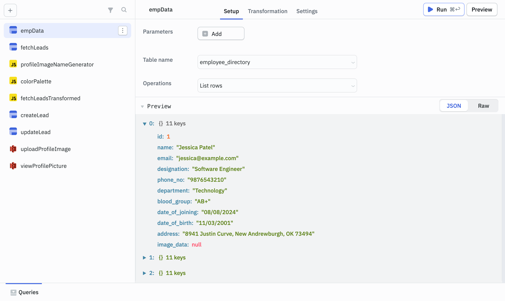
To generate a form using query output, select the query name from the Generate form from dropdown in the form’s property panel.
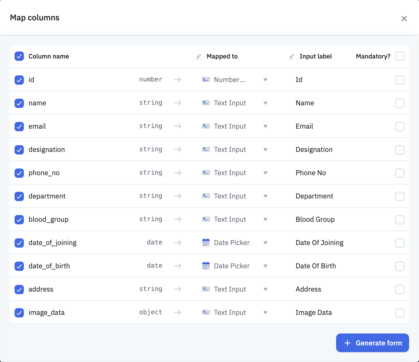
After selecting the query, a modal will appear that automatically maps all the query output fields to their respective input components based on the input type. You can modify the component type or the input label if needed. Additionally, you can choose whether a field should be mandatory. Once you’ve made the necessary adjustments, click the + Generate Form button at the bottom of the modal to create the form.
After the form is generated, you can further manage each input field from the form's property panel, including changing the input type, label, placeholder, default value, and more.
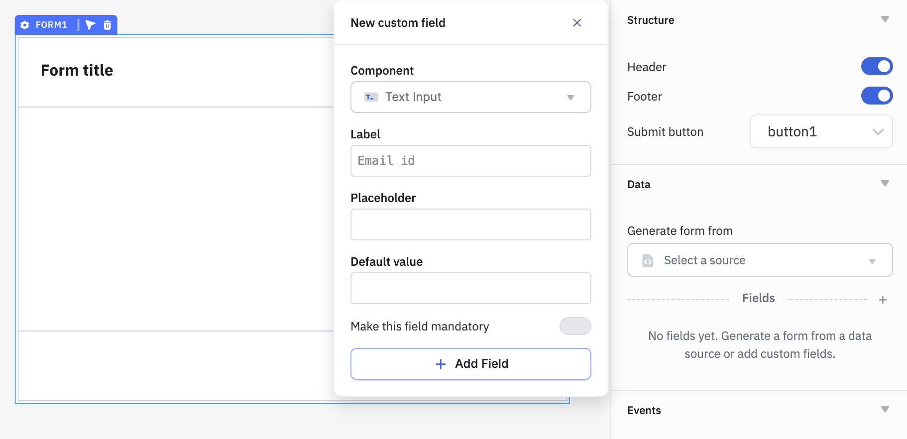
Using Form Property Panel
You can generate a form using the Form component's property panel. Click on the + icon next to the Fields section in the panel. A modal will open where you can select the input component type, set the label, placeholder, default value, and mark the field as mandatory.
After configuring the properties, click the + Add Field button at the bottom to add the new input field to the form.
Once the form is generated, you can further manage each input field from the form's property panel, including changing the input type, label, placeholder, default value, and more.
By Dragging Components into the Form
You can drag and drop components from the component library directly into the Form component to build a form. Once the form is created, you can manage each input field from the form's property panel, including changing the input type, label, placeholder, default value, and more.