List View
The List View component allows to create a list of repeatable rows of data. Just like the Container component, you can nest other components inside of it and control how many times they repeat.
Certain components, namely Calendar and Kanban, are restricted from being placed within the List View component using drag-and-drop functionality.
Setting List Data
To dynamically populate List View components, you can use specific data properties.
Consider this data being passed inside a List View component's List data property:
{{[
    { imageURL: 'https://www.svgrepo.com/show/34217/image.svg', text: 'Sample text 1', buttonText: 'Button 1' },
    { imageURL: 'https://www.svgrepo.com/show/34217/image.svg', text: 'Sample text 1', buttonText: 'Button 2' },
    { imageURL: 'https://www.svgrepo.com/show/34217/image.svg', text: 'Sample text 1', buttonText: 'Button 3' },
]}}
Based on the above data, you can set the Data property of a Text component inside List View using the below code:
{{listItem.text}}
Similarly, for an Image component inside List View, you can use the below code to pass the imageURL value:
{{listItem.imageURL}}
Properties
Property | Description | Expected Value |
|---|---|---|
| List data | The data that you want to display in the List View component. This can be an array of objects or data from a query that returns an array of objects. | An array of objects or a query that returns an array of objects. |
| Mode | The layout of the List View component. You can choose between List and Grid mode. | list or grid |
| Show bottom border | Whether to show or hide the bottom border on a row. This option is only available when the Mode is set to List. | true or false |
| Columns | The number of columns in the List View component. This option is only available when the Mode is set to Grid. | Any numerical value |
| Row height | The height of each row in the List View component. | Any number between 1 and 100 |
| Enable pagination | Whether to enable pagination. If enabled, you can set the number of rows per page. | true or false |
| Rows per page | The number of rows per page. This option is only available when Enable pagination is enabled. | Any numerical value |
Events
To attach an event handler to the List View component, follow these steps:
- Click on the component handle to open its properties on the right sidebar.
- Navigate to the Events section.
- Click on the +Add handler button.
There are two events that you can use with the List View component:
Row clicked
The Row clicked event is triggered when any row inside the List View is clicked. Similar to other events in ToolJet, you can define multiple actions for this event.
When a row is clicked in the List View component, certain related data is made available through the selectedRowId and selectedRow variables. For the List View component's available exposed variables, refer to the here section.
The Row clicked event is being deprecated, so it is recommended to use the Record Clicked event instead.
Record clicked
The Record clicked event is similar to the row click event, as it is triggered whenever an interaction is made with a record in the component.
When a record is clicked in the List View component, relevant data is exposed through the selectedRecordId and selectedRecord variables. For the List View component's available exposed variables, refer to the here section.
To get detailed information about all the Actions, please consult the Action Reference documentation.
Component Specific Actions (CSA)
There are currently no CSA (Component-Specific Actions) implemented to regulate or control the component.
Exposed Variables
Variables | Description | How To Access |
|---|---|---|
| data | This variable stores the data loaded into the List View component. | Retrieve the data of each record in the list view using {{components.listview1.data["0"].text1.text}} |
| selectedRowId (deprecated) | This variable holds the ID of the clicked row in the list view. The row ID starts from 0. | Access the selectedRowId using {{components.listview1.selectedRowId}} |
| selectedRow (deprecated) | This variable contains the data of the components within the selected row. | Access the data using {{components.listview1.selectedRow.text1}} |
| selectedRecordId | This variable holds the ID of the clicked record in the list view. The record ID starts from 0. | Access the selectedRecordId using {{components.listview1.selectedRecordId}} |
| selectedRecord | This variable stores the data of the components within the selected record. | Access the data using {{components.listview1.selectedRecord.text1}} |
| children | This variable stores the data of the components within all the records in listview component. | The purpose of exposing children is to enable the child components to be controlled using component specific actions. |
Additional Actions
Action | Description | Expected Value |
|---|---|---|
| Dynamic height | Automatically adjusts the component's height based on its content. | Enable/disable the toggle button or dynamically configure the value by clicking on fx and entering a logical expression. |
| Tooltip | Provides additional information on hover. Set a display string. | String |
Devices
Property | Description | Expected Value |
|---|---|---|
| Show on desktop | Makes the component visible in desktop view. | You can set it with the toggle button or dynamically configure the value by clicking on fx and entering a logical expression. |
| Show on mobile | Makes the component visible in mobile view. | You can set it with the toggle button or dynamically configure the value by clicking on fx and entering a logical expression. |
Styles
Style | Description |
|---|---|
| Background color | You can change the background color of the component by entering the Hex color code or choosing a color of your choice from the color picker. |
| Border color | You can change the border color of the listview by entering the Hex color code or choosing a color of your choice from the color picker. |
| Visibility | This is to control the visibility of the component. If {{false}} the component will not be visible after the app is deployed. It can only have boolean values i.e. either {{true}} or {{false}}. By default, it's set to {{true}}. |
| Disable | This property only accepts boolean values. If set to {{true}}, the component will be locked and becomes non-functional. By default, its value is set to {{false}}. |
| Border radius | Use this property to modify the border radius of the list view. The field expects only numerical value from 1 to 100, default is 0. |
Any property having fx button next to its field can be programmatically configured.
Example: Displaying Data in the List View
-
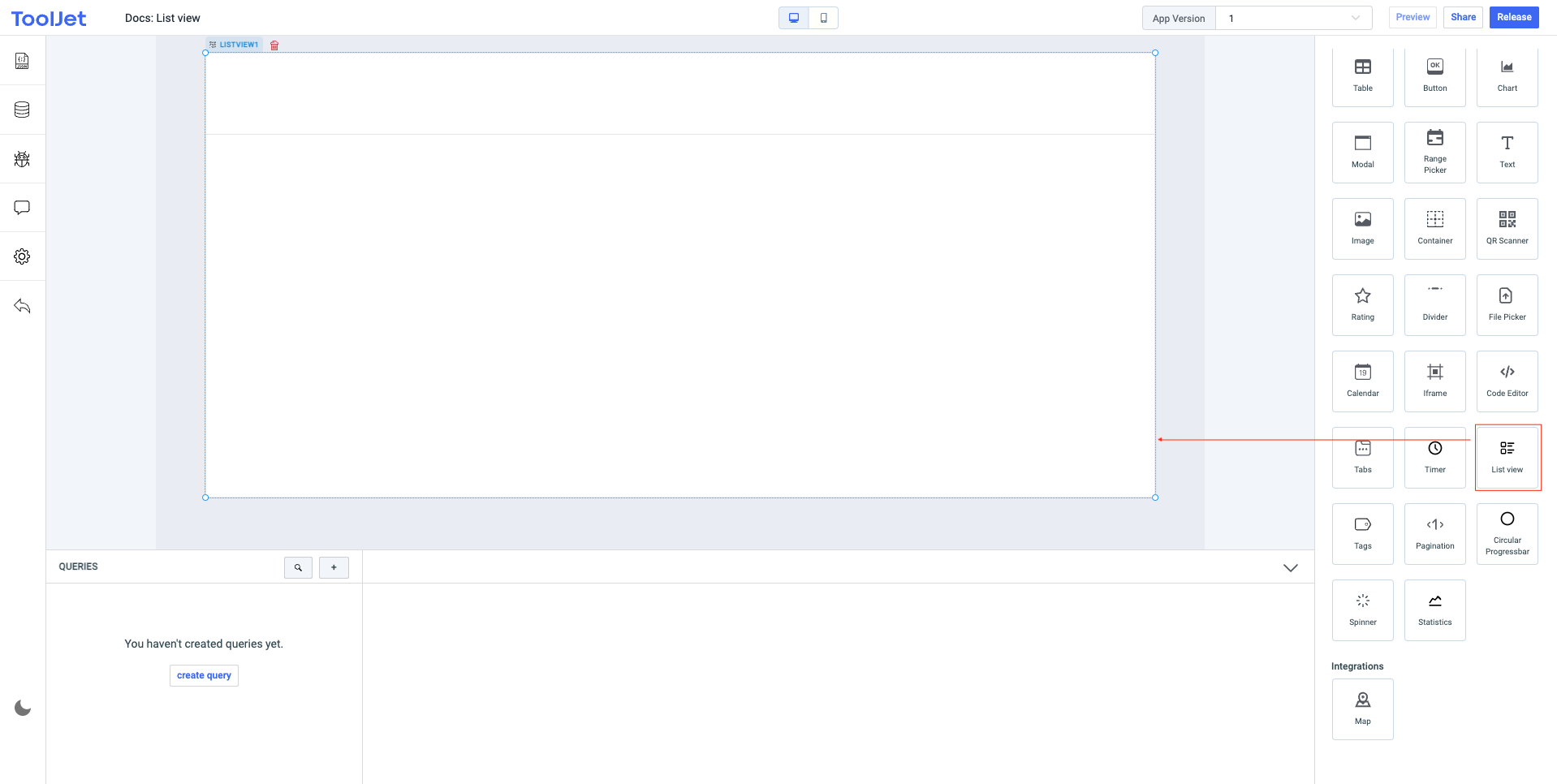
Let's start by creating a new app and then dragging the List View component onto the canvas.

-
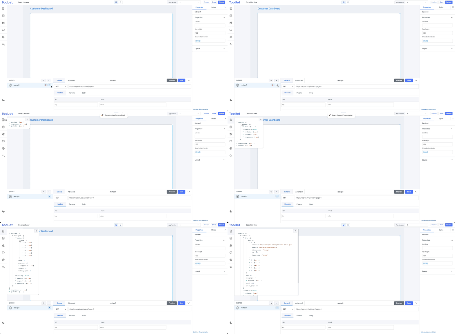
Now lets create a query and select the REST API from the datasource dropdown. Choose the
GETmethod and enter the API endpoint -https://reqres.in/api/users?page=1. Save this query and fire it. Inspect the query results from the left sidebar, you'll see that it resulted in thedataobject having an array of objects.
-
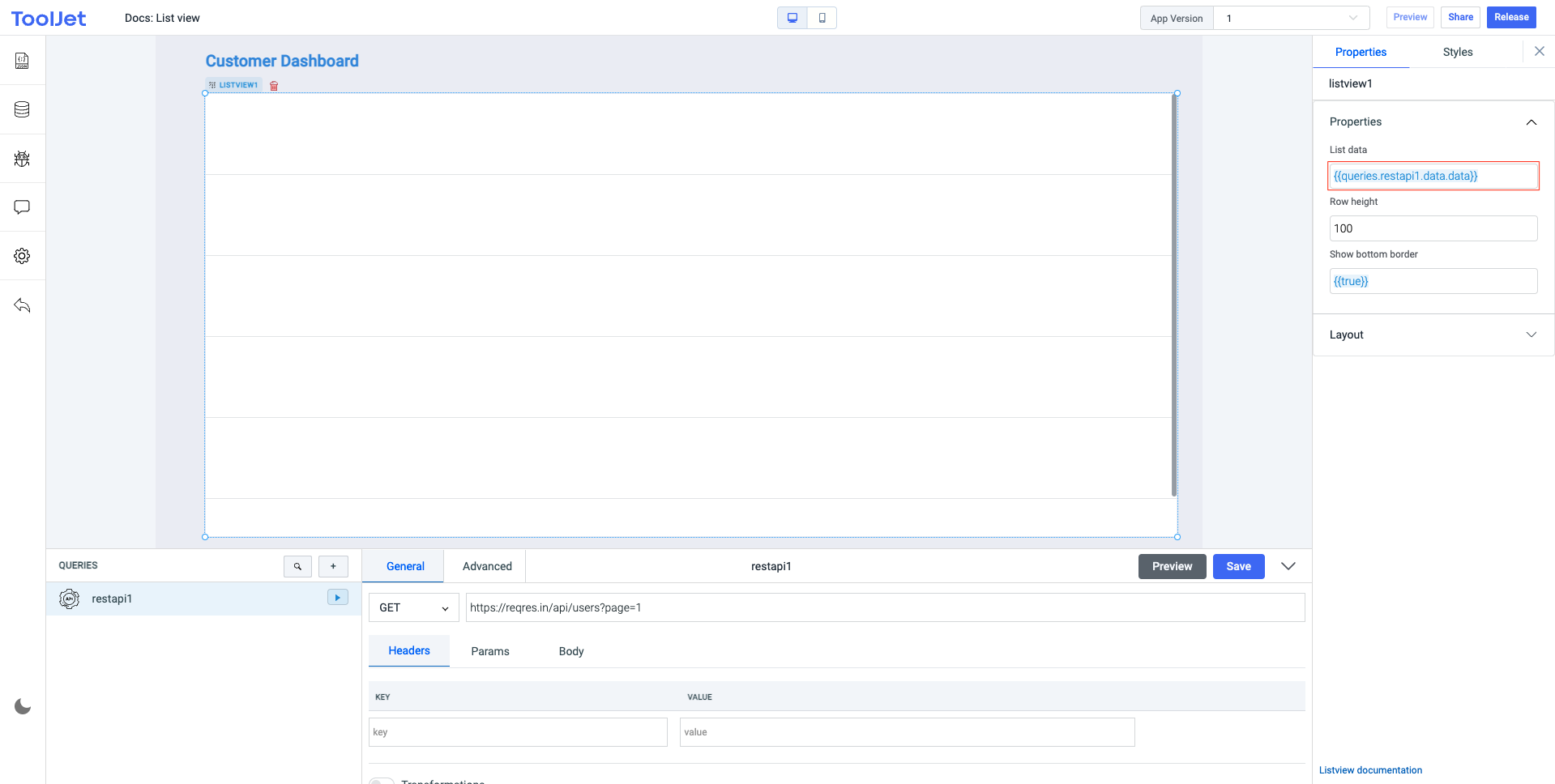
Now lets edit the
List dataproperty of the List View component for displaying the query data. We will use JS to get the data from the query -{{queries.restapi1.data.data}}. Here the lastdatais a data object that includes an array of objects, the firstdatais the data resulted from therestapi1query. This will automatically create the rows in the component using the data.
-
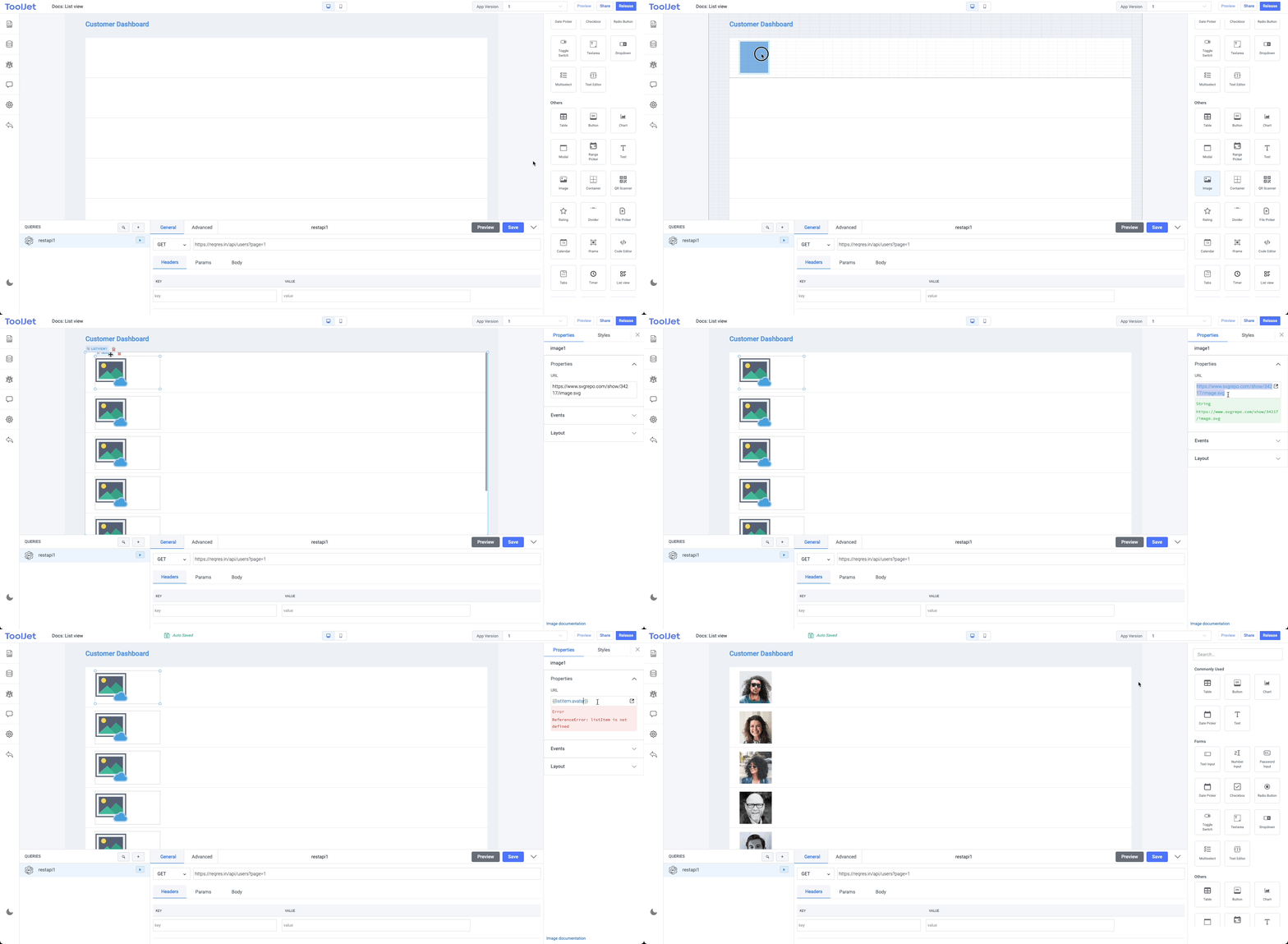
Finally, we will need to nest components into the first row of List View component and the component will automatically create the subsequent instances. The subsequent rows will appear the same way you'll display the data in the first row.

Use {{listItem.key}} to display data on the nested components. Example: For displaying the images we used {{listItem.avatar}} where avatar is one of the key in the objects from the query result.
Controlling Child Components
All the child components of the List View component are exposed through the children variable. This variable is an array of objects, where each object represents a record in the listview and contains the data of the child components.
The components inside the list view can be controlled using the javascript queries. For example, if you want to disable the button1 component in the first record, you can use the following expression:
components.listview1.children[0].button1.disable(true) // disables the button1 component in the first record