Custom Component
Custom Component can be used to create your own React component when the needed functionality isn't available in other components.

Properties
Data
The data needs to be an object that needs to be passed as data props to the Custom Component.
Example:
{{{
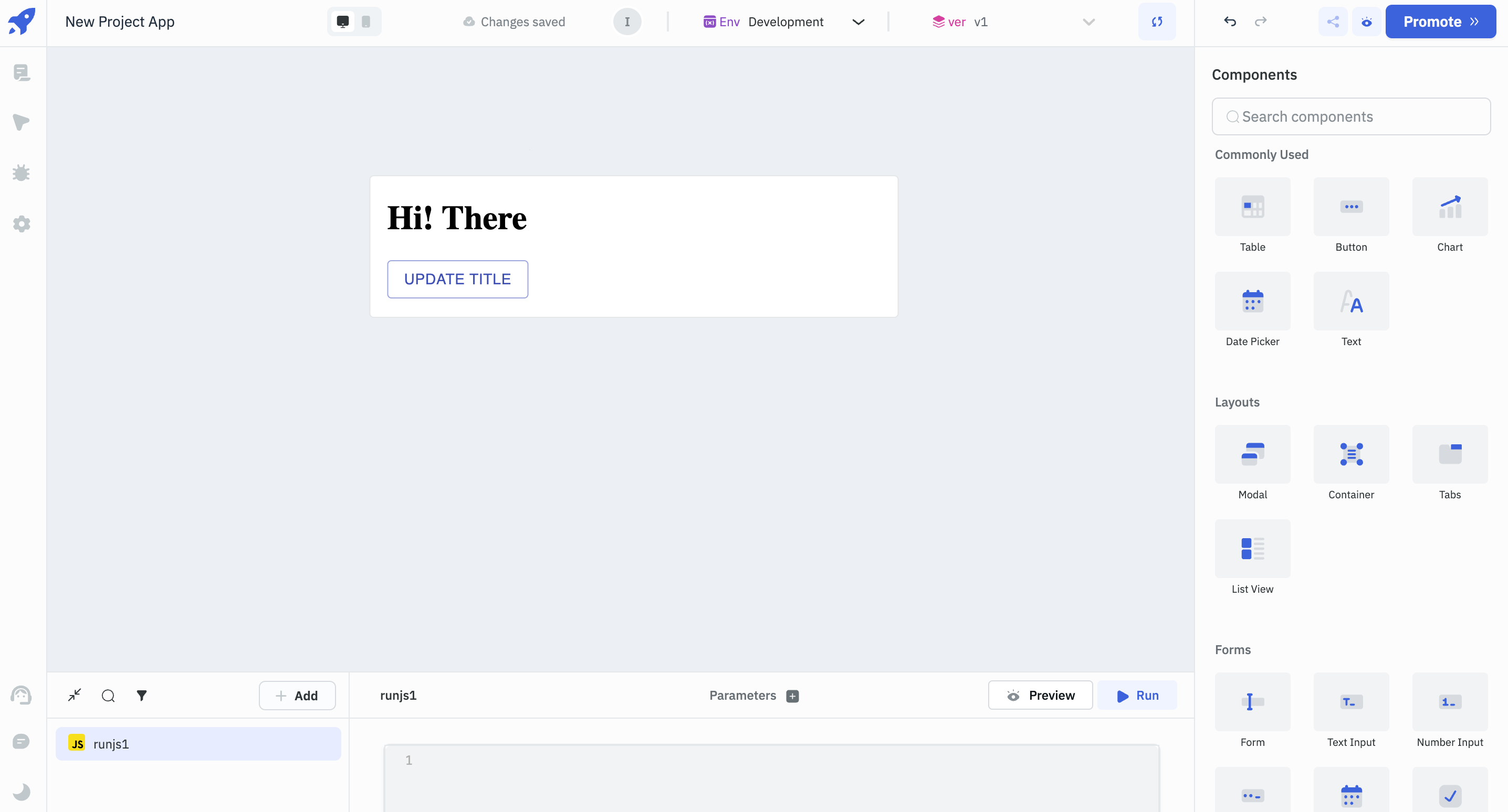
    title: "Hi! There",
    buttonText: "Updated Text",
    queryName: "runjs1"
}}}
Code
This field is used to add a React code for your custom component. The packages for the custom component can be imported from Skypack or esm. For example, to import React package into the custom component it can be imported as import React from 'https://cdn.skypack.dev/react'.
ToolJet provides 3 props to interact with the app:
- data is a shared object between a custom component and the ToolJet app.
- updateData is a function that accepts a single object used to update the data passed to the custom component.
- runQuery is a function that accepts a query name as a string used to run the query from the custom component.
Example:
import React from "https://cdn.skypack.dev/react";
import ReactDOM from "https://cdn.skypack.dev/react-dom";
import { Button, Container, Link } from "https://cdn.skypack.dev/@material-ui/core";

const MyCustomComponent = ({data, updateData, runQuery}) => (
    <Container>
        <h1>{data.title}</h1>
        <Button
            color="primary"
            variant="outlined"
            onClick={() => {updateData({...data, title: 'Hello World!!'})}}>
            {data.buttonText}
        </Button>
        <Button
            color="primary"
            variant="outlined"
            onClick={() => {runQuery(data.queryName)}}
        >
            Run Query
        </Button>
    </Container>
);

const ConnectedComponent = Tooljet.connectComponent(MyCustomComponent);

ReactDOM.render(<ConnectedComponent />, document.body);
Tooljet.connectComponent acts as a HOC and it is required to get access to the data passed into the custom component and run the query.
Component Specific Actions (CSA)
There are currently no CSA (Component-Specific Actions) implemented to regulate or control the component.
Exposed Variables
Variables | Description | How To Access |
|---|---|---|
| data | This variable will hold the variables assigned inside the code for custom component. | Access the value dynamically using JS: {{components.customcomponent1.data.title}}. |
General
Tooltip
A Tooltip is often used to specify extra information about something when the user hovers the mouse pointer over the component.
Under the General accordion, you can set the value in the string format. Now hovering over the component will display the string as the tooltip.
Layout
Layout | Description | Expected Value |
|---|---|---|
| Show on desktop | Toggle on or off to display desktop view. | You can programmatically determining the value by clicking on fx to set the value {{true}} or {{false}}. |
| Show on mobile | Toggle on or off to display mobile view. | You can programmatically determining the value by clicking on fx to set the value {{true}} or {{false}}. |
Styles
Style | Description | Default value |
|---|---|---|
| Visibility | Toggle on or off to control the visibility of the component. You can programmatically change its value by clicking on the fx button next to it. If {{false}} the component will not visible after the app is deployed. | By default, it's set to {{true}}. |
Any property having fx button next to its field can be programmatically configured.