Map
The Map component enables users to display a map on the app. It can be used to display or choose a single location or multiple locations on the map. The Map component can be used to display the location of a business, a store, or a restaurant. It can also be used to display the location of a user on the map. It allows users to interact with the map interface and pick specific points of interest.
If you are utilizing the self-hosted version of ToolJet, it is necessary to configure the Google Maps API key as an environment variable. Please refer to the environment variable setup documentation.
Properties
Properties | Description | Expected Value |
|---|---|---|
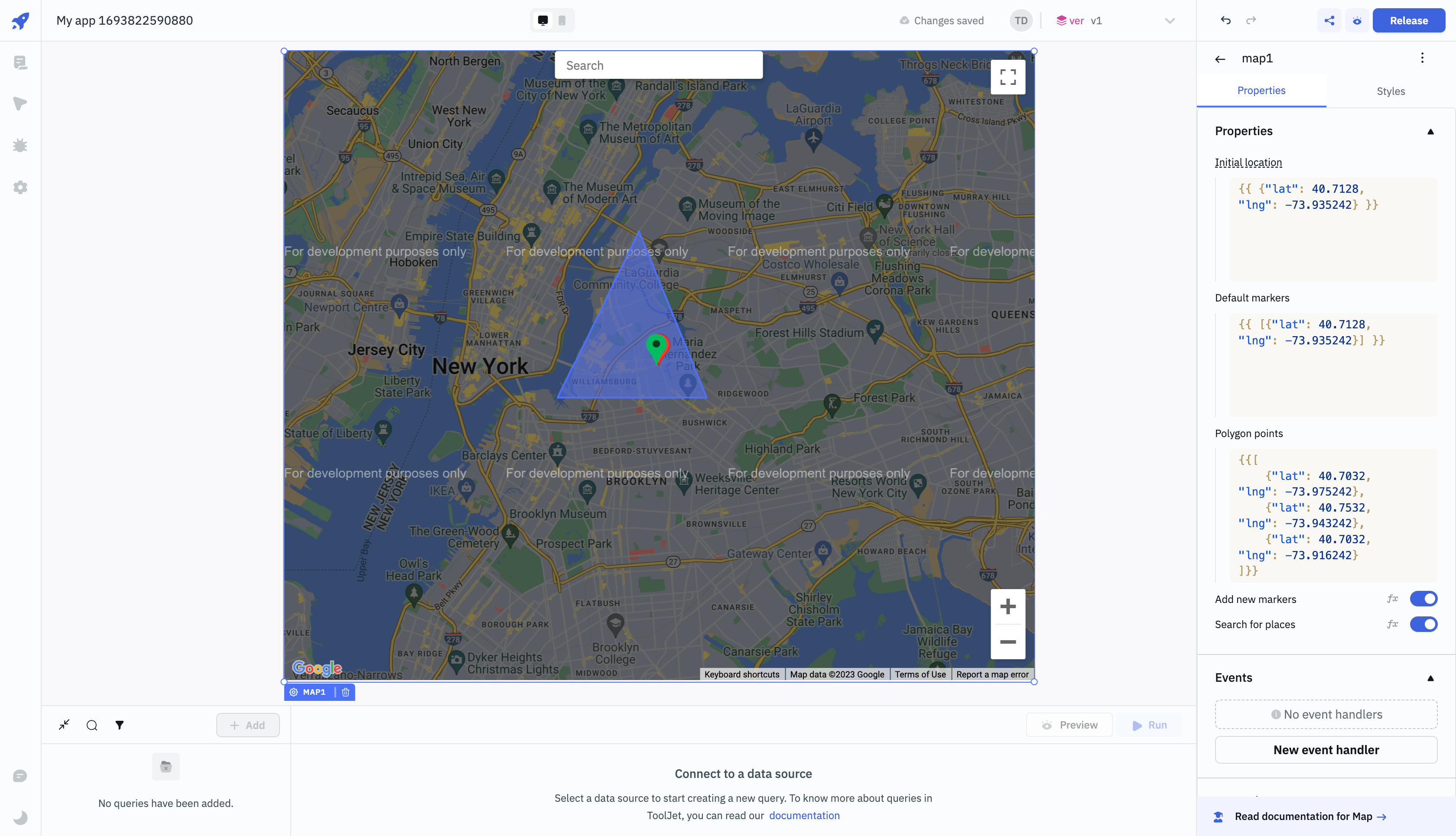
| Initial location | default location when the app is loaded initially. | An object containing the latitude and longitude as key value pairs. ex: {{ {"lat": 40.7128, "lng": -73.935242} }}. |
| Default markers | Number of markers that should be shown on the map. | An array of objects containing the coordinates. ex: {{ [{"lat": 40.7128, "lng": -73.935242}, {"lat": 40.7128, "lng": -73.935242}] }}. |
| Polygon points | Create a polygon on the map using the given coordinates. | An array of objects containing the coordinates. ex: {{ [{"lat": 40.7128, "lng": -73.935242}, {"lat": 40.7128, "lng": -73.935242}] }}. |
| Add new markers | On clicking the map, a new marker will be added to the map. | By default, it's set to On. Toggle off to disable adding new markers on the map. Click fx to set {{true}} or {{false}} programmatically. |
| Search for places | Enable to show the search box on the map. | By default, it's set to On. Toggle off to disable the search box on the map. Click fx to set {{true}} or {{false}} programmatically. |
Events
Event Name | Description |
|---|---|
| On bounds change | Triggers when the bounding area is modified. This event occurs after the bounds variable changes. |
| On create marker | Triggers when a new marker is added to the map. |
| On marker click | Triggers when the user clicks on any of the markers on the map. |
| On polygon click | Triggers when the user clicks on the polygon on the map. |
For detailed information about all the available Actions, please refer to the Action Reference documentation.
Component Specific Actions (CSA)
Following actions of Map component can be controlled using the component specific actions(CSA):
Actions | Description | How To Access |
|---|---|---|
| setLocation | Set the marker's location on map using latitude and longitude values as parameters via a component-specific action within any event handler. | Employ a RunJS query to execute component-specific actions such as: component.map1.setLocation(40.7128, -73.935242). |
Exposed Variables
Exposed variables can be used to get data from the component.
Variables | Description | How To Access |
|---|---|---|
| center | This variable will hold the latitude, longitude and the google map url value. | |
center.lat | This variable holds the latitude value of the marker on the Map component. | Access the value dynamically using JS: {{components.map1.center.lat}}. |
center.lng | This variable gets updated with RGB color code whenever a user selects a color from the color picker. | Access the value dynamically using JS: {{components.map1.center.lng}}. |
center.googleMapUrl | This variable holds the URL of the location where the center marker is placed on the Map component. | Access the value dynamically using JS: {{components.map1.center.googleMapUrl}}. |
| markers | The markers variable will hold the value only if add new markers is enabled from the map properties. Each marker is an object and will have lat and lng keys. | Access the values dynamically using {{components.map1.markers[1].lat}}. |
| selectedMarker | Object with the marker selected by the user. | |
| bounds | It constructs a rectangle from the points at its south-west and north-east corners. | |
| bounds.northEast | It holds the latitude and longitude of the north-east corner of the rectangle. | Access the value dynamically using JS: {{components.map1.bounds.northEast.lat}} or {{components.map1.bounds.northEast.lng}}. |
| bounds.southWest | It holds the latitude and longitude of the south-west corner of the rectangle. | Access the value dynamically using JS: {{components.map1.bounds.southWest.lat}} or {{components.map1.bounds.southWest.lng}}. |
General
Tooltip
A Tooltip is often used to specify the extra information when the user hovers the mouse pointer over the component. Once a value is set for Tooltip, hovering over the element will display the specified string as the tooltip text.
Devices
Property | Description | Expected Value |
|---|---|---|
| Show on desktop | Makes the component visible in desktop view. | You can set it with the toggle button or dynamically configure the value by clicking on fx and entering a logical expression. |
| Show on mobile | Makes the component visible in mobile view. | You can set it with the toggle button or dynamically configure the value by clicking on fx and entering a logical expression. |
Styles
Properties | Description | Expected Value |
|---|---|---|
| Visibility | Toggle on or off to control the visibility of the component. | You can programmatically change its value by clicking on the fx button next to it. If {{false}} the component will not be visible after the app is release. By default, it's set to {{true}}. |
| Disable | This is off by default, toggle on the switch to lock the component and make it non-functional. | You can also programmatically set the value by clicking on the fx button next to it. If set to {{true}}, the component will be locked and becomes non-functional. By default, its value is set to {{false}}. |
| Box shadow | Add a shadow effect to the component by providing values to X, Y, Blur, Spread and Color. | You can also programmatically set the value by clicking on the fx button next to it. Ex: {{"x": 0, "y": 0, "blur": 0, "spread": 0, "color": "#000000"}}. |