Calendar
The Calendar component allows you to visually organize and schedule events. You can set the default view (day, week, or month), enable/disable various display options, and bind data to events and resources.
Certain components are restricted from being placed within the Popout of the Calendar component:
- Calendar, Kanban.
Properties
Property | Description |
|---|---|
| Date Format | Determines the format in which any date passed to the calendar via any of the properties will be parsed. It also determines the format in which any date made available by the calendar via exposed variables will be displayed. It uses the date format conventions of moment.js. |
| Default Date | Determines the date on which the calendar's view will be centered on. By default, the default date is set to the current date using moment.js i.e. {{moment().format("MM-DD-YYYY HH:mm:ss A Z")}}. If the calendar is on month view, it will show the month on which this date exists. If the calendar is on week view, it will show the week on which this date exists. This property needs to be formatted using the Date format property which is configurable on the inspector. |
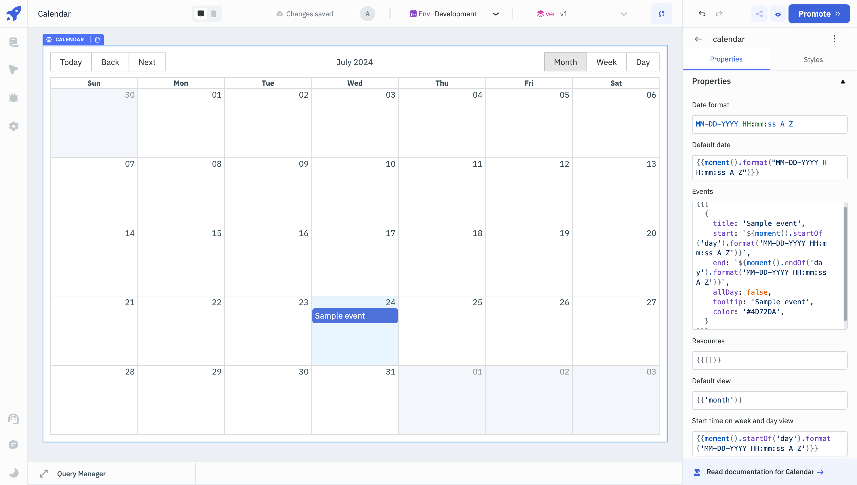
Events
Events property should contain an array of objects, each of which describes the events that the calendar needs to display.
Assuming that you set the date format to MM-DD-YYYY HH:mm:ss A Z, setting the Events property to the following code snippet will display an event titled Sample Event at the first hour of this day, as displayed in the image of calendar at the beginning of this page.
{
  {
    [
      {
        title: "Sample event",
        start: `${moment().startOf("day").format("MM-DD-YYYY HH:mm:ss A Z")}`,
        end: `${moment().endOf("day").format("MM-DD-YYYY HH:mm:ss A Z")}`,
        allDay: false,
        tooltip: "Sample event",
        color: "lightgreen",
      },
    ];
  }
}
Event Object Properties
Name | Description |
|---|---|
| title | Title of the event |
| start | The date(and time) on which this event begins. Needs to be formatted in the Date format you've supplied |
| end | The date(and time) on which this event ends. Needs to be formatted in the Date format you've supplied |
| allDay | Optional. Qualifies the event as an 'All day event', which will pin it to date headers on day and week level views |
| tooltip | Tooltip which will be display when the user hovers over the event |
| color | Background color of the event, any css supported color name or hex code can be used |
| textColor | Color of the event title, any css supported color name or hex code can be used |
| textOrientation | Optional. If it is set to vertical, the title of the event will be oriented vertically. |
| resourceId | Applicable only if you're using resource scheduling. This is the id of the resource to which this event correspond to. |
You may supply any other additional property to the event(s). These additional properties will available to you when the calendar widget exposes any of the events via its exposed variables.
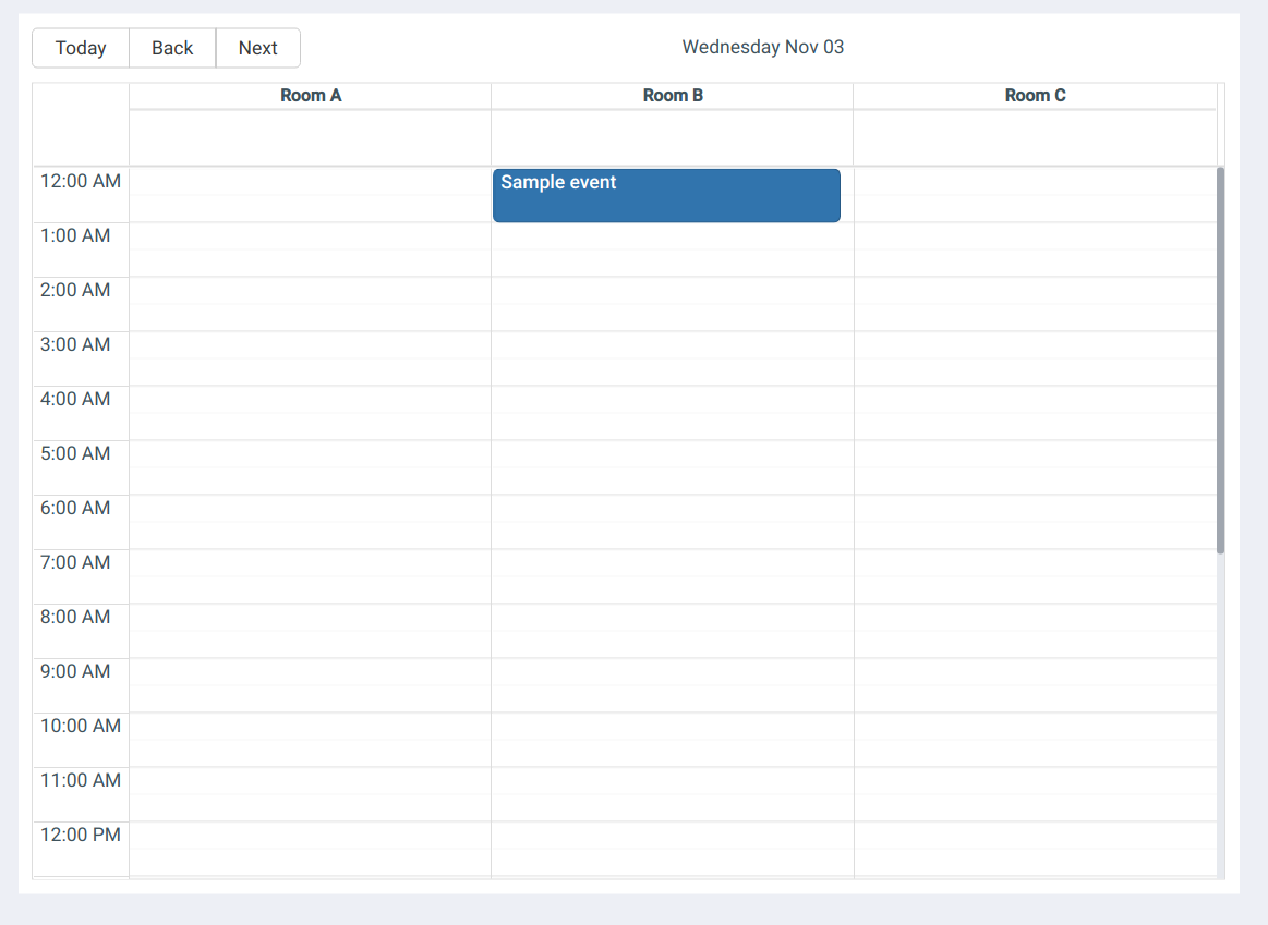
Resources
Specifying resources will make the calendar categorize week view and day view for each of the resources specified.
For example, to categorize week/day view into for three rooms, we specify resources this way:
{
  {
    [
      { resourceId: 1, title: "Room A" },
      { resourceId: 2, title: "Room B" },
      { resourceId: 3, title: "Room C" },
    ];
  }
}
If we specify the resourceId of any of the events as 1, then that event will be assigned to Room A, generating the following calendar, assuming that we've set the view to day and are viewing the day on which this event exists.
Default View
Determines whether the calendar would display a day, a week or a month. Setting this property to anything other than these values will make the calendar default to month view.
The view that is currently selected will be exposed as the variable currentView.
Start Time on Week and Day View
This determines the time at which week view and day view cells begins. Keep in mind that this field accepts a date, but still only the time and timezone(if provided) are taken from this date. The date should be provided in the date format chosen by you in the first property field.
End Time on Week and Day View
This determines the time at which week view and day view cells ends. Keep in mind that this field accepts a date, but still only the time and timezone(if provided) are taken from this date. The date should be provided in the date format chosen by you in the first property field.
Show Toolbar
Determines whether the calendar toolbar should be displayed or not. Click on Fx button to programmatically determine the field value to {{true}} or {{false}}.
Show View Switcher
Determines whether the calendar's buttons that allow user to switch between month, week and day level views will be displayed. Click on Fx button to programmatically determine the field value to {{true}} or {{false}}.
Highlight Today
Determines whether the today's card on the calendar should be highlighted or not. Click on Fx button to programmatically determine the field value to {{true}} or {{false}}.
Show Popover When the Event is Clicked
Determines whether to display a popover whenever an event is clicked. Click on Fx button to programmatically determine the field value to {{true}} or {{false}}.
Events
| Event | Description |
|---|---|
| On Event Selected | This event is fired when the user clicks on a calendar event. Last selected event is exposed as selectedEvent. |
| on Slot Selected | This event is fired when the user either clicks on an calendar slot(empty cell or empty space of a cell with event) or when they click and drag to select multiple slots. Last selected slot(s) are exposed as selectedSlots. |
| On Date Navigate | This event is fired when the user clicks on Today, Next or Back buttons on the calendar. The corresponding date to which the user navigated, will be exposed as currentDate. |
| On View Change | This event is fired when a different view is selected by the user. The current view is exposed as currentView. |
Check Action Reference docs to get the detailed information about all the Actions.
Component Specific Actions (CSA)
There are currently no CSA (Component-Specific Actions) implemented to regulate or control the Calendar component.
Exposed Variables
| Variables | Description |
|---|---|
| selectedEvent | This variable stores information about the event that has been chosen on the calendar component. This object comprises keys like title, start, end, allDay, and color, and they can be accessed dynamically through JS using the following syntax: {{components.calendar1.selectedEvent.title}} or {{components.calendar1.selectedEvent.start}} |
| selectedSlots | The variable selectedSlots contains the values of the slots chosen on the calendar component. This object comprises keys like slots, start, end, resourceId, and action, and they can be accessed dynamically through JS using the following syntax: {{components.calendar1.selectedSlots.slots[0]}} or {{components.calendar1.selectedSlots.end}}. |
| currentView | The currentView variable holds the type of view currently set on the calendar. The value updates when the user changes the view from the calendar header. Types of views supported: month, week, and day. The value can be accessed using {{components.calendar1.currentView}} |
| currentDate | The currentDate variable holds the current date data. The date returned by the variable is in the MM-DD-YYYY HH:mm:ss A Z format. The value can be accessed using {{components.calendar1.currentDate}} |
General
Tooltip
A Tooltip is often used to specify extra information about something when the user hovers the mouse pointer over the widget. Under the General accordion, you can set the value in the string format. Now hovering over the widget will display the string as the tooltip.
Layout
Layout | Description | Configuration Options |
|---|---|---|
| Show on Desktop | Toggle on or off to display the widget in desktop view. | The value can be programmatically determined by clicking on Fx to set the value {{true}} or {{false}}. |
| Show on Mobile | Toggle on or off to display the widget in desktop view. | The value can be programmatically determined by clicking on Fx to set the value {{true}} or {{false}}. |
Styles
Property | Description | Configuration Options |
|---|---|---|
| Visibility | Controls component visibility. | Toggle on or off, or set programmatically using fx. |
| Cell size in views classified by resource | Controls cell size when resources are specified. | Choose between Compact or Spacious. |
| Header date format on week view | Determines column header format for each day in week view. | Enter a date format following momentjs standard (default: DD MMM). |
| Border color | Sets the border color of the calendar. | Select a color from the color picker or set it programmatically using fx. |
| Border radius | Sets the corner radius of the calendar. | Enter a numeric value (default: 6) or set it programmatically using fx. |
Any property having fx button next to its field can be programmatically configured.