Canvas and Layout
Canvas is the main area in the app-builder where you build your application and design the user interface.

Global Settings
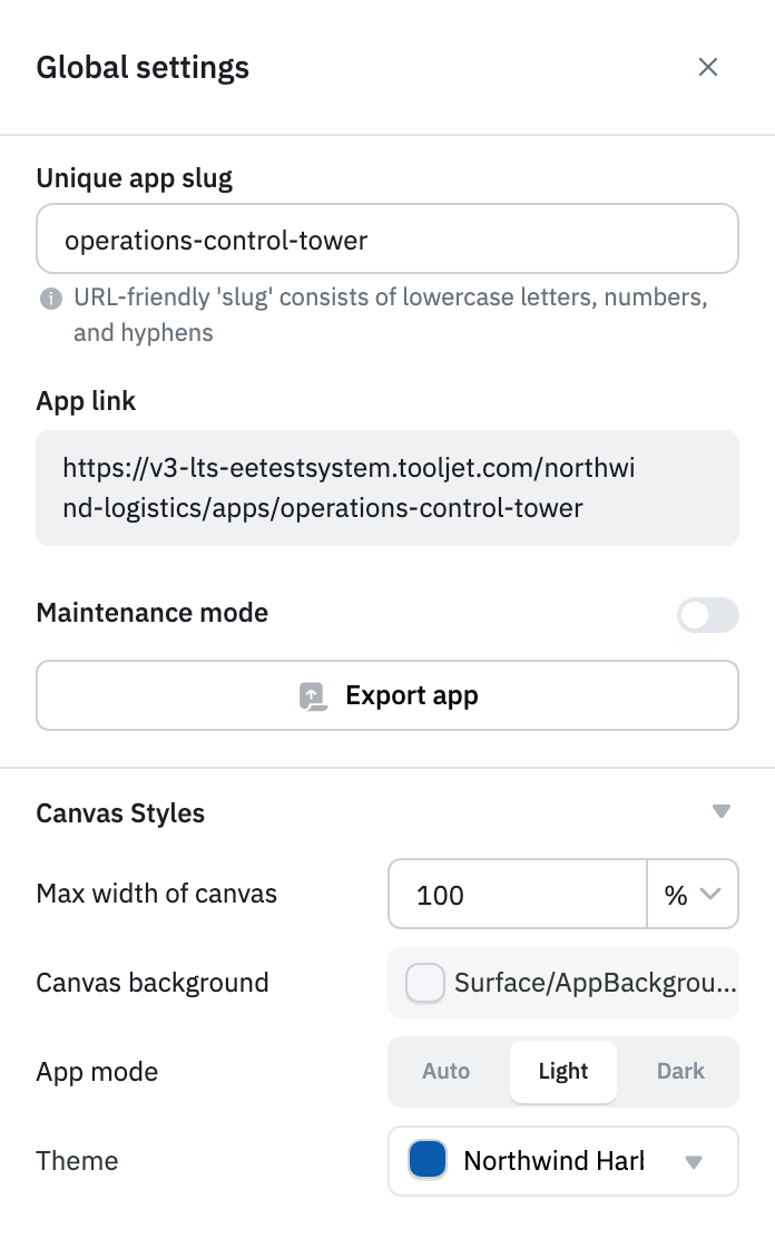
Global settings holds app-level settings such as the app URL, maintenance mode, export, and canvas styles. To open it, click the Settings icon in the left sidebar of the app builder.
Unique App Slug
The app slug identifies your app in its URLs. By default, it's the app's ID. Enter a readable slug in Unique app slug, for example inventory-tracker.
- A slug can contain only lowercase letters, numbers, and hyphens, and can be up to 50 characters long.
- The slug must be unique across all apps on your ToolJet instance. If another app already uses it, you see This app slug is already taken.
- ToolJet saves the slug automatically after you stop typing. When it's saved, you see Slug accepted! and the App link updates.
The slug is used in the following URLs:
- App link:
<ToolJet URL>/<workspace>/apps/<slug>opens the app in the app builder. - The released app and app previews:
<ToolJet URL>/applications/<slug>.
Maintenance Mode
Turn on Maintenance mode to stop users from opening the app, for example while you fix an issue in the released version. ToolJet asks you to confirm before the change is applied.
While maintenance mode is on:
- Anyone who opens the app, including through Preview, sees a message that the app is under maintenance instead of the app.
- On the dashboard, the app's Launch button changes to Maintenance and is disabled.
- Builders can still open and edit the app in the app builder.
Turn off Maintenance mode to let users launch the released version again.
Export App
Click Export app to download the app as a JSON file. In the Select a version to export dialog, choose a version, select whether to Export ToolJet table schema, and click Export selected version or Export All. For details, see Import and Export Applications.
Canvas Styles
The Canvas Styles section has the following settings:
- Max width of canvas: Sets the maximum width of the canvas in
pxor%. The default is1292px. Switching the unit to%sets the width to100. The height of the canvas expands automatically as more components are added. - Canvas background: Sets the background color of the canvas. To set it dynamically, click fx and enter an expression.
- App mode: Choose from three theme modes:
- Auto: Follows the light or dark mode preference set in ToolJet.
- Light: Keeps the app in light mode, users cannot switch to dark mode.
- Dark: Keeps the app in dark mode, users cannot switch to light mode.
- Theme: Selects the App Theme used by the app. Custom themes need a paid plan. Without one, the dropdown is disabled and the default ToolJet theme is used.
Maintenance mode and Canvas Styles can't be changed while the app builder is locked for editing, for example when the released version is open.
Global Settings in the Module Editor
When you edit a module, Global settings shows a reduced set of options:
- Unique app slug and Maintenance mode aren't available, because modules aren't launched on their own.
- The export button is Export module. It downloads the module as a JSON file immediately, without a version selection dialog.
- Canvas Styles has no Max width of canvas setting, because the app that embeds the module controls its width. App mode is labelled Module mode.
Building the User Interface
To build the user interface, components can be dragged from the Components Library on the right. Use the Component Handle to reposition a component. A component can be resized from any of its edges or corners.

Grid, Snapping and Markers
ToolJet's Canvas provides a grid background, smart snapping, and visual markers to support precise alignment and positioning of components. Components automatically snap to grid lines and nearby elements, reducing the need for manual adjustments. Each cell on the canvas grid has a fixed height of 10 pixels. The width of each cell adjusts based on the screen size.

Desktop and Mobile Layouts
Each page has a desktop layout and a mobile layout. To switch the canvas between them, use the Desktop Layout and Mobile Layout buttons in the app builder header.
- Each component stores its position and size separately for desktop and mobile.
- A component appears in a layout only when its Show on desktop or Show on mobile property, in the Devices section of the component's properties, is turned on. Turning on Show on mobile adds the component to the mobile layout using its desktop size.
- Components that you add while in mobile layout are shown only on mobile.
When users open the app, ToolJet uses the mobile layout on screens narrower than 600 pixels and the desktop layout on wider screens.
Auto Layout for Mobile
By default, ToolJet generates each page's mobile layout from its desktop layout by stacking the components to fit the mobile canvas. While auto layout is on, you can't move, resize, or add components in mobile layout.
To arrange the mobile layout manually, switch to mobile layout and click Disable auto alignment, then click Turn off to confirm. This applies to the current page only. You can't turn auto layout back on, and the mobile layout no longer follows changes to the desktop layout.
Previewing the App
Click Preview in the app builder header to open the current page in a new tab, using the version and environment selected in the app builder. In the preview, use the Preview settings bar to switch the version, environment, or desktop and mobile layout.
Creating Layout
In ToolJet, components can be grouped using a Layout component such as a Container or a Form. You can drag and drop the relevant components into the layout components on the canvas to create a section.

Managing Components on Canvas
Select and Move Multiple Components
You can select multiple components by clicking and dragging over them, or by clicking individually while holding the Shift key. Once selected, all components can be moved together as a group.
Copy Components
Components on the canvas can be copied using Cmd/Ctrl + C.

Paste Components
Copied components can be pasted onto the canvas using Cmd/Ctrl + V.

Clone Components
Components on the canvas can be cloned using Cmd/Ctrl + D. Unlike copy and paste, cloning creates a duplicate of the selected component instantly.

For additional shortcuts, refer to the Keyboard Shortcuts Guide.
Multiplayer Editing
Team PlanMultiplayer editing lets several builders work on the same app at the same time and see each other's changes as they happen.
When other builders open the same version and page as you:
- Avatars: Your avatar and theirs appear at the bottom of the left sidebar. Up to two avatars are shown. Hover over the +N indicator to see the rest.
- Cursors: Each builder's cursor appears on the canvas in its own color, labelled with their first name.
- Live changes: Components that others add, delete, move, resize, or update appear on your canvas without reloading. These changes aren't added to your undo and redo history.
ToolJet doesn't lock components while someone is editing them. Avoid editing the same component at the same time as another builder.
Enabling Multiplayer Editing
Self HostedOn self-hosted instances, a super admin turns multiplayer editing on or off from Settings > Manage instance settings using the Multiplayer editing toggle. Its initial value comes from the ENABLE_MULTIPLAYER_EDITING environment variable.