Pages and Navigation
ToolJet allows the creation of multi-page applications, helping you break your application into different sections. Instead of building everything on a single screen, you can create separate pages to organize different functionalities or enable navigation within your application.
You can add the following items to the navigation menu in ToolJet:
- New Page: Create new pages to support multi-page applications and organize functionalities more effectively.
- Web Pages: Add external URLs to the navigation menu to redirect users to specific webpages.
- ToolJet Application: Link to other ToolJet applications directly from the nav menu. Note: The application must be a released app within the same workspace.
- Custom Navigation: Add any custom navigation using the OnClick event and available actions. Items of this type cannot be set as the home page or disabled.
- Nav Group: Group related navigation items together to simplify navigation in complex applications. For example, all admin-related items can go under one group, and user-related items under another.
This guide discusses how pages and the navigation menu work, how to create new navigation items, and manage them.
Pages and Navigation Panel
You manage pages and configure the navigation menu from the Pages and navigation panel in the right sidebar. To open it, do one of the following:
- Click the Page settings icon in the right sidebar.
- Click an empty area of the navigation menu on the canvas.
- Hover over the navigation menu on the canvas and click the edit icon next to the Page and nav label.
The panel has two tabs:
- Properties: Contains the Pages And Menu section, where you add and manage pages and nav items, and the Header And Navigation section, where you configure the app header and the navigation menu.
- Styles: Customize the colors and pill radius of the navigation menu. See Navigation Menu Styles.
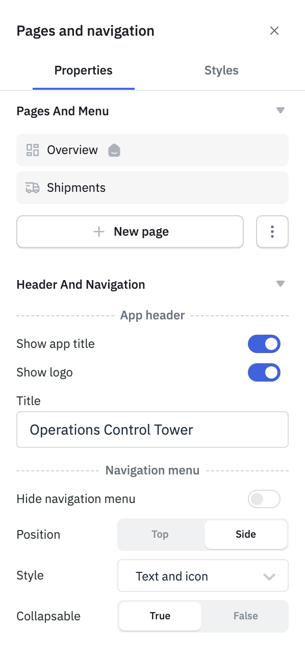
Page Properties
Each page in ToolJet comes with properties that define its identity and behavior. These properties help in organizing, referencing, and securing pages within your application.

Name
A display name for the page, shown in the application's navigation menu. It is also used to reference the page within the ToolJet application. You can optionally add an icon to make the page easier to identify in the menu. The page name and icon can be updated using the kebab menu (three dots) next to the page name and then selecting Edit page details.

Handle
The page handle is a unique identifier used to generate a shareable URL for the page. It is appended as a slug to the end of your application URL. By default, it's auto-generated from the page name. You can change it manually from the Edit page details option.
Home Page
The home page is the default landing page when the app launches. Only one page can be designated as the home page in your application. It cannot be deleted, disabled, or hidden from the page menu. A page can be marked as the home page using the kebab menu (three dots) next to the page name or by selecting the Edit page details option.
Permissions
Enterprise PlanPage permissions control who can access a particular page. You can choose to:
- Allow access to all users with application access
- Restrict access to selected users
- Restrict access to selected user groups
To configure page permissions, click the kebab menu (three dots) next to the page name, select Page permission, and select a permission option from the popup.
Disable Page
Disable Page allows you to disable a page, making it inaccessible in the released application. A page marked as Home cannot be disabled.
Hide Page on Navigation Menu
You can hide a page from the navigation menu in the released application. However, hidden pages can still be accessed using the Switch Page action or by navigating directly to the page URL. Pages set as Home cannot be hidden.
To hide a page conditionally, open the page's edit popover, click the fx button next to Hide this page on navigation, and enter an expression that resolves to true or false, for example {{!globals.currentUser.groups.includes("admin")}}. The page's visibility updates when the values the expression references change. A hidden or disabled page can't be marked as the home page.
Page Indicators
Icons next to an item in the pages panel show its state. Hover over an icon to see what it means:
- A home icon marks the app's home page.
- A skip icon marks a disabled page.
- An eye-off icon marks an item hidden from the navigation menu.
- A lock icon marks a page with page permissions applied.
Nav items also show their type next to the name: URL, TJ app, or Custom.
Header and Navigation Menu
App Header
The app header section allows you to control what is displayed in the application’s header.

- Show app title: Toggle this on to display the app title in the header. The logo is controlled separately by Show logo.
- Show logo: Toggle this on to display the application logo. You can update the logo from the white labeling settings.
- Title: Set a title for the application. This will be displayed in the app header. It defaults to the app name, can't be empty, and can be up to 32 characters long.
Hiding the app title or the logo is available on Team and Enterprise plans. On other plans, both are always shown and their toggles are disabled.
Navigation Menu
The Navigation Menu lets users navigate between pages, external web pages, and other ToolJet applications in your application. You can customize how it looks and works, or even hide certain pages from it.
Hide Navigation Menu
Toggle Hide navigation menu on to hide the navigation items. It's off by default. Users can still navigate using events and page URLs. The app header stays visible unless you also turn off Show app title and Show logo.
To hide the menu conditionally, click fx and enter an expression that returns true or false, for example {{!globals.currentUser.groups.includes('admin')}}.
When the navigation menu is hidden, the Position, Style, and Collapsable options aren't shown.
Position
Choose whether to display the navigation menu at the Top or on the Side of the application. The default is Side.
Top Navigation Menu

Side Navigation Menu

Style
Choose how navigation items are displayed. The default is Text and icon.
| Style | Top | Side |
|---|---|---|
| Text and icon | Yes | Yes |
| Text only | Yes | Yes |
| Icon only | No | Yes |
If you switch the position from Side to Top while Icon only is selected, the style changes to Text and icon. With Icon only, the side menu always shows as a collapsed icon rail.
Collapsable
Available only when Position is Side and Style is Text and icon. Set it to True (default) to show a button at the bottom of the side menu that lets users collapse it to icons and expand it again. Set it to False to keep the side menu always expanded. The top navigation menu can't be collapsed.
Navigation Menu Styles
Use the Styles tab of the Pages and navigation panel to customize the navigation menu's appearance. By default, colors use your app's theme colors.
Item list
| Style | Default |
|---|---|
| Default text | Text/Placeholder |
| Default icon | Icon/Default |
| Selected text | Text/Primary |
| Selected icon | Icon/Default |
| Pill hover background | Surface/Surface2 |
| Pill selected background | Surface/AppBackground |
| Pill radius | 6 px |
Container
| Style | Default |
|---|---|
| App title | Text/Primary |
| Background | Surface/Surface1 |
| Border | Border/Weak |
Page Header and Footer
Team PlanEach page can have its own header and footer. These areas sit above and below the page canvas, and you use them for content that should stay visible on that page, such as a logo, a title, or action buttons. Header and footer settings and content are configured per page.
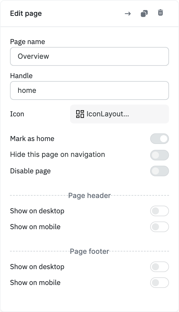
Enable the Header or Footer
- In the pages panel, click the page, or click the kebab menu (three dots) next to it and select Edit page details.
- Under Page header, turn on Show on desktop, Show on mobile, or both.
- Under Page footer, turn on Show on desktop, Show on mobile, or both.
Show on desktop applies to the desktop layout and Show on mobile applies to the mobile layout, so you can, for example, show a footer only on mobile. Both are off by default for new pages. If your plan doesn't include page headers or footers, these toggles are disabled.
Add Components
Drag components into the App header or App footer area on the canvas, the same way you add them to the page. The header stays at the top of the page and the footer stays at the bottom while users scroll.
The following components can't be placed in a page header or footer: Accordion, Calendar, Camera, Chart, Chat, Code Editor, Container, Form, HTML Viewer, Iframe, JSON Editor, JSON Explorer, Kanban, Key Value Pair, List View, Map, PDF, QR Scanner, Tabs, Text Editor, Timeline, and Tree Select.
Style the Header or Footer
Click an empty area of the header or footer on the canvas to open the App header or App footer panel in the right sidebar.
| Property | Description |
|---|---|
| Background | Background color of the header or footer. Defaults to the theme's surface color. |
| Border | Color of the header's bottom border or the footer's top border. Defaults to the theme's weak border color. |
| Height | Height in pixels, in steps of 10. Default: 60. |
Event Handlers
The Page Event Handler lets you trigger actions automatically when a page loads. Use it to prepare data, set default values, or run any required logic.
For example, it can run a query to fetch the latest data from the database and populate it in a table component. This ensures the page is ready with up-to-date information whenever it is loaded.

Exposed Variables
Exposed variables are values from a page that can be accessed throughout the application. These include default page-level values like page name, page ID, and page handle. In addition to the default ones, custom page variables can also be defined and accessed as exposed variables.
| Variable | Description | How To Access |
|---|---|---|
| handle | Represents the slug of the page within the app. It is automatically set when a page is created, but can be renamed from the page options. | {{page.handle}} |
| name | Indicates the name of the page. | {{page.name}} |
| id | Each page in the ToolJet application receives a unique identifier upon creation. | {{page.id}} |
| variables | Variables object contains all the variables created for a specific page using the Set Page Variable action. | {{page.variables.<pageVariableName>}}, where <pageVariableName> refers to the variable name. |
Manage Navigation Item
New Page
You can add a new page to organize the application navigation or to separate different parts of your app. To add a new page, click the + New page button at the bottom of the Pages And Menu section in the Pages and navigation panel. Enter the page name and press enter to create the page.

Web Page
To link an external web page to the navigation menu, click the kebab menu (three dots) next to the + New Page button, then select Add nav item with URL. Enter a name and provide the URL. You can also choose whether to open the web page in a new tab or in the same tab, and optionally select an icon for the navigation item.

ToolJet App
To add a ToolJet application to the navigation menu, click the kebab menu (three dots) next to the + New Page button, then select Add nav item ToolJet app. Enter a name and select the application from the dropdown. Only the release application from the same workspace will appear in the dropdown. You can also choose whether to open the application in a new tab or in the same tab, and optionally select an icon for the navigation item.

Custom Navigation
To add a custom navigation item to the navigation menu, click the kebab menu (three dots) next to the + New Page button, then select Add custom nav item. Enter a name and optionally select an icon for the navigation item. You can then configure the On Click event handler to trigger any available action when the item is clicked.
Items of this type cannot be set as the home page or disabled.

Nav Group
Team PlanRelated navigation items can be grouped together using a nav group. To add a new nav group, click the kebab menu (three dots) next to the + New Page button, then select Add nav group. Enter the group name and press enter to create the group. You can then drag items into the group folder. You can also add an icon to the group for better visual identification.
If your plan doesn't include nav groups, Add nav group is disabled and the pages panel shows a flat list.
A group appears in the released app's navigation menu only if it contains at least one page that isn't disabled and isn't hidden. You can hide a group itself with Hide this item on navigation in its edit popover.
Page and Group Actions
Click the kebab menu (three dots) next to a page or nav item to see these options:
- Edit page details: Opens the edit popover, where you can rename the item and change its settings.
- Mark home: Sets the page as the home page. Available for pages only.
- Duplicate page: Creates a copy named
<name> (copy)with the handle<handle>-copy, including its components, event handlers, visibility settings, and page header and footer, and opens it. - Delete page: Deletes the item. The home page can't be deleted.
- Page permission: Restricts who can access the page. See Permissions.
The kebab menu next to a nav group has these options:
- Edit group details: Rename the group, change its icon, or hide it.
- Duplicate group: Creates a copy of the group and all the pages in it, with
(copy)added to each name. - Delete group: Opens a confirmation dialog. Click Delete to remove only the group and move its pages out of it, or Delete group and pages to remove the group along with its pages. A group that contains the home page can't be deleted together with its pages.
The duplicate and delete actions are also available as icons at the top of the edit popover.
