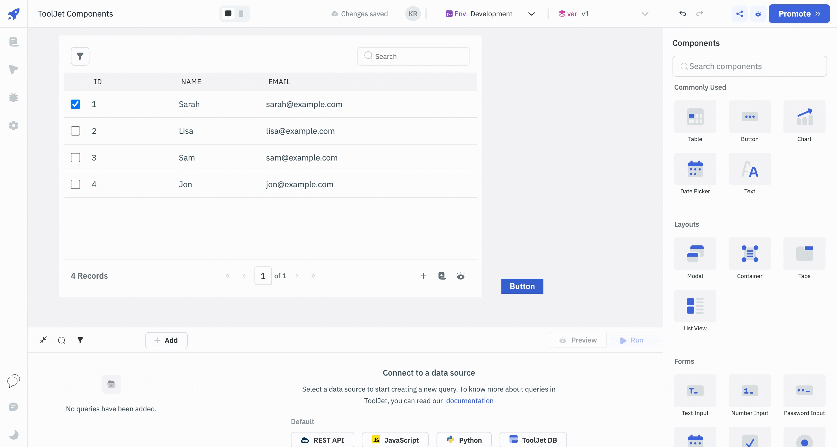
Components
Components in ToolJet serve as the building blocks for creating applications. They are pre-designed elements that you can drag and drop onto the canvas in the App-Builder. ToolJet comes with 45+ built-in components.
Customizing Components
Components are highly customizable and interactive. Once you place a component on the canvas, you can easily modify its properties, styles, and behaviors through the properties panel on the right side of the App-Builder. This allows you to make your application dynamic and responsive.
Using Components With Data
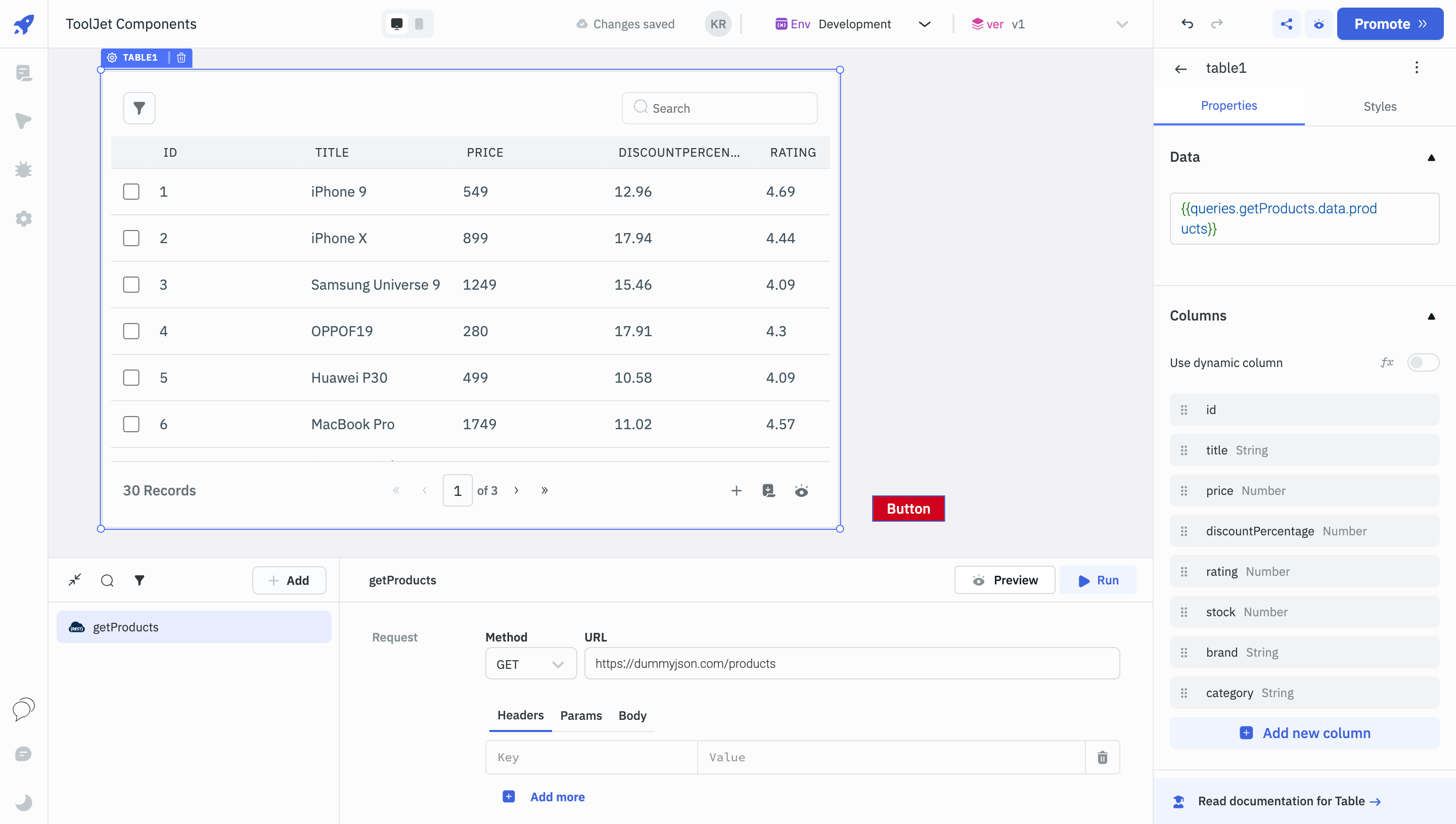
In ToolJet, components can be easily connected to various data sources like databases, APIs, and third-party services through queries. Once the data is fetched, you can bind it to components like tables, charts, and more.
Custom Components
ToolJet allows for the creation of custom components using React. This feature is invaluable for developers who require functionalities beyond the 45+ built-in components that ToolJet offers. To create a custom component, you can drag and drop a Custom Component on the canvas and configure its data and code.
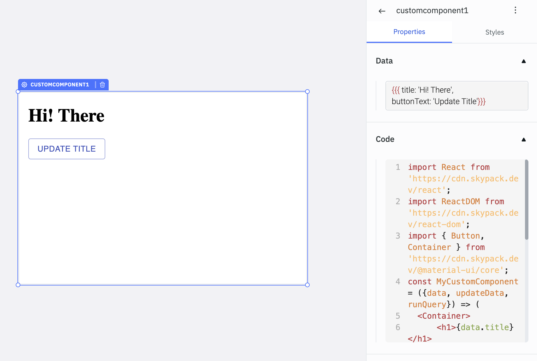
By incorporating custom React components, you can significantly extend the capabilities of your ToolJet applications, allowing for a more tailored and unique user experience.
To explore the full list of components in ToolJet, go through the Component Library.