Creating a Module
A module is a reusable interface that can be imported into applications. It allows you to build complex functionality once and reuse it across multiple applications without having to rewrite code each time. This guide explains how to create and use a module in ToolJet.
Create a Module
Follow these steps to get started with creating a module:
- Go to the Modules section from the ToolJet dashboard.

- Click on the Create Module button. In the popup, enter a name for the module.

- Add components, queries, and actions just like you would in a normal app. place and resize your components on the Module container.

- Click the module container to open its properties panel. Use the Input and Output sections to define how the module communicates with the parent application. This makes it easier to build dynamic, reusable modules that work across different data sets and queries. Check out the Configuring Inputs and Outputs guide to learn more. Under Additional actions, you can also set Dynamic height and Collapse when hidden. Each new instance of the module starts with these values, and you can change them for each instance in the application.

Use a Module
Once a module is created, it becomes available in the Modules tab of the components panel inside the App Builder. You can use it like any other component by dropping it on the canvas and configuring it.
- Open the application in which you want to use a module.
- In the components panel, switch to the Modules tab. You can search for a module by name.
- Drag and drop the module onto the canvas.

- Select the module to see the inputs (if any) defined in the module in the Input section of the properties panel.
- Bind the inputs to values from your data source or configure static values if needed. For Query inputs, select a query from the application.
- If your module has outputs, you can reference them using:
{{components.<module_name>.<output_name>}}
You can reuse the same module multiple times in a single application by dropping it multiple times on the canvas and configuring each instance with different input bindings.
Please refer to the Input and Output documentation for detailed information on how to manage the inputs and outputs of a module.
If no modules exist in the workspace, the Modules tab shows a Create Module button. On plans without modules, the module cards are disabled.
Module Instance Properties
When you select a module on the canvas, the properties panel shows the following settings for that instance.
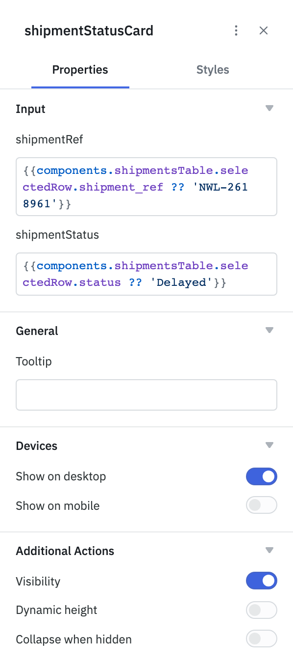
Properties
| Section | Property | Description | Default |
|---|---|---|---|
| Input | One field per module input | Value for each input defined in the module. Data inputs accept a value or an expression; Query inputs let you select a query from the application. If the module has no inputs, the section shows an Edit module button. | The input's Default value |
| General | Tooltip | Text shown when hovering over the module. | Empty |
| Devices | Show on desktop | Shows the module in the desktop layout. | On |
| Devices | Show on mobile | Shows the module in the mobile layout. | Off |
| Additional Actions | Visibility | Shows or hides the module. | On |
| Additional Actions | Dynamic height | Adjusts the module's height to fit its content when the application is running. | Value set in the module builder (Off by default) |
| Additional Actions | Collapse when hidden | Removes the space the module takes up when it's hidden. | Value set in the module builder (Off by default) |
Styles
| Property | Description | Default |
|---|---|---|
| Padding | Select Default to keep the standard padding around the module's content, or None to remove it so the module's content fills the component. | Default |
Edit a Module from an Application
To change a module while you're working in an application, select the module on the canvas. Then click the ⋮ menu in the properties panel header and select Edit module. The module builder opens in a new browser tab. Changes you make to the module apply to every application that uses it.