Tabs
A Tabs widget contains a number of defined containers that can be navigated through the tabs. Each tab acts as a container that can have different widgets placed inside it.
How To Use Tabs Widget
Properties
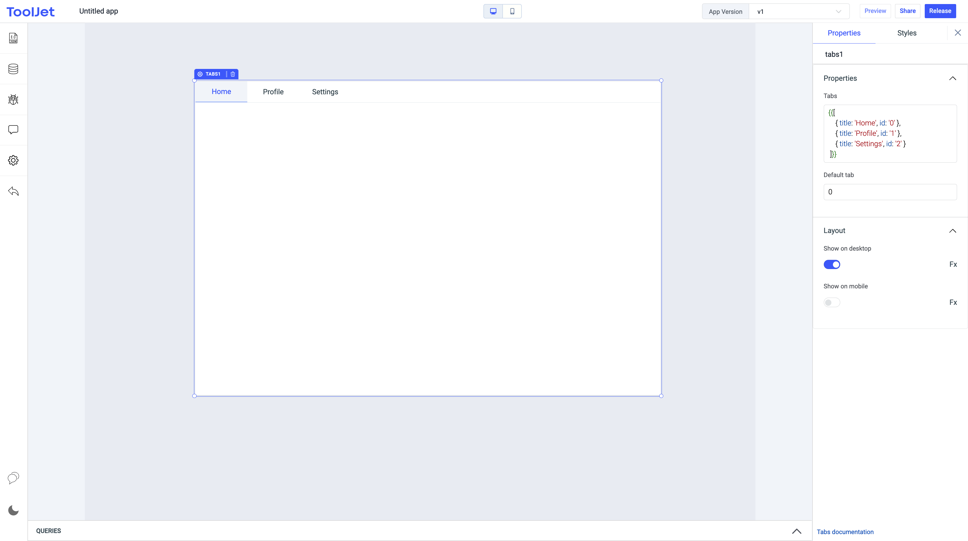
Tabs
This property lets you add and remove containers from the tabs widget. Each container in the tab has its unique id , title and disabled for disabling individual tabs . This field expects an array of objects.
{{[
    { title: 'Home', id: '0' },
    { title: 'Profile', id: '1',disabled:'true' },
    { title: 'Settings', id: '2' }
]}}
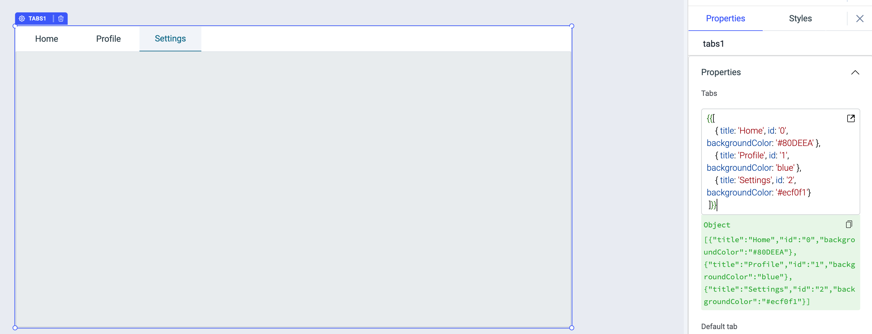
Adding background color to Tabs
You can specify the different color for each tab using the backgroundColor property and use hex color code or color name as the value.
{{[
		{ title: 'Home', id: '0', backgroundColor: '#81D4FA' },
		{ title: 'Profile', id: '1', backgroundColor: 'blue' },
		{ title: 'Settings', id: '2', backgroundColor: '#ecf0f1'}
 ]}}
Default tab
This property selects the container in the tab which matches the corresponding id. By default, the value is set to 0.
Hide tab
It allows you to hide all the tab titles defined in the Tabs property above. It accepts boolean values which can also be set using the toggle option or programmatically by clicking on the FX button.
Render only active tab
This property is enabled by default. When enabled, only the active tab will be rendered and when disabled, all the tabs in the component will be rendered.
Events
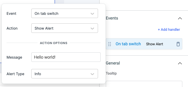
On tab switch
This event is triggered when the tab is switched.
Check Action Reference docs to get the detailed information about all the Actions.
Actions
| Action | Description | Properties |
|---|---|---|
| setTab | Set current tab. | id |
Layout
Show on desktop
Toggle on or off to display the widget in desktop view. You can programmatically determine the value by clicking on Fx to set the value {{true}} or {{false}}.
Show on mobile
Toggle on or off to display the widget in mobile view. You can programmatically determine the value by clicking on Fx to set the value {{true}} or {{false}}.
Styles
Highlight Color
You can change the highlight color of the selected tab by entering the Hex color code or choosing a color of your choice from the color picker.
Tab width
Tab width can be set as auto or equally split.
Visibility
Toggle on or off to control the visibility of the widget. You can programmatically change its value by clicking on the Fx button next to it. If {{false}} the widget will not be visible after the app is deployed. By default, it's set to {{true}}.
Disable
This is off by default, toggle on the switch to lock the widget and make it non-functional. You can also programmatically set the value by clicking on the Fx button next to it. If set to {{true}}, the widget will be locked and becomes non-functional. By default, its value is set to {{false}}.
Any property having Fx button next to its field can be programmatically configured.