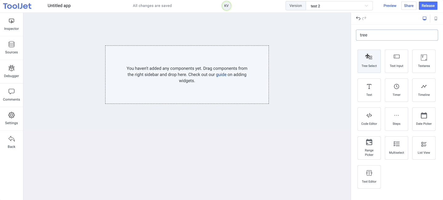
Tree Select
Tree Select widget is a group checkboxes in a TreeView which can be expanded or collapsed.
Properties
Title
The text is to be used as the title for the tree select. This field expects a String input.
Structure
Data requirements: The structure needs to be an array of objects and each object should have label and value keys. If you wish to have children under any of the checkbox, then children array needs to be passed with label and value keys.
Example:
[
  {
    "label": "Asia",
    "value": "asia",
    "children": [
      {
        "label": "China",
        "value": "china",
        "children": [
          { "label": "Beijing", "value": "beijing" },
          { "label": "Shanghai", "value": "shanghai" }
        ]
      },
      { "label": "Japan", "value": "japan" },
      {
        "label": "India",
        "value": "india",
        "children": [
          { "label": "Delhi", "value": "delhi" },
          { "label": "Mumbai", "value": "mumbai" },
          { "label": "Bengaluru", "value": "bengaluru" }
        ]
      }
    ]
  },
  {
    "label": "Europe",
    "value": "europe",
    "children": [
      { "label": "France", "value": "france" },
      { "label": "Spain", "value": "spain" },
      { "label": "England", "value": "england" }
    ]
  },
  { "label": "Africa", "value": "africa" }
]
Note: The value should be unique throughout the structure array.
Checked Values
Checked values is an array of values passed to select the checkboxes by default.
Example:
["asia", "spain"]
Expanded Values
Similar to checked values, expanded values is an array of values passed to expand the node by default.
Example:
["asia"]
Events
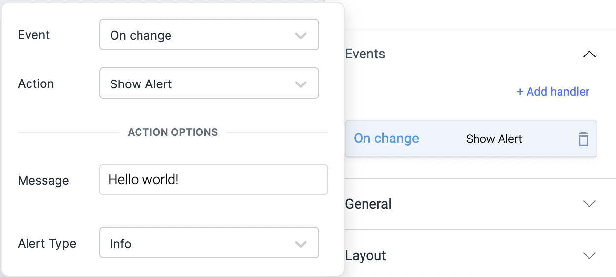
Check Action Reference docs to get the detailed information about all the Actions.
On change
On check event is triggered whenever the checkbox value is changed (checked or unchecked).
On check
On check event is triggered whenever the checkbox value is checked.
On uncheck
On uncheck event is triggered whenever the checkbox value is unchecked.
Layout
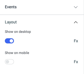
Show on desktop
Toggle on or off to display the widget in desktop view. You can programmatically determine the value by clicking on Fx to set the value {{true}} or {{false}}.
Show on mobile
Toggle on or off to display the widget in mobile view. You can programmatically determine the value by clicking on Fx to set the value {{true}} or {{false}}.
Styles
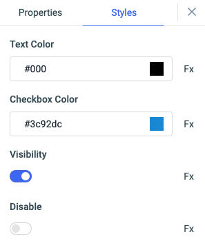
Text color
Change the color of the Label by entering the Hex color code or choosing a color of your choice from the color-picker.
Checkbox color
You can change the color of the checkbox by entering the Hex color code or choosing a color of your choice from the color-picker.
Visibility
Toggle on or off to control the visibility of the widget. You can programmatically change its value by clicking on the Fx button next to it. If {{false}} the widget will not be visible after the app is deployed. By default, it's set to {{true}}.
Disable
This is off by default, toggle on the switch to lock the widget and make it non-functional. You can also programmatically set the value by clicking on the Fx button next to it. If set to {{true}}, the widget will be locked and becomes non-functional. By default, its value is set to {{false}}.
Any property having Fx button next to its field can be programmatically configured.