Radio Button
Radio button widget can be used to select one option from a group of options.
How To Use Radio button Widget
Radio buttons are preferred when the list of options is less than six, and all the options can be displayed at once.
For more than six options, consider using Dropdown widget.
Event
On select
This event is triggered when an option is clicked.
Check Action Reference docs to get the detailed information about all the Actions.
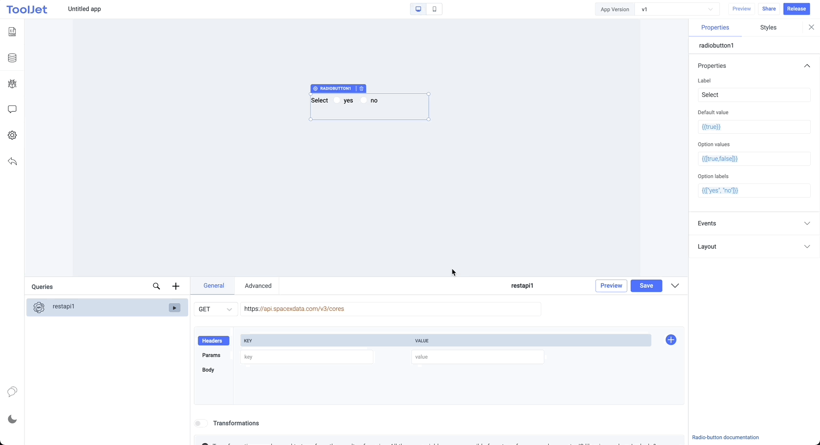
Properties
Label
The text is to be used as the label for the radio button. This field expects a String value.
Default value
The value of the default option.
Option values
List of values for different items/options. Refer your query data with dynamic variables {{queries.datasource.data.map(item => item.value)}} or populate it with sample values {{[true, false]}}
Option labels
List of labels for different items/options. Refer your query data with dynamic variables {{queries.datasource.data.map(item => item.label)}} or populate it with sample values {{["yes", "no"]}}
General
Tooltip
A Tooltip is often used to specify extra information about something when the user hovers the mouse pointer over the widget.
Under the General accordion, you can set the value in the string format. Now hovering over the widget will display the string as the tooltip.

Layout
Show on desktop
Toggle on or off to display the widget in desktop view. You can programmatically determine the value by clicking on Fx to set the value {{true}} or {{false}}.
Show on mobile
Toggle on or off to display the widget in mobile view. You can programmatically determine the value by clicking on Fx to set the value {{true}} or {{false}}.
Styles
Text color
Change the color of the text in the widget by providing the Hex color code or by choosing the color of your choice from the color picker.
Active color
Change the color of active radio button by providing the Hex color code or by choosing the color of your choice from the color picker.
Visibility
Toggle on or off to control the visibility of the widget. You can programmatically change its value by clicking on the Fx button next to it. If {{false}} the widget will not be visible after the app is deployed. By default, it's set to {{true}}.
Disable
This is off by default, toggle on the switch to lock the widget and make it non-functional. You can also programmatically set the value by clicking on the Fx button next to it. If set to {{true}}, the widget will be locked and becomes non-functional. By default, its value is set to {{false}}.
Example
Actions
| Action | Description | Properties |
|---|---|---|
| selectOption | Select an option from the radio buttons. | option eg: component.radiobutton1.selectOption('one') |