Checkbox
Checkbox widget can be used for allowing the users to make a binary choice, e.g,. unselected or selected.
The checkbox widget consists of a single checkbox input.
How To Use Checkbox Widget
Properties
Label
The text is to be used as the label for the checkbox. This field expects a String input.
Default Status
The property is used to set the default status (enabled or disabled) of the checkbox widget when the app is loaded. By default, the checkbox component is set to {{false}}/disabled.
Events
To add an event to a checkbox component, click on the widget handle to open the widget properties on the right sidebar. Go to the Events section and click on + Add handler.
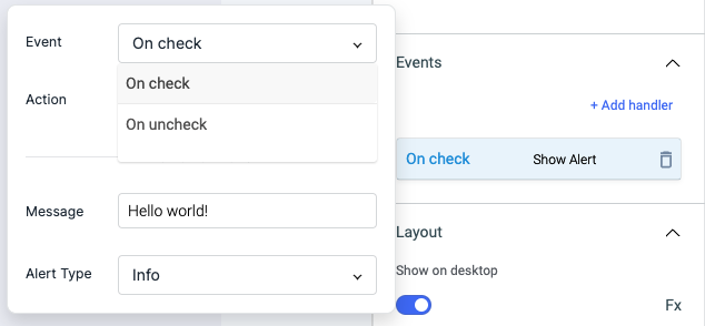
On check
On check event is triggered when checkbox input is checked.
On uncheck
On uncheck event is triggered when checkbox input is unchecked.
Check Action Reference docs to get the detailed information about all the Actions.
General
Tooltip
A Tooltip is often used to specify extra information about something when the user hovers the mouse pointer over the widget.
Under the General accordion, you can set the value in the string format. Now hovering over the widget will display the string as the tooltip.

Layout
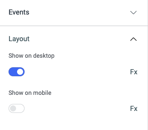
Show on desktop
Toggle on or off to display the widget in desktop view. You can programmatically determine the value by clicking on Fx to set the value {{true}} or {{false}}.
Show on mobile
Toggle on or off to display the widget in mobile view. You can programmatically determine the value by clicking on Fx to set the value {{true}} or {{false}}.
Styles
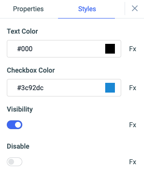
Text color
Change the color of the Text in checkbox by entering the Hex color code or choosing a color of your choice from the color-picker.
Checkbox color
You can change the color of the checkbox by entering the Hex color code or choosing a color of your choice from the color-picker.
Visibility
Toggle on or off to control the visibility of the widget. You can programmatically change its value by clicking on the Fx button next to it. If {{false}} the widget will not be visible after the app is deployed. By default, it's set to {{true}}.
Disable
This is off by default, toggle on the switch to lock the widget and make it non-functional. You can also programmatically set the value by clicking on the Fx button next to it. If set to {{true}}, the widget will be locked and becomes non-functional. By default, its value is set to {{false}}.
Any property having Fx button next to its field can be programmatically configured.
Actions
| Action | Description | Properties |
|---|---|---|
setChecked | Set checkbox state. | pass status as parameter. ex: components.checkbox1.setChecked(true) |