Link
Link widget allows you to add a hyperlink and navigate to the external URL.
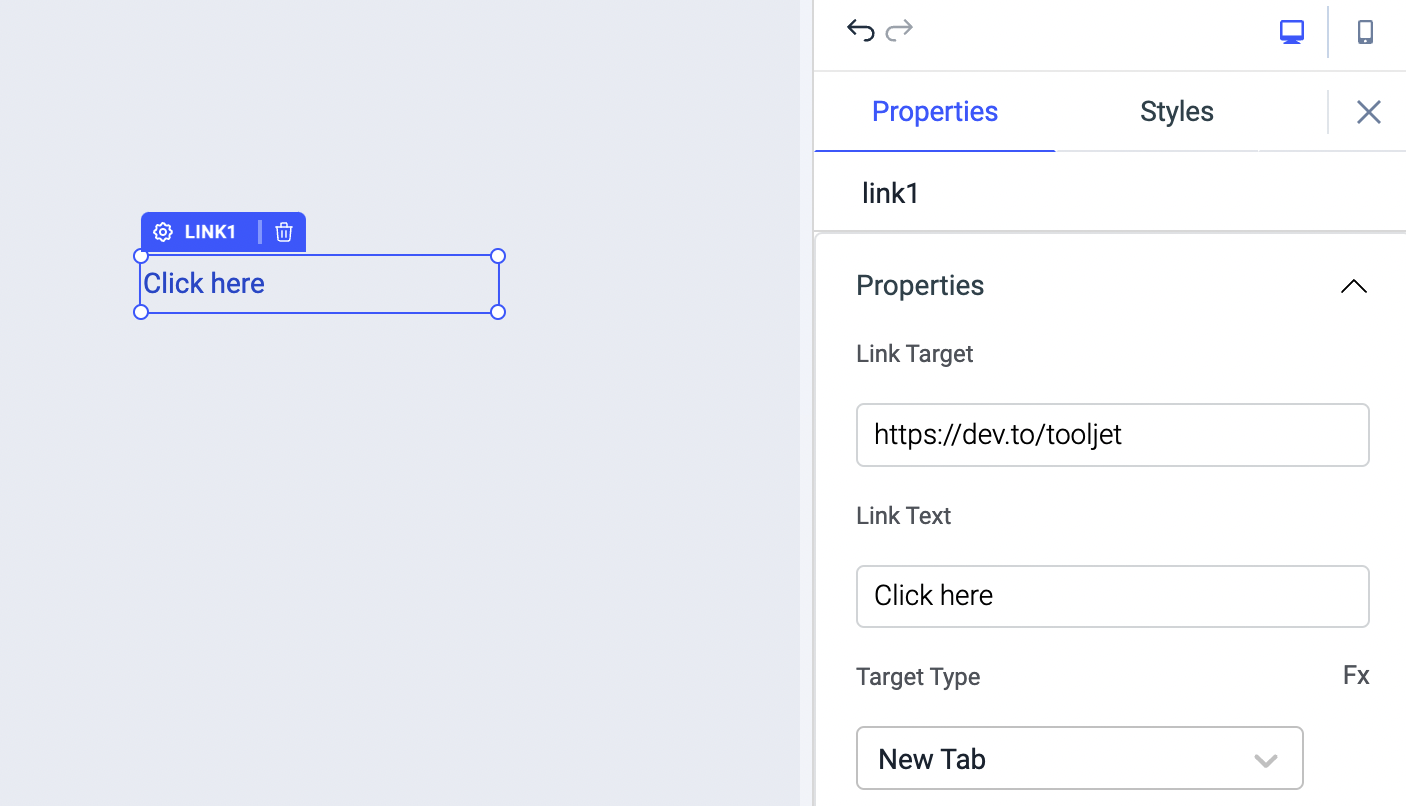
Properties
| Properties | description | Expected value |
|---|---|---|
| Link Target | This property sets the URL where the user needs to be taken on clicking the link | example: https://dev.to/tooljet or {{queries.xyz.data.url}} |
| Link Text | This property sets the text for the link widget | example: Click here or Open webpage |
| Target Type | This property specifies the link to be opened in the same tab or new tab on clickinh the link | Options: New Tab & Same Tab |
Events
To add an event to a link, click on the widget handle to open the widget properties on the right sidebar. Go to the Events section and click on Add handler.
On Click
On Click event is triggered when the link is clicked. Just like any other event on ToolJet, you can set multiple handlers for on click event.
On hover
On Hover event is triggered when the link is hovered. Just like any other event on ToolJet, you can set multiple handlers for on click event.
Check Action Reference docs to get the detailed information about all the Actions.
General
Tooltip
A Tooltip is often used to specify extra information about something when the user hovers the mouse pointer over the widget.
Under the General accordion, you can set the value in the string format. Now hovering over the widget will display the string as the tooltip.
Layout
| Layout | description | Expected value |
|---|---|---|
| Show on desktop | Toggle on or off to show/hide the widget on desktop view. | You can programmatically determine the value by clicking on Fx to set the value {{true}} or {{false}} |
| Show on mobile | Toggle on or off to show/hide the widget on mobile view. | You can programmatically determine the value by clicking on Fx to set the value {{true}} or {{false}} |
Styles
| Style | Description |
|---|---|
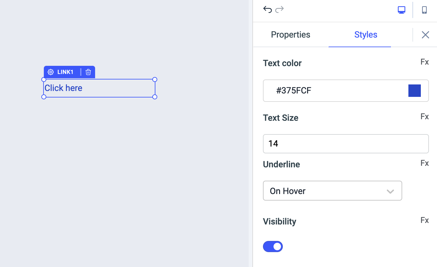
| Text Color | You can change the background color of the text by entering the Hex color code or choosing a color of your choice from the color picker. |
| Text Size | By default, the text size is set to 14. You can enter any value from 1-100 to set custom text size. |
| Underline | You can change the underline of the text in the following ways: on-hover (default), never, always |
| Visibility | Toggle on or off to control the visibility of the widget. You can programmatically change its value by clicking on the Fx button next to it. If {{false}} the widget will not visible after the app is deployed. By default, it's set to {{true}}. |
Any property having Fx button next to its field can be programmatically configured.