Statistics
Statistics can be used to display different statistical information.
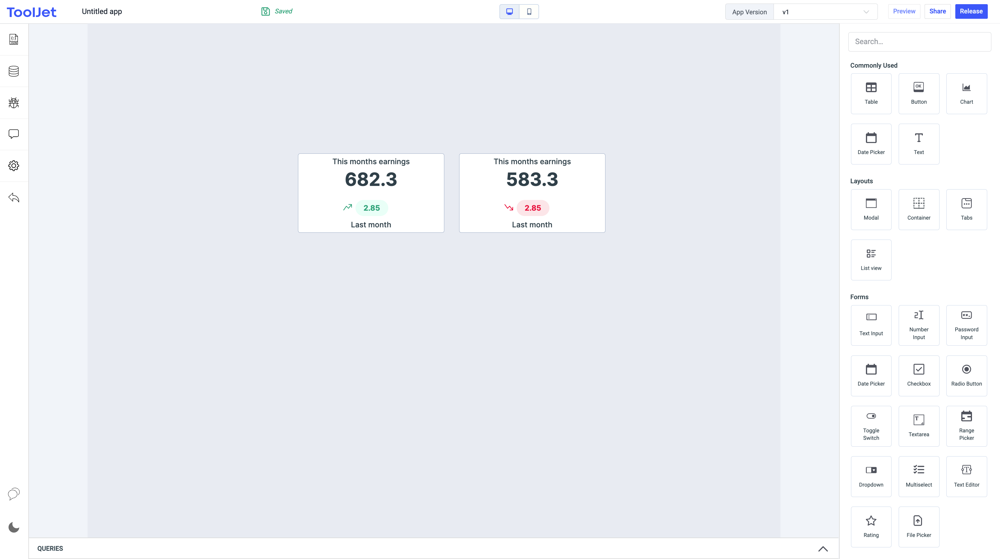
Properties
Primary value label
This property lets you add and remove primary value label.
Primary value
This property lets you add and remove primary value,the actual amount can be represented here.
Hide secondary value
This property lets you show/hide the secondary value from the statistics component. By default, this property is disabled. Toggle it on to hide the secondary value, you can also click on the Fx button next to it to dynamically set the value to {{true}} or {{false}}.
Secondary value label
This property lets you add and remove secondary value label.
Secondary value
This property lets you add and remove secondary value,the change in value can be represented here.
Secondary sign display
This property lets you add and secondary sign either positive or negative,can be used to represent positive(increase) or negative(decrease) movement.Default value is positive.
Loading state
Loading state can be used to show a spinner on the statistics. Loading state is commonly used with isLoading property of the queries to show a loading status while a query is being run. Switch the toggle On or click on fx to programmatically set the value {{true}} or {{false}}.
General
Tooltip
A Tooltip is often used to specify extra information about something when the user hovers the mouse pointer over the widget.
Under the General accordion, you can set the value in the string format. Now hovering over the widget will display the string as the tooltip.

Layout
Show on desktop
Toggle on or off to display the widget in desktop view. You can programmatically determine the value by clicking on Fx to set the value {{true}} or {{false}}.
Show on mobile
Toggle on or off to display the widget in mobile view. You can programmatically determine the value by clicking on Fx to set the value {{true}} or {{false}}.
Styles
Primary Label Colour
You can change the primary label color by entering the Hex color code or choosing a color of your choice from the color picker.
Primary Text Colour
You can change the primary text color of the primary label by entering the Hex color code or choosing a color of your choice from the color picker.
Secondary Label Colour
You can change the secondary label color of the primary label by entering the Hex color code or choosing a color of your choice from the color picker.
Secondary Text Colour
You can change the secondary text color of the primary label by entering the Hex color code or choosing a color of your choice from the color picker.
Visibility
Toggle on or off to control the visibility of the widget. You can programmatically change its value by clicking on the Fx button next to it. If {{false}} the widget will not be visible after the app is deployed. By default, it's set to {{true}}.
Any property having Fx button next to its field can be programmatically configured.