Styling Components
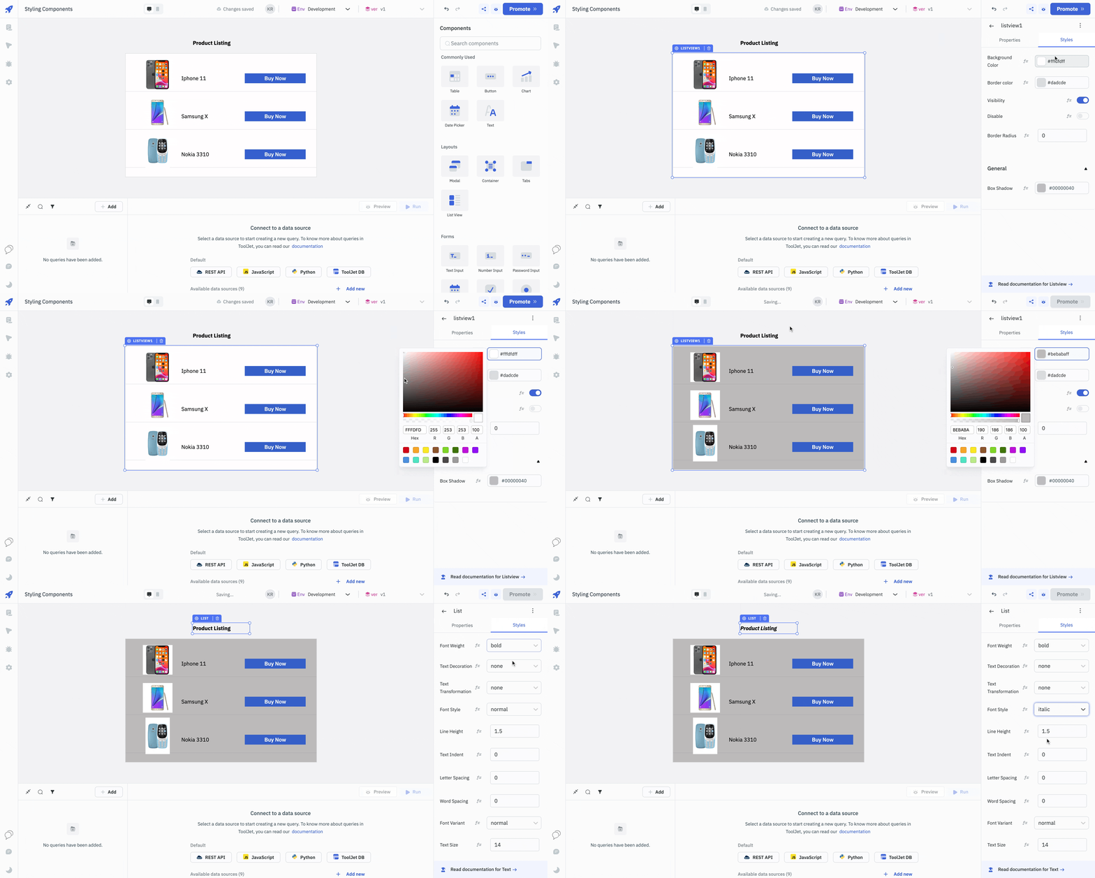
Styling components in ToolJet is a straightforward yet powerful way to enhance the visual appeal and usability of your application. Once you've dragged and dropped a component onto the canvas in the App-Builder, you can access its styling options through the properties panel on the right side. The Styles tab on the properties panel allows you to modify various visual properties such as colors, fonts, borders, and dimensions. You can also apply conditional styling based on data or user interactions, enabling you to create a more dynamic and responsive user interface.
Styling Options
The styling options in ToolJet are designed to be intuitive, eliminating the need for extensive CSS or design experience. You can easily change the background color of a button, adjust the font size of a text field, or add padding and margins to layout components. These styling changes are immediately reflected on the canvas, providing real-time feedback as you build your application.

Custom CSS
By injecting Custom CSS, users can easily override default styles, offering a straightforward and efficient approach to visual customization. To add Custom Styles, users can navigate to the Custom styles tab under Workspace Settings in the ToolJet dashboard. For instance, changing the default color of a button involves identifying the component's class and applying the desired CSS changes on the Custom Styles page. This approach ensures that all instances of the app reflect the new styling, like changing button colors, without the need to edit each button individually. This ensures consistent theming across the workspace.
Continue reading about Custom CSS here.