Custom Styles
The Custom Styles feature in ToolJet allows users to apply their own CSS, overriding the default app styles. This enables easy customization of app appearance, and maintains consistent themes across all ToolJet apps. By using standardized styles, users avoid the repetitive task of manually styling components for each new app, enhancing development efficiency and ensuring visual coherence for a seamless user experience
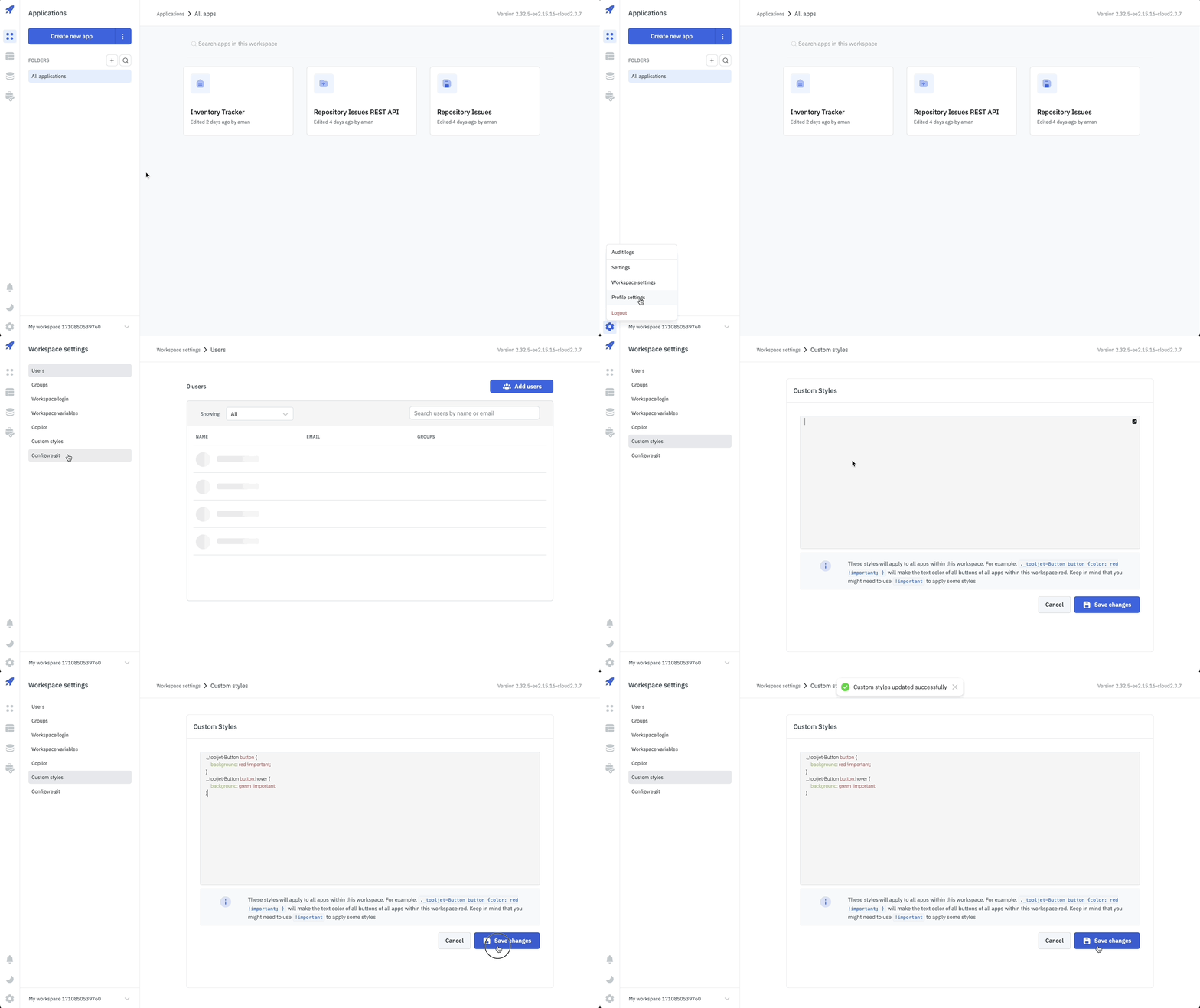
Applying Custom Styles To All Components
Follow these steps to apply custom styles in your ToolJet apps:
- Navigate to the Custom Styles page from Workspace Settings on the ToolJet dashboard
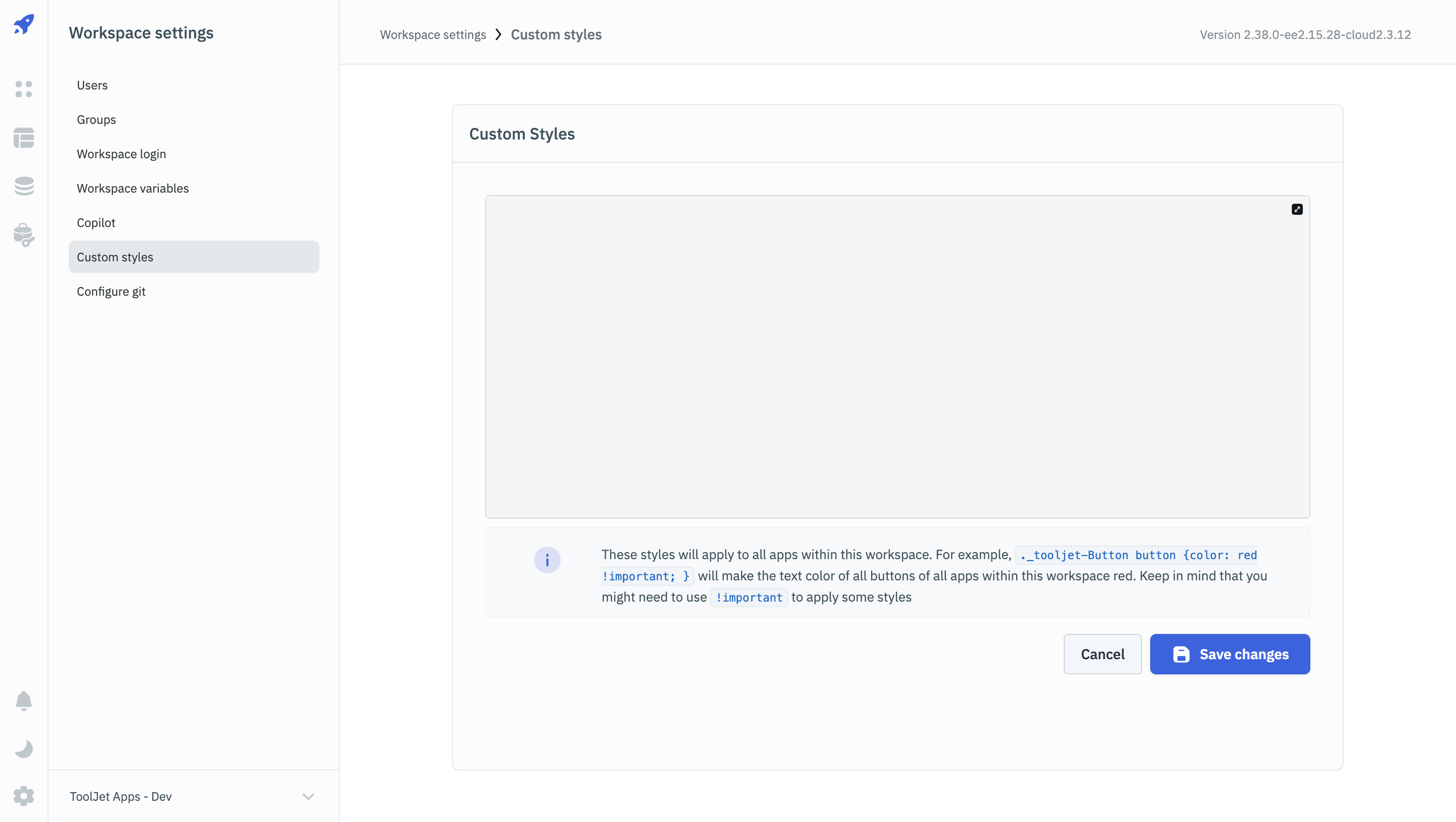
- To modify the default colors of components, use their class names, which follow the format
_tooljet-<component>.
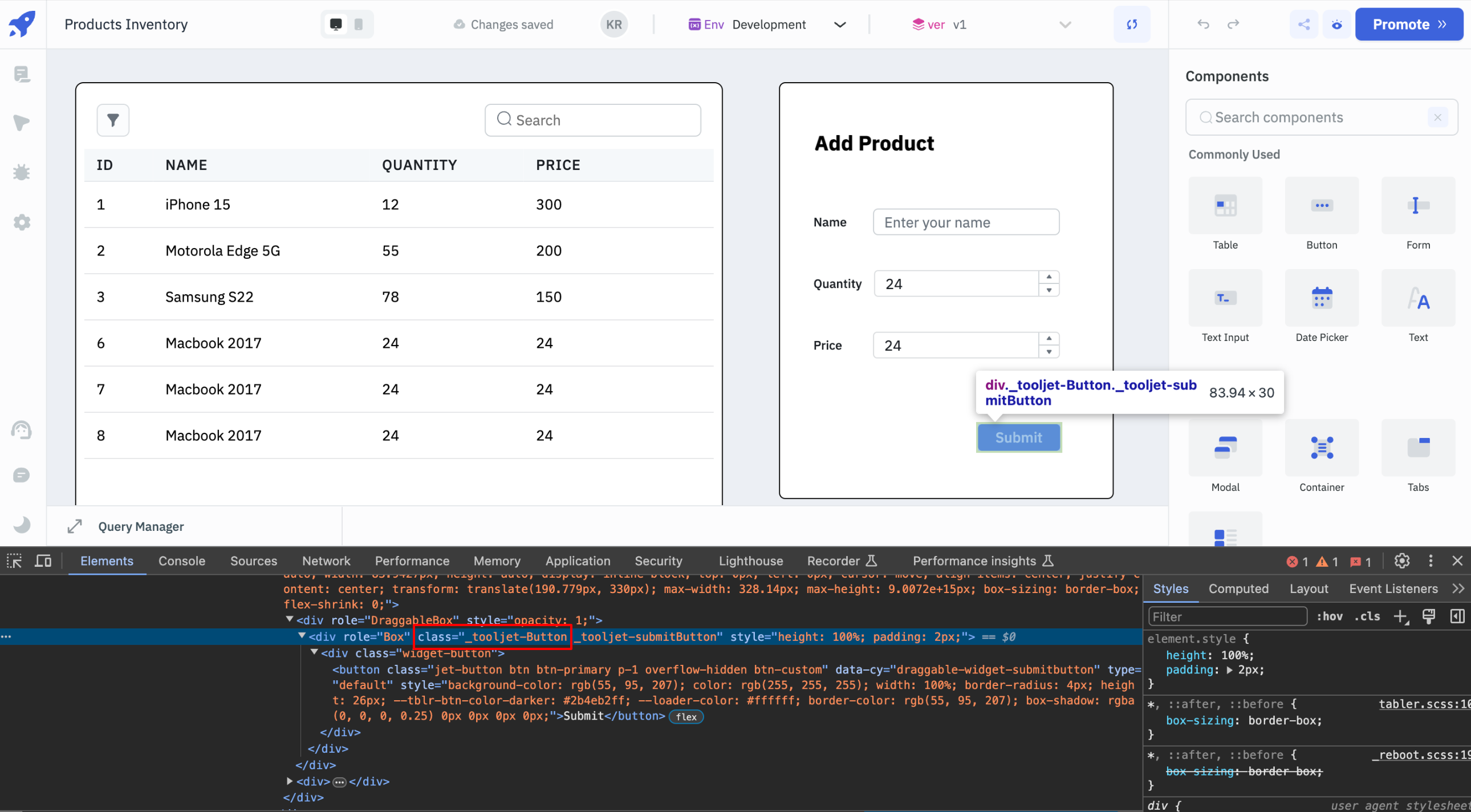
- You'll need to identify the specific sub-class(or HTML tags) of each component to target particular attributes. The browser's inspector will allow you to easily find the sub-class(or HTML tags) of the specific properties.
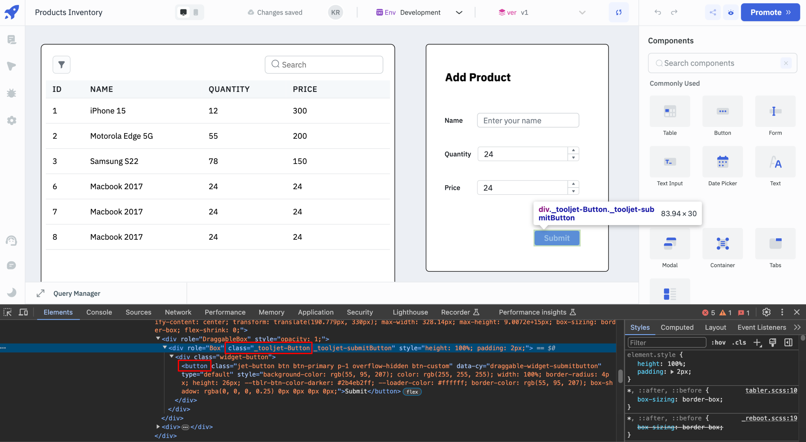
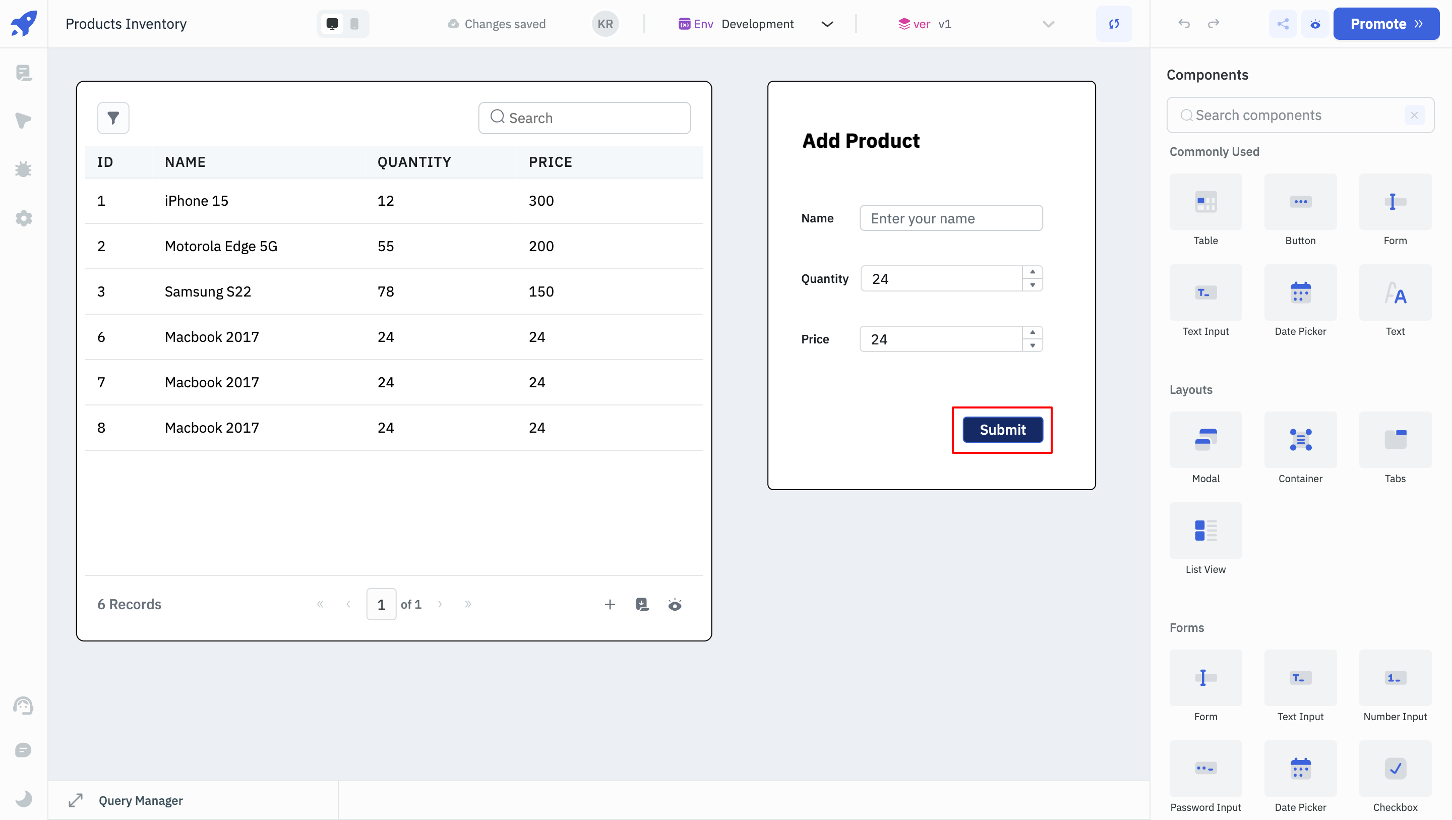
- After locating the specific sub-class(or HTML tag), refer it in the Custom Styles section and add styling to it. For instance, for the Button component above, the the below CSS will change the background color:
._tooljet-Button button {
    background-color: #152A65 !important;
}
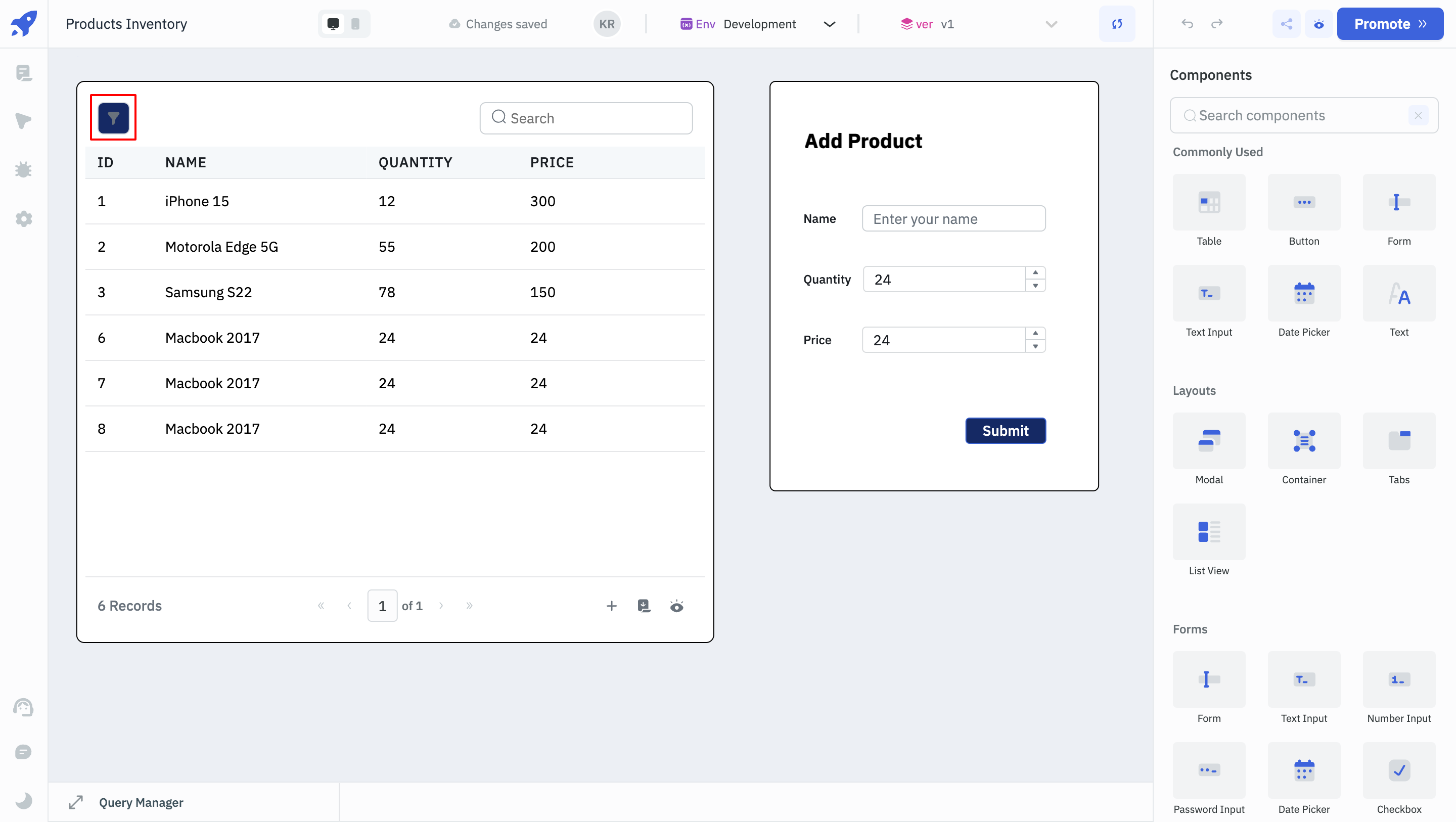
- Similarly, the code below can be used to change the background color of the Filter button on a Table component.
._tooljet-Table .table-card-header button {
    background-color: #152A65 !important;
}
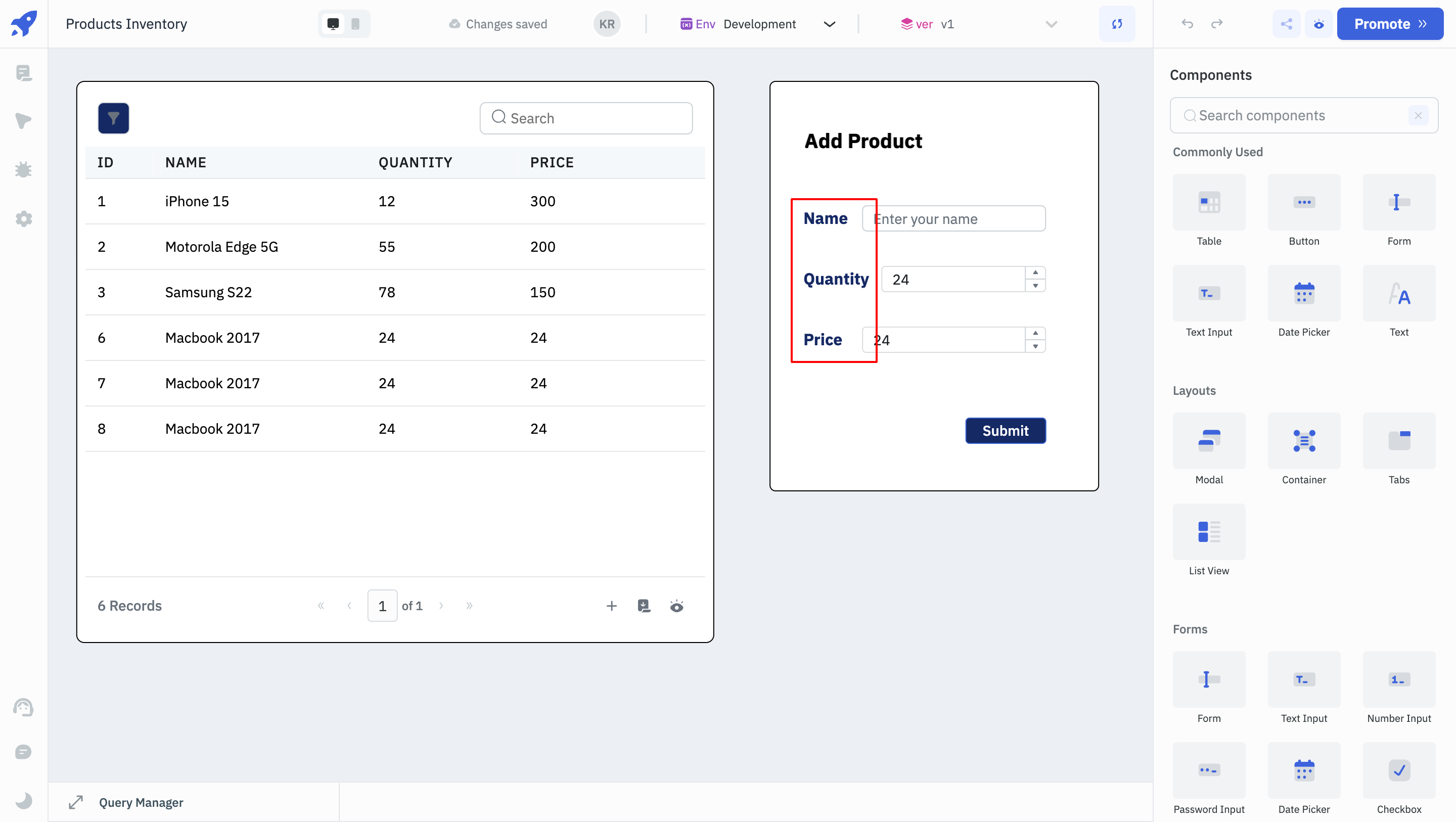
- The code below will change the font size and color of the Text Input and Number Input labels.
._tooljet-TextInput p  {
	color: #152A65 !important;
    font-size: 16px !important;
    font-weight: bold !important;
}

._tooljet-NumberInput p  {
	color: #152A65 !important;
    font-size: 16px !important;
    font-weight: bold !important;
}
Applying Custom Styles To Individual Components
To modify the colors of individual components, use their class names, which follow the format _tooljet-<component_name>. Here, the component name refers to the name of the component that is set in the application.
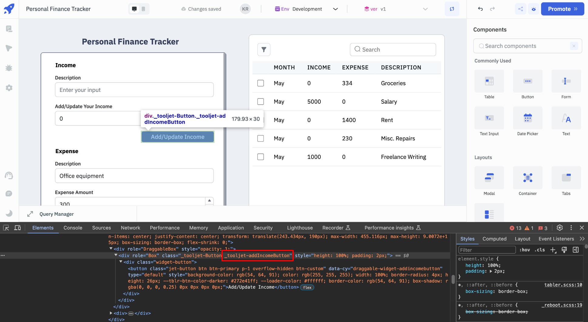
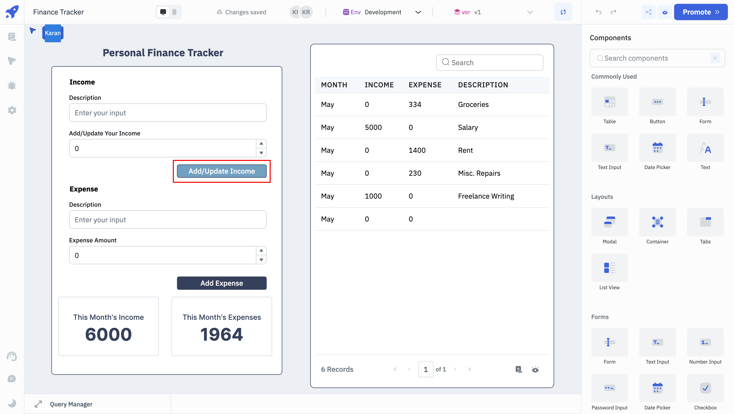
- The color of the Button component above can be changed using the code below:
._tooljet-addIncomeButton button {
    background-color: blue !important;
}
In conclusion, Custom CSS feature lets you override default styles with your own CSS. By providing the flexibility to apply both global and component-specific customizations, this feature enhances the visual coherence and branding of your apps. cs