Transforming Data for Charts
This guide explains how to transform data using RunJS and RunPy in ToolJet and visualize it using the chart component. The chart component in ToolJet enables the creation of various types of charts, with the option to integrate with Plotly for enhanced customization and advanced visualizations. While ToolJet provides the ability to connect to multiple databases, APIs, and data sources for integration, this guide will focus on using ToolJet DB to fetch the required data.
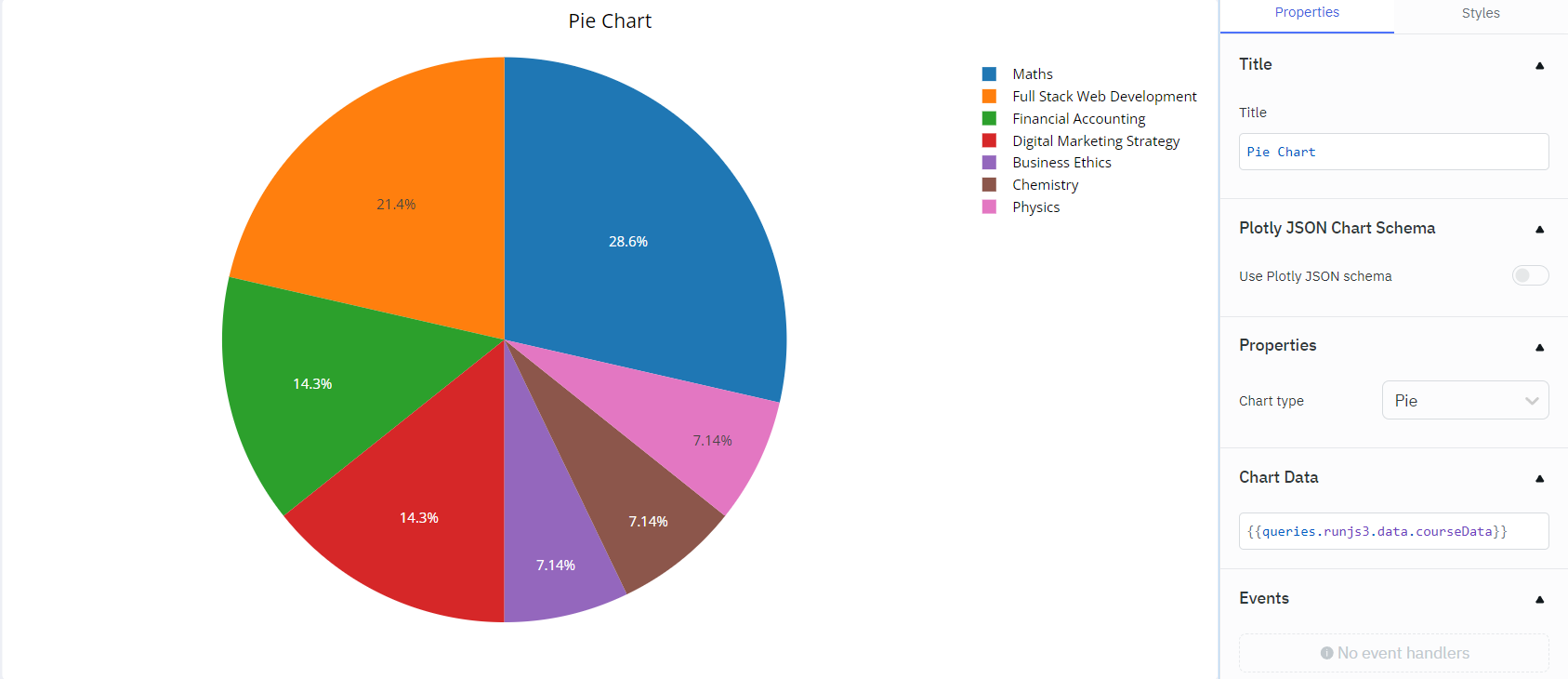
Plotting a Simple Pie Chart
To create a simple pie chart, the data has been stored in the table with the following structure in ToolJet DB:
id | course |
|---|---|
| 1 | Maths |
| 2 | Full Stack Web Development |
| 3 | Digital Marketing Strategy |
| 4 | Business Ethics |
| 5 | Maths |
| 6 | Full Stack Web Development |
| 7 | Digital Marketing Strategy |
| 8 | Financial Accounting |
| 9 | Maths |
| 10 | Chemistry |
| 11 | Financial Accounting |
| 12 | Physics |
| 13 | Full Stack Web Development |
| 14 | Maths |
Query to Fetch Data
- Click on + Add button of the query manager at the bottom panel of the editor.
- Select the ToolJet Database as the data source.
- Select your table from the dropdown.
- Select the List rows operation.
- Click on the Preview button to preview the output or Click on the Run button to trigger the query.
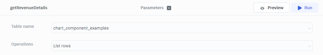
This query will fetch the data from the ToolJet DB.
Transform the Data
To restructure the data into a format compatible with the chart component, we will be using RunJS transformation.
Create a new RunJS Query and add the following code:
await queries.getRevenueDetails.run();

let data = queries.getRevenueDetails.getData();

const courseCounts = data.reduce((counts, obj) => {
  if (obj.course) {
    counts[obj.course] = (counts[obj.course] || 0) + 1;
  }
  return counts;
}, {});

const courseData = Object.keys(courseCounts).map(course => ({
     x: course,
     y: courseCounts[course]
}));

return {courseData};
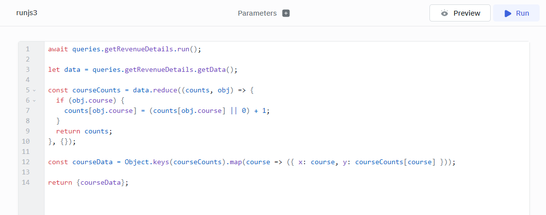
This query will calculate the number of each course and return an array of objects that can be utilized to plot the pie chart.
Plotting Pie Chart
- Add a chart component from the component library available on right to the canvas.
- Under Properties section select Pie as the chart type from the dropdown.
- Under chart data section input
{{queries.<Your RunJS Query Name>.data.courseData}}to input the data from the query.
Plotting a Line Chart with RunJS Transformation
To create the line chart, the data has been stored in the table with the following structure in ToolJet DB:
id | x | y | region | rdate |
|---|---|---|---|---|
| 1 | Social Media Engagement | 15 | North America | 15-01-2024 |
| 2 | Email Marketing | 10 | Europe | 10-02-2024 |
| 3 | SEO Optimization | 20 | Asia | 05-03-2024 |
| 4 | Content Creation | 25 | North America | 20-04-2024 |
| 5 | Paid Advertising | 30 | Europe | 12-05-2024 |
| 6 | Analytics and Reporting | 18 | Asia | 18-06-2024 |
| 7 | Influencer Marketing | 12 | North America | 30-07-2024 |
| 8 | Market Research | 22 | Europe | 25-08-2024 |
| 9 | Web Development | 17 | Asia | 15-09-2024 |
| 10 | Customer Relationship Management | 28 | North America | 02-10-2024 |
Query to Fetch Data
- Click on + Add button of the query manager at the bottom panel of the editor.
- Select the ToolJet Database as the data source.
- Select your table from the dropdown.
- Select the List rows operation.
- Click on the Preview button to preview the output or Click on the Run button to trigger the query.
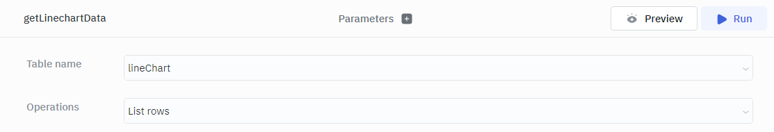
This query will fetch the data from the ToolJet DB.
Transform the Data
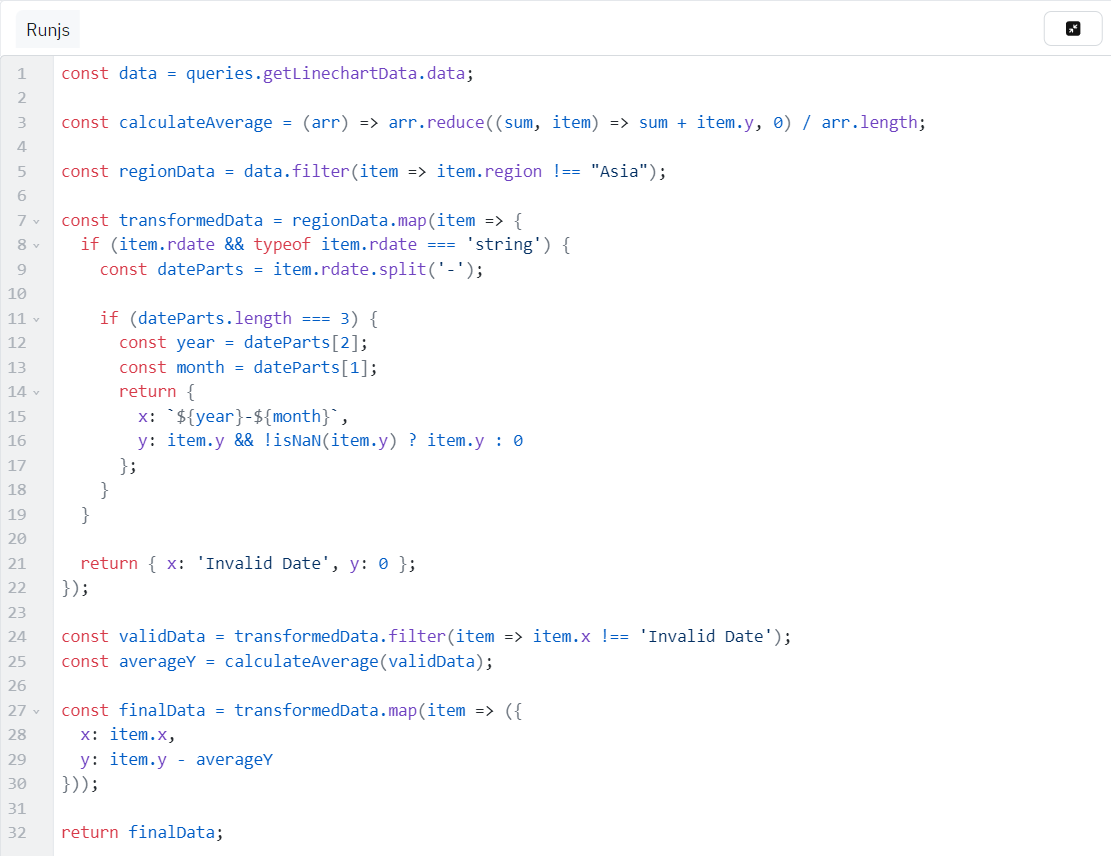
Create a new RunJS Query and add the following code:
const data = queries.getLinechartData.data;

const calculateAverage = (arr) => arr.reduce((sum, item) => sum + item.y, 0) / arr.length;

const regionData = data.filter(item => item.region !== "Asia");

const transformedData = regionData.map(item => {
  if (item.rdate && typeof item.rdate === 'string') {
    const dateParts = item.rdate.split('-');

    if (dateParts.length === 3) {
      const year = dateParts[2];
      const month = dateParts[1];
      return {
        x: `${year}-${month}`,
        y: item.y && !isNaN(item.y) ? item.y : 0
      };
    }
  }

  return { x: 'Invalid Date', y: 0 };
});

const validData = transformedData.filter(item => item.x !== 'Invalid Date');
const averageY = calculateAverage(validData);

const finalData = transformedData.map(item => ({
  x: item.x,
  y: item.y - averageY
}));

return finalData;
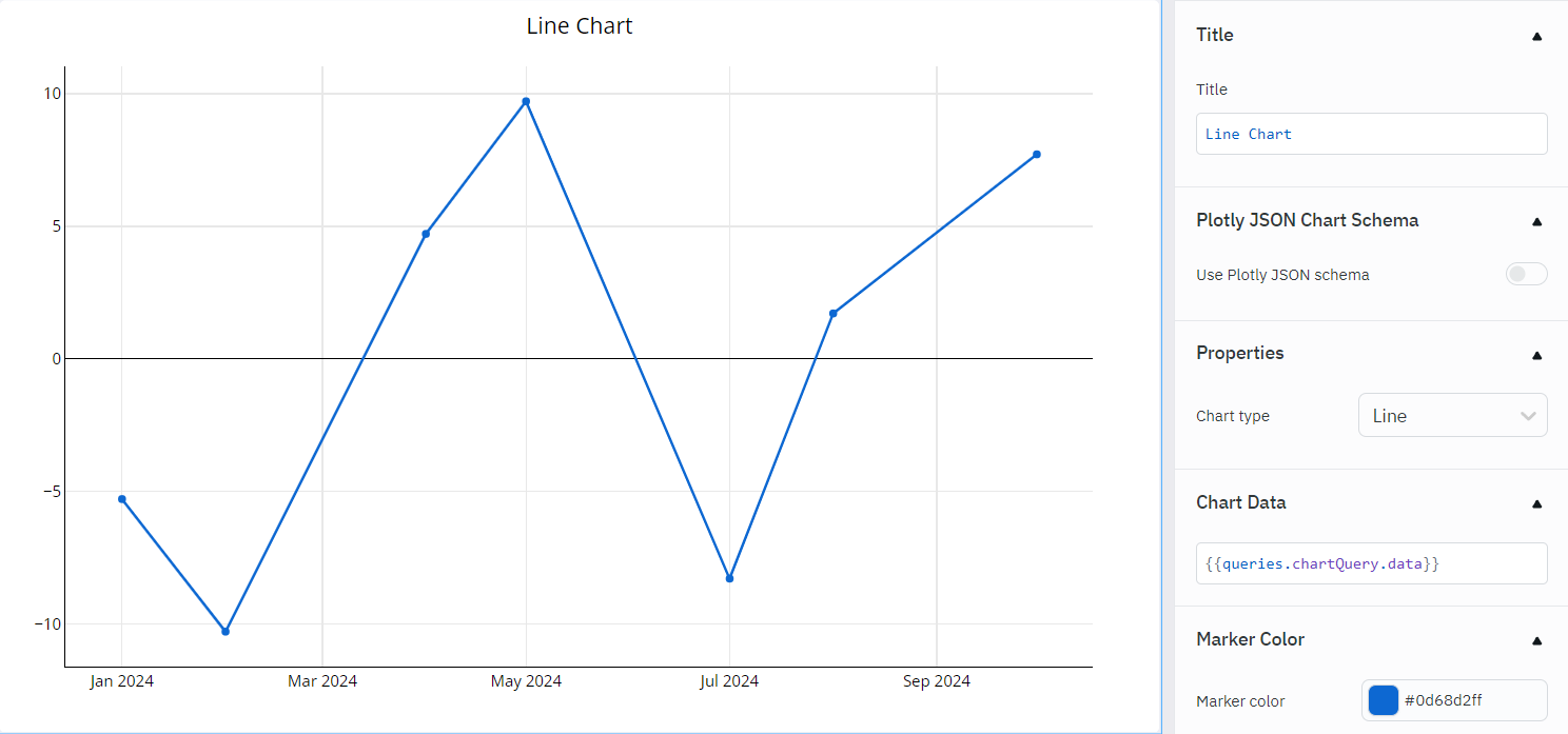
Plotting Line Chart
- Add a chart component from the component library available on right to the canvas.
- Under Properties section select Line as the chart type from the dropdown.
- Under chart data section input
{{queries.<Your RunJS Query Name>.data}}to input the data from the query.
Plotting Candle Stick Chart Using Plotly
To create a candlestick chart, the data has been stored in the table with the following structure in ToolJet DB:
id | sdate | open | high | low | sclose |
|---|---|---|---|---|---|
| 1 | 2024-04-02 | 115 | 125 | 115 | 120 |
| 2 | 2024-04-03 | 120 | 130 | 120 | 125 |
| 3 | 2024-04-04 | 125 | 135 | 125 | 130 |
Query to Fetch Data
- Click on + Add button of the query manager at the bottom panel of the editor.
- Select the ToolJet Database as the data source.
- Select your table from the dropdown.
- Select the List rows operation.
- Click on the Preview button to preview the output or Click on the Run button to trigger the query.
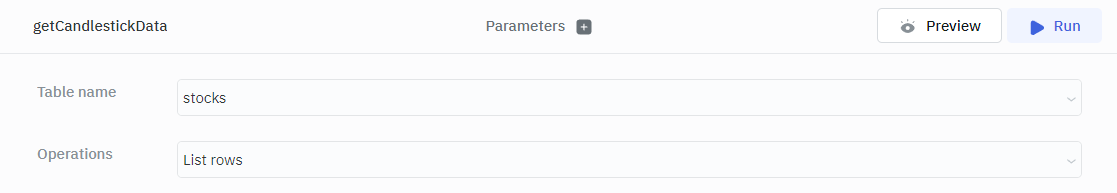
This query will fetch the data from the ToolJet DB.
Transform the Data
To restructure the data into a format compatible with the chart component, we will be using RunJS transformation.
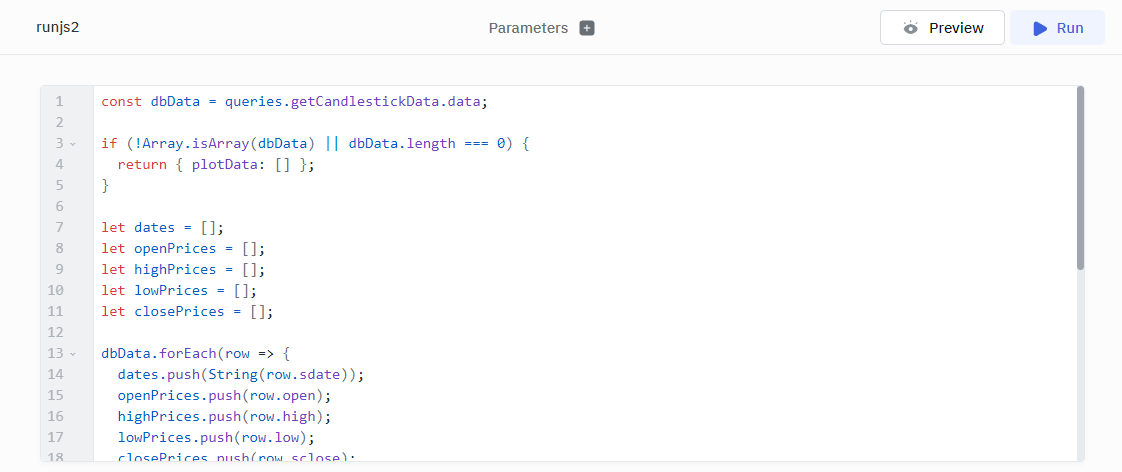
Create a new RunJS Query and add the following code:
const dbData = queries.getCandlestickData.data;

if (!Array.isArray(dbData) || dbData.length === 0) {
  return { plotData: [] };
}

let dates = [];
let openPrices = [];
let highPrices = [];
let lowPrices = [];
let closePrices = [];

dbData.forEach(row => {
  dates.push(String(row.sdate));
  openPrices.push(row.open);
  highPrices.push(row.high);
  lowPrices.push(row.low);
  closePrices.push(row.sclose);
});

const transformedData = [
  {
    x: dates,
    open: openPrices,
    high: highPrices,
    low: lowPrices,
    close: closePrices,
    type: 'candlestick'
  }
];

let result = {
  data: transformedData
};

return JSON.stringify(result)
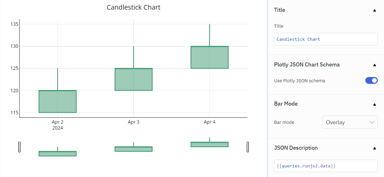
Plotting Candlestick Chart
- Add a chart component from the component library available on right to the canvas.
- Enable use plotly JSON schema under Plotly JSON Chart Schema section.
- Under JSON Description section input
{{queries.<Your RunJS Query Name>.data}}to input the data from the query.
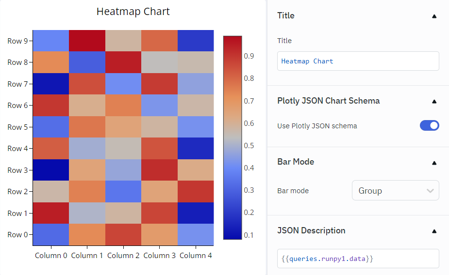
Plotting heatmap Chart Using Plotly
To create a heatmap chart, the data has been stored in the table with the following structure in ToolJet DB:
id | x | y | value |
|---|---|---|---|
| 1 | 0 | 0 | 0.32 |
| 2 | 0 | 1 | 0.95 |
| 3 | 0 | 2 | 0.57 |
| 4 | 0 | 3 | 0.08 |
| 5 | 0 | 4 | 0.82 |
| 6 | 0 | 5 | 0.33 |
| 7 | 0 | 6 | 0.9 |
| 8 | 0 | 7 | 0.11 |
| 9 | 0 | 8 | 0.73 |
| 10 | 0 | 9 | 0.39 |
Query to Fetch Data
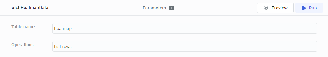
- Click on + Add button of the query manager at the bottom panel of the editor.
- Select the ToolJet Database as the data source.
- Select your table from the dropdown.
- Select the List rows operation.
- Click on the Preview button to preview the output or Click on the Run button to trigger the query.
This query will fetch the data from the ToolJet DB.
Transform the Data
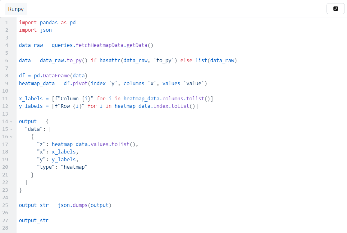
To restructure the data into a format compatible with the chart component, we will be using RunPy transformation.
Create a new RunPy Query and add the following code:
import pandas as pd
import json

data_raw = queries.fetchHeatmapData.getData()

data = data_raw.to_py() if hasattr(data_raw, 'to_py') else list(data_raw)

df = pd.DataFrame(data)
heatmap_data = df.pivot(index='y', columns='x', values='value')

x_labels = [f"Column {i}" for i in heatmap_data.columns.tolist()]
y_labels = [f"Row {i}" for i in heatmap_data.index.tolist()]

output = {
  "data": [
    {
      "z": heatmap_data.values.tolist(),
      "x": x_labels,
      "y": y_labels,
      "type": "heatmap"
    }
  ]
}

output_str = json.dumps(output)

output_str
Plotting Heatmap Chart
- Add a chart component from the component library available on right to the canvas.
- Enable use plotly JSON schema under Plotly JSON Chart Schema section.
- Under JSON Description section input
{{queries.<Your RunJS Query Name>.data}}to input the data from the query.