Kanban
Kanban widget allows you to visually organize and prioritize your tasks with a transparent workflow. You can set the number of columns to display, enable/disable the add cards button, and bind data to the cards.
Events
To add an event, click on the widget handle to open the widget properties on the right sidebar. Go to the Events section and click on Add handler.
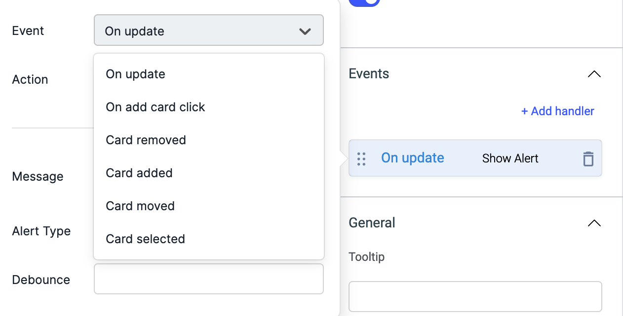
Just like any other event on ToolJet, you can set multiple handlers for any of the above mentioned events.
Check Action Reference docs to get the detailed information about all the Actions.
Check the Component Specific Action available for Kanban.
On Update
On update event is triggered whenever the card data (id, title, description, or columnID) is updated using the component specific actions.
On add card click
This event is triggered whenever the Add card button on the kanban is clicked.
Card removed
This event is triggered whenever the card is deleted from the kanban by dragging it into the bottom delete box or using component specific action.
Card added
This event is triggered whenever a card is added on the kanban using the component specific action.
Card moved
This event is triggered whenever the card's position is changed on the kanban or using the component specific action.
Card selected
This event is triggered whenever a card is clicked to open the modal.
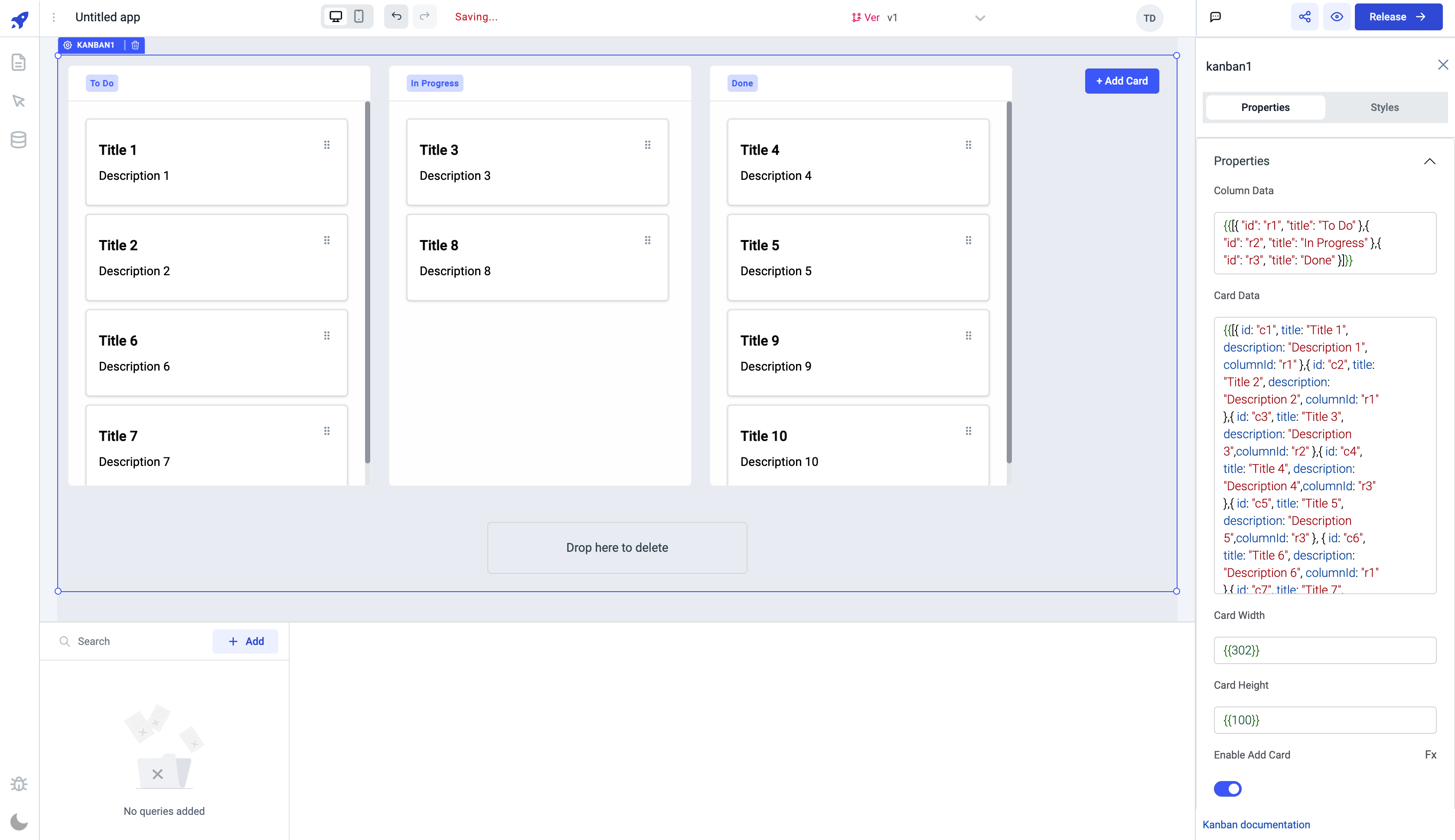
Properties

- It is mandatory to provide
idfor each column in thecolumn datafield. Theidcan be of typestringornumber. - It is mandatory to provide
id, andcolumnIdfor each card in theCard datafield. TheidandcolumnIdcan be of typestringornumber.
| Properties | description | Expected value |
|---|---|---|
| Column Data | Enter the columns data - id and title in the form of array of objects or from a query that returns an array of objects. | {{[{ "id": "c1", "title": "to do" },{ "id": "c2", "title": "in progress" },{ "id": "c3", "title": "Completed" }]}} or {{queries.xyz.data}} |
| Card Data | Enter the cards data - id, title and columnId in the form of array of objects or from a query that returns an array of objects. | {{[{ id: "r1", title: "Title 1", description: "Description 1", columnId: "c1" },{ id: "r2", title: "Title 2", description: "Description 2", columnId: "c2" },{ id: "r3", title: "Title 3", description: "Description 3",columnId: "c3" }]}} or {{queries.abc.data}} |
| Card Width | Set the width of the card | This property expects a numerical value. By default, the value is set to {{302}} |
| Card Height | Set the width of the card | This property expects a numerical value. By default, the value is set to {{100}} |
| Enable Add Card | This property allows you to show or hide the +Add Cards button on the Kanban. | By default its enabled, you can programmatically set value to {{true}} or {{false}} to enable/disable button by clicking on the Fx next to it |
| Show Delete button | This property allows you to show or hide the Drop here to delete cards section at the bottom of the kanban. | By default its enabled, you can programmatically set value to {{true}} or {{false}} to enable/disable button by clicking on the Fx next to it |
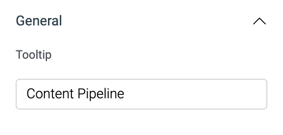
General
Tooltip
A Tooltip is often used to specify extra information about something when the user hovers the mouse pointer over the widget.
Under the General accordion, you can set the value in the string format. Now hovering over the widget will display the string as the tooltip.
Layout
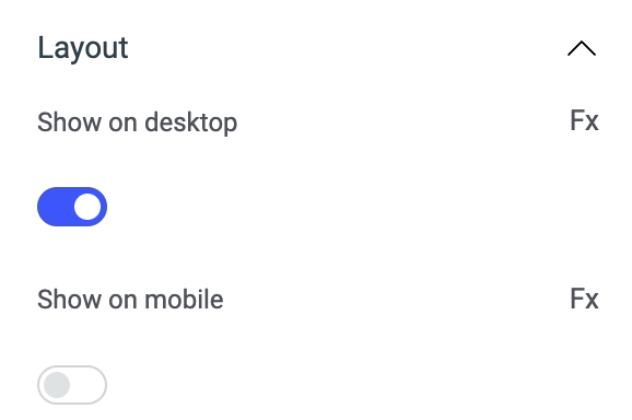
| Layout | description | Expected value |
|---|---|---|
| Show on desktop | Toggle on or off to display the widget in desktop view. | You can programmatically set the value by clicking on Fx to set the value {{true}} or {{false}} |
| Show on mobile | Toggle on or off to display the widget in mobile view. | You can programmatically set the value by clicking on Fx to set the value {{true}} or {{false}} |
Styles

| Style | Description |
|---|---|
| Disable | If disabled or set to {{false}} the widget will be locked and becomes non-functional. By default, its disabled i.e. its value is set to {{true}} . |
| Visibility | This is to control the visibility of the widget. If {{false}}/disabled the widget will not visible after the app is deployed. By default, it's enabled (set to {{true}}). |
| Accent color | You can change the accent color of the column title by entering the Hex color code or choosing a color of your choice from the color picker. |
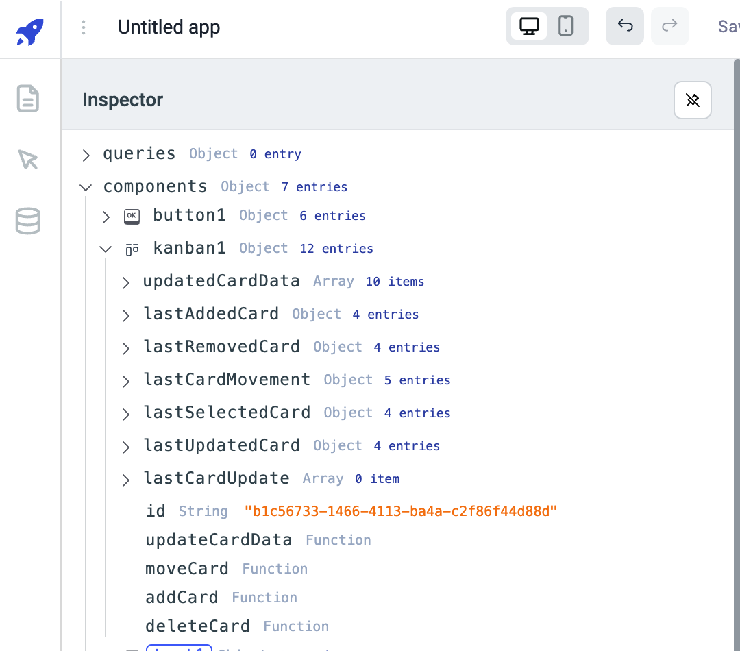
Exposed variables
| Variable | Description |
|---|---|
| updatedCardData | The updatedCardData variable will hold the latest values of all the cards in the kanban. This variable won't have any values initially, it will have values only when any action on any of the card is performed like when the card is moved, added, deleted, or updated. |
| lastAddedCard | The variable lastAddedCard holds the values of the the last added card. It holds the following data - id, title, description and columnId of the last added card. You can get the values using {{components.kanban1.lastAddedCard.title}} |
| lastRemovedCard | The variable lastRemovedCard holds the properties of the card that has been recently deleted from the kanban. It holds the following data - id, title, description and columnId of the recently deleted card. You can get the values using {{components.kanbanboard1.lastRemovedCard.title}} |
| lastCardMovement | The variable lastCardMovement holds the properties of the card that has been recently moved from its original position. It holds the following data - originColumnId, destinationColumnId, originCardIndex, destinationCardIndex and an object cardDetails which includes id, title, description and columnId of the moved card. You can get the values using {{components.kanbanboard1.lastCardMovement.cardDetails.title}} or {{components.kanbanboard1.lastCardMovement.destinationCardIndex}} |
| lastSelectedCard | The variable lastSelectedCard holds the id, title, columnId, and description of the last selected(clicked to view) card on the kanban. You can get the values using {{components.kanban1.lastSelectedCard.columnId}} |
| lastUpdatedCard | The variable lastUpdatedCard holds the id, title, description, and columnId of the last updated card(using componenet specific action). You can get the values using {{components.kanban1.lastUpdatedCard.columnId}} |
| lastCardUpdate | The variable lastCardUpdate holds the old an new values of the property that has been changed in the card(using componenet specific action). You can get the values using {{components.kanban1.lastCardUpdate[0].title.oldValue}} |
Component specific actions (CSA)
Following actions of kanban component can be controlled using the component specific actions(CSA):
| Actions | Description |
|---|---|
| updateCardData | Update the card data of kanban component via a component-specific action within any event handler. Additionally, you have the option to employ a RunJS query to execute component-specific actions such as components.kanban1.updateCardData('c1', {title: 'New Title'}) |
| moveCard | Move a card from one column to other column on the kanban via a component-specific action within any event handler. Additionally, you have the option to employ a RunJS query to execute component-specific actions such as await components.kanban1.moveCard('card id,'column id') ex: await components.kanban1.moveCard('c1','r2') |
| addCard | Add a card onto the kanban via a component-specific action within any event handler. Additionally, you have the option to employ a RunJS query to execute component-specific actions such as await components.kanban1.addCard('c1', {title: 'New Title'}) |
| deleteCard | Delete a card from the kanban via a component-specific action within any event handler. Additionally, you have the option to employ a RunJS query to execute component-specific actions such as await components.kanban1.deleteCard('card id') ex: await components.kanban1.deleteCard('c2') |