Icon
An Icon widget can be used to add icons(sourced from icon library). It supports events like on hover and on click.
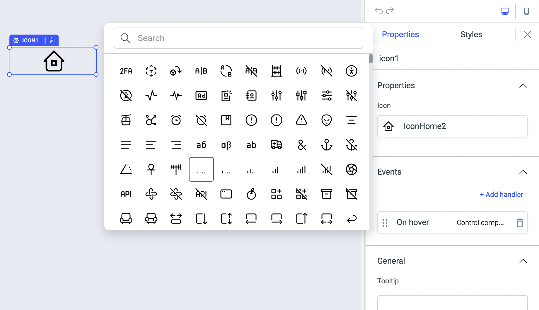
Properties
| Properties | description | Expected value |
|---|---|---|
| Icon | Use this to choose an icon form the list of available icons | You can also use the search bar in it to look for the icons |
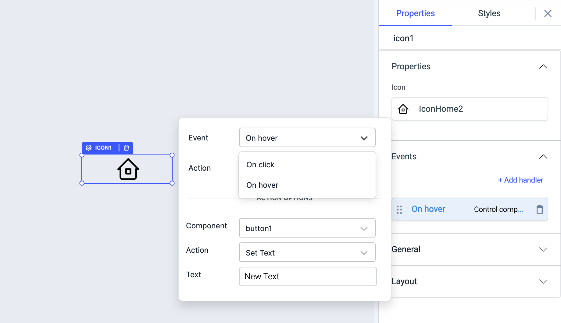
Events
To add an event, click on the icon widget's configuration handle to open the widget properties on the components drawer on the right. Go to the Events section and click on + Add handler.
The Icon widget supports the following events:
| Event | Description |
|---|---|
| On hover | This event is triggered when the cursor is hovered over the icon |
| On click | This event is triggered when the icon is clicked |
Just like any other event on ToolJet, you can set multiple handlers for any of the above-mentioned events.
Check Action Reference docs to get the detailed information about all the Actions.
General
Tooltip: Set a tooltip text to specify the information when the user moves the mouse pointer over the widget.
Layout
| Layout | description | Expected value |
|---|---|---|
| Show on desktop | Toggle on or off to show/hide the widget on desktop screens. | You can programmatically determine the value by clicking on Fx to set the value {{true}} or {{false}} |
| Show on mobile | Toggle on or off to show/hide the widget on mobile screens. | You can programmatically determine the value by clicking on Fx to set the value {{true}} or {{false}} |
Styles
| Style | Description | Expected value |
|---|---|---|
| Icon color | You can change the color of the icon widget by entering the Hex color code or choosing a color of your choice from the color picker. | |
| Visibility | This is to control the visibility of the widget. | If {{false}} the widget will not visible after the app is deployed. |
| Box shadow | This property adds a shadow to the widget. | You can use different values for box shadow property like offsets, blur, spread, and the color code. |
Any property having Fx button next to its field can be programmatically configured.
Exposed variables
There are currently no exposed variables for the component.
Component specific actions (CSA)
Following actions of the component can be controlled using the component specific actions(CSA):
| Actions | Description |
|---|---|
| setVisibility | You can toggle the visibility of the icon component via a component-specific action within any event handler. Additionally, you have the option to employ a RunJS query to execute component-specific actions such as await components.icon1.setVisibility(false) |
| click | You can trigger the click action on icon component via a component-specific action within any event handler. Additionally, you have the option to employ a RunJS query to execute component-specific actions such as await components.icon1.click() |