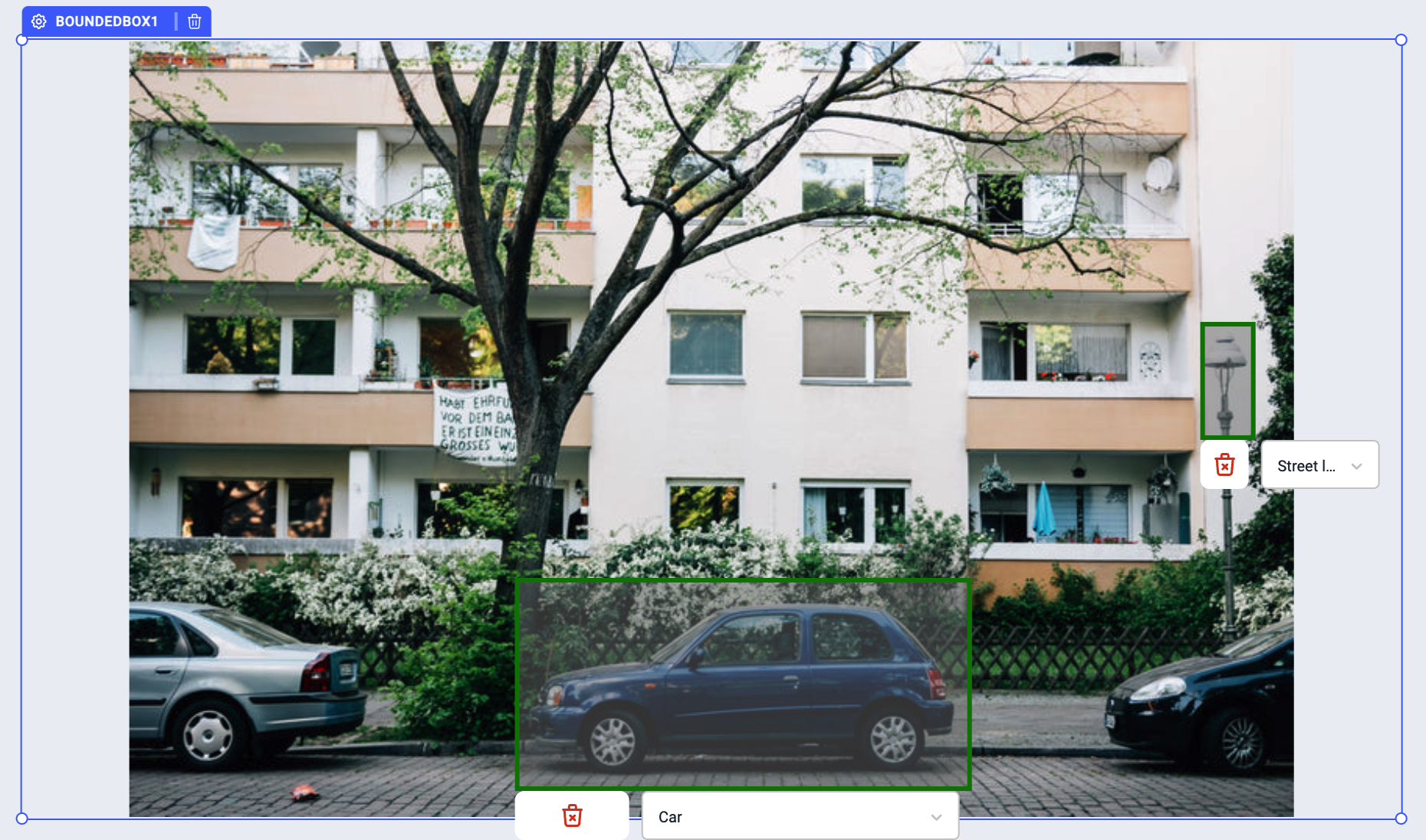
Bounded box
A bounded box is an infinitely customizable image annotation component that can be used to select and tag areas of an image. It supports selection using specific points (landmarking) or draw rectangular areas (bounding boxes).
Properties
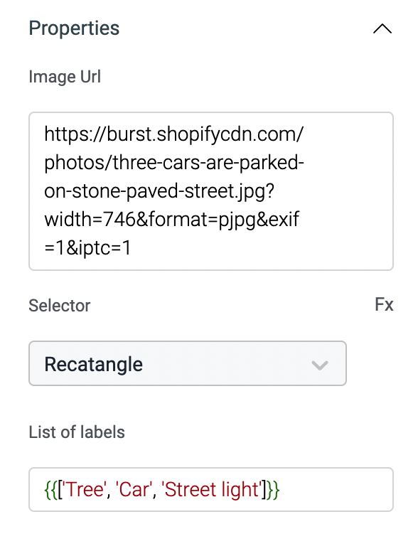
Image URL
The bounding box required an image to display, enter the URL of the image to display it on the component.
Selector
The bounded box support selection using:
- Rectangle
- Point
You can also click on the Fx to set the value programmatically.
List of labels
This property will include the list of label that will be displayed in the dropdown while selection in the bounded-box. This property requires the label in array format.
Events
To add an event to a bounded-box, click on the component handle to open its properties on the right. Go to the Events accordion and click on Add handler.
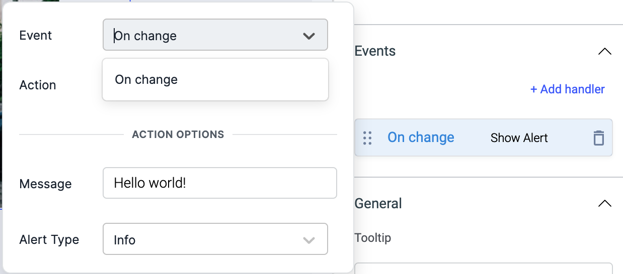
On change
On change event is triggered when the label from the dropdown in the selector is changed in the bounded box. Just like any other event on ToolJet, you can set multiple handlers for on-change event.
Check Action Reference docs to get the detailed information about all the Actions.
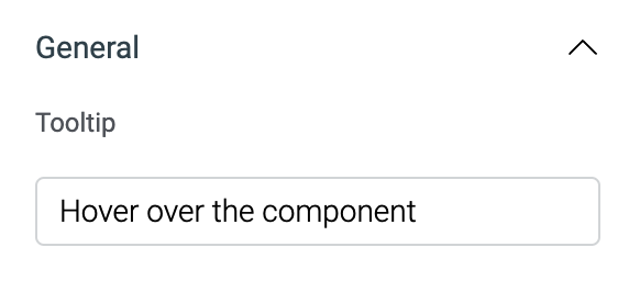
General
Tooltip
A Tooltip is often used to specify extra information about something when the user hovers the mouse pointer over the widget.
Under the General accordion, you can set the value in the string format. Hovering over the component will display the string as the tooltip.
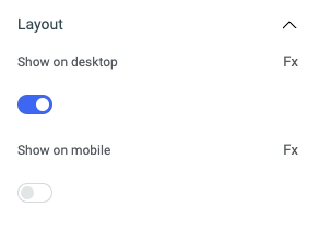
Layout
| Layout | description | Expected value |
|---|---|---|
| Show on desktop | Toggle on or off to display desktop view. | You can programmatically determine the value by clicking on Fx to set the value {{true}} or {{false}} |
| Show on mobile | Toggle on or off to display mobile view. | You can programmatically determine the value by clicking on Fx to set the value {{true}} or {{false}} |
Styles
| Style | Description |
|---|---|
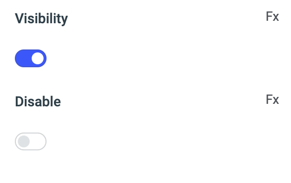
| Visibility | Toggle on or off to control the visibility of the component. You can programmatically change its value by clicking on the Fx button next to it. If {{false}} the component will not be visible when the app is loaded. By default, it's set to {{true}}. |
| Disable | Toggle on to disable the widget. You can programmatically change its value by clicking on the Fx button next to it, if set to {{true}}, the component will be disabled and becomes non-functional. By default, its value is set to {{false}}. |
Any property having Fx button next to its field can be programmatically configured.
Exposed variables
| variable | Description |
|---|---|
| annotations | This variable is an array of objects, where each object represents an annotation added to an image. The object contains the following keys: type, x, y, width, height, text, and id |
annotations.type | There are two types of annotations: Rectangle and Point |
annotations.x | coordinates on x axis |
annotations.y | coordinates on y axis |
annotations.width | width of annotation |
annotations.height | height of annotation |
annotations.text | label selected for the annotation |
annotations.id | unique id of the annotation (system generated) |
The values can be accessed dynamically using {{components.boundedbox1.annotations[0].text}} or {{components.boundedbox1.annotations[1].width}}
Component specific actions (CSA)
There are currently no CSA (Component-Specific Actions) implemented to regulate or control the bounding box component.