Styling Components
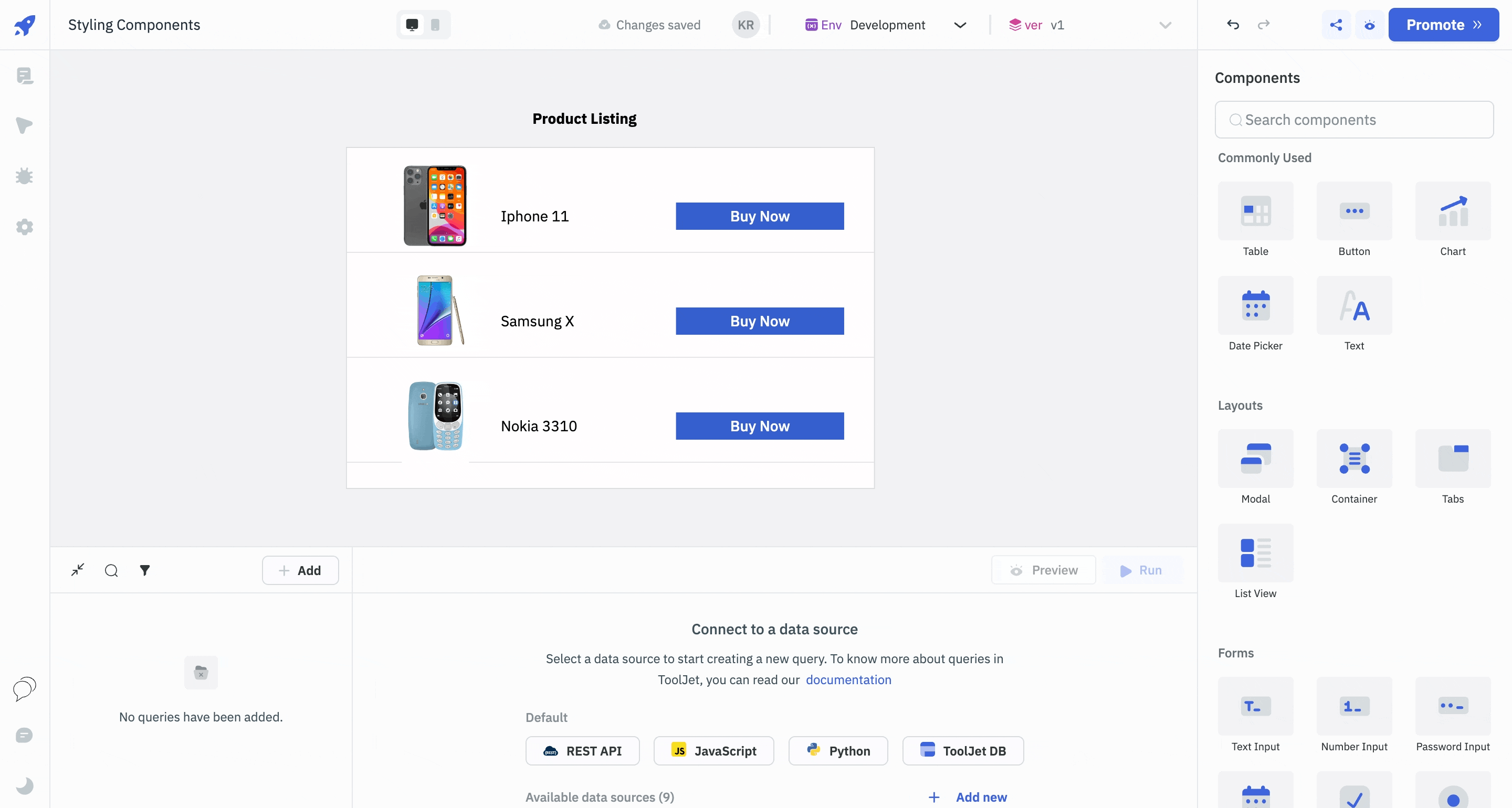
Styling components in ToolJet is a straightforward yet powerful way to enhance the visual appeal and usability of your application. Once you've dragged and dropped a component onto the canvas in the App-Builder, you can access its styling options through the properties panel on the right side.
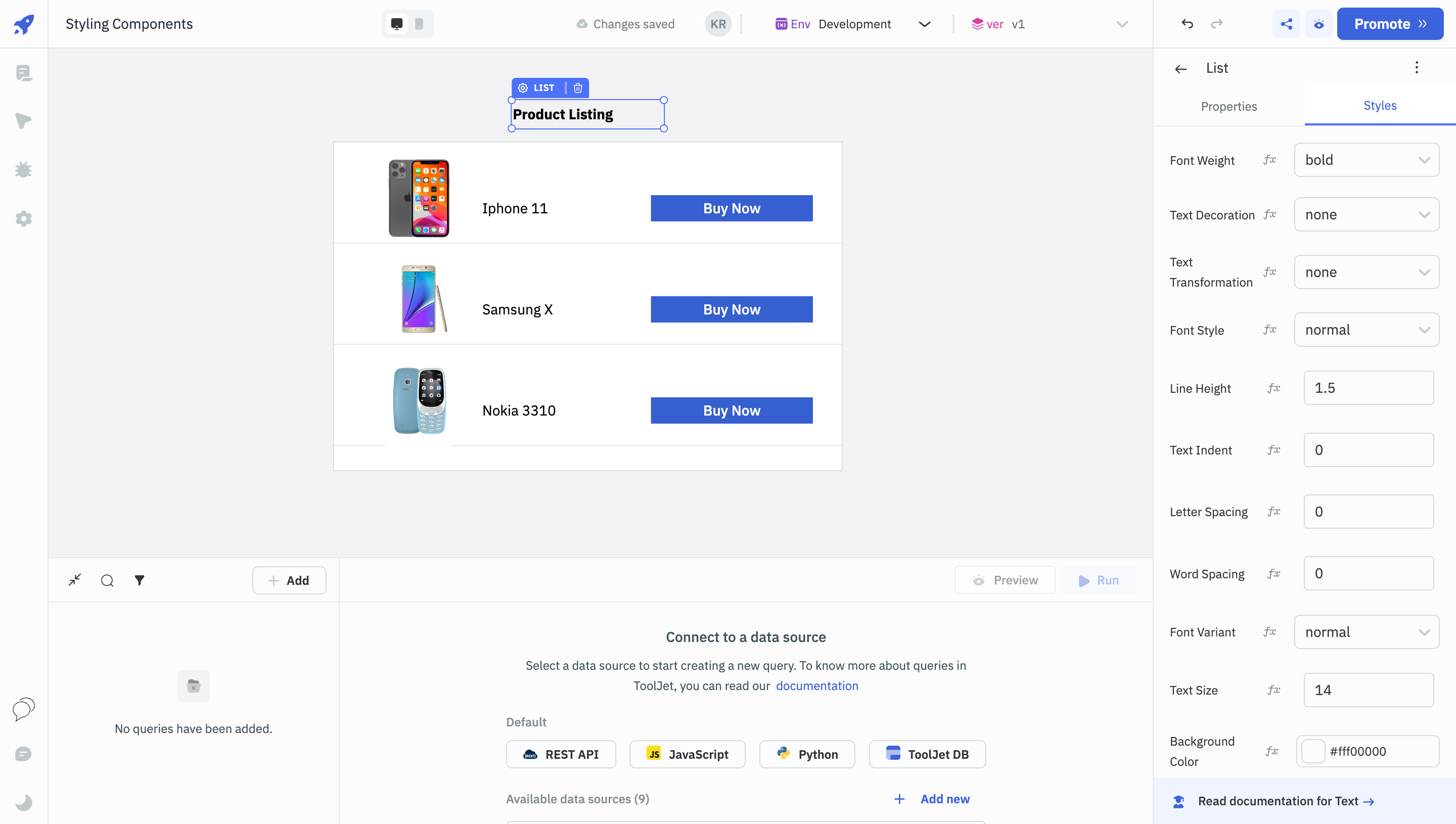
The Styles tab on this panel allows you to modify various visual properties such as colors, fonts, borders, and dimensions. You can also apply conditional styling based on data or user interactions, enabling you to create a more dynamic and responsive user interface.
Intuitive Styling Options
The styling options in ToolJet are designed to be intuitive, eliminating the need for extensive CSS or design experience. You can easily change the background color of a button, adjust the font size of a text field, or add padding and margins to layout components. These styling changes are immediately reflected on the canvas, providing real-time feedback as you build your application.
Custom CSS
Beyond basic styling, ToolJet also offers advanced customization capabilities. For users who are comfortable with CSS, there's the option to add custom classes. This opens up endless possibilities for fine-tuning the appearance and behavior of your application. Whether you're aiming for a specific brand aesthetic or need to meet particular accessibility standards, ToolJet's styling options give you the flexibility to create an application that not only functions well but also looks great.