Components Library
The Components Library on the right sidebar contains all of the available components. Use this to drag-and-drop a component from the library to the canvas. It organizes components into sections and you can enter a search term to quickly find a component you need.
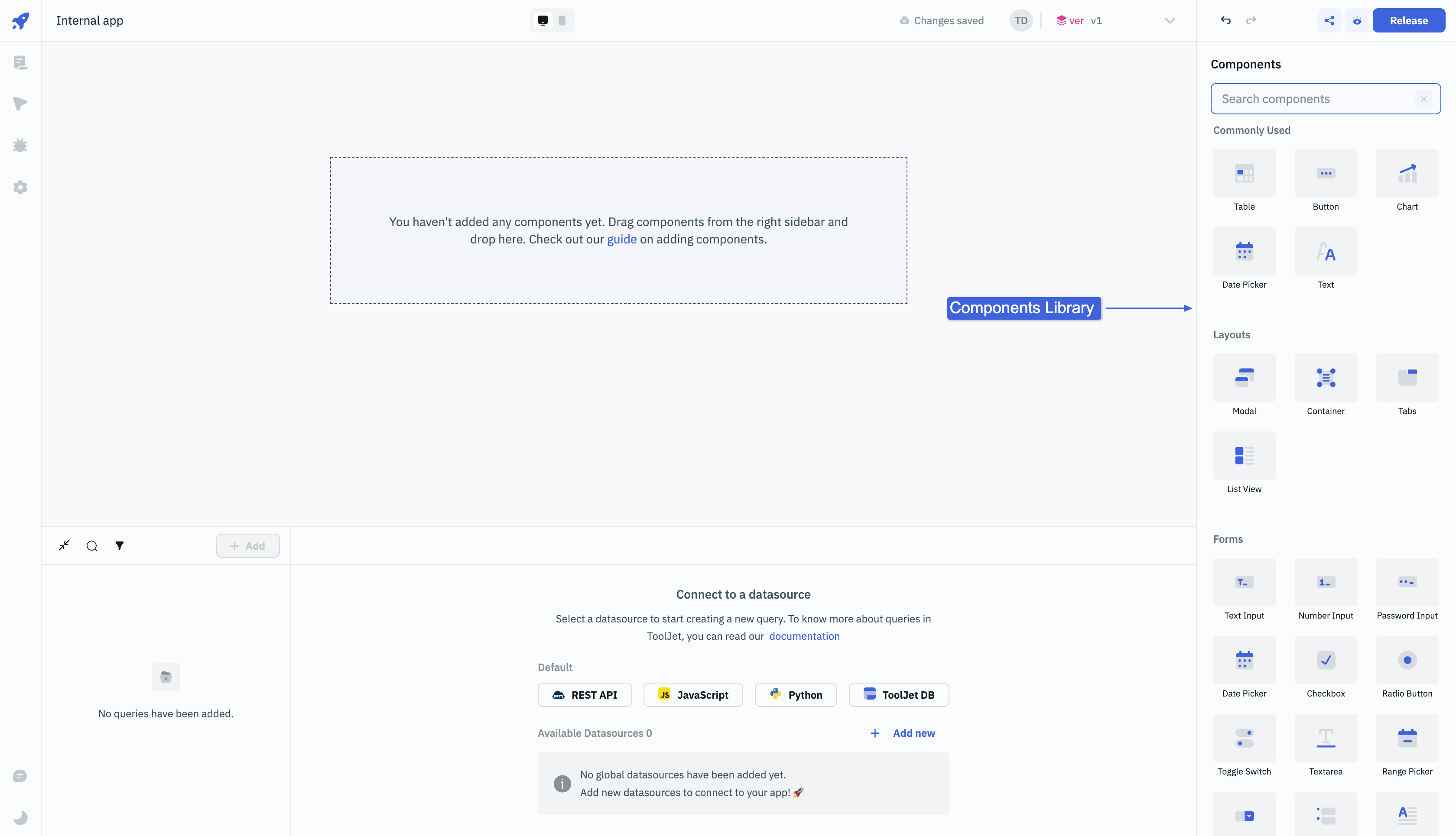
Check the Components Catalog to know more about specific component.
Properties Panel
The Properties Panel contains all the available settings for the selected component and is where you set values, update component names, and create event handlers. The Properties Panel organizes settings into different sections, such as Properties and Styles.
To open the Properties Panel, click on the component handle that is present on the top of the component including ⚙️ + Component Name and the Properties Panel will open up on the right side.