Textarea
The Textarea component allows users to enter text in an input field similar to the Text Input component. Textarea is generally preferred when we are expecting an input of multiple sentences. In this document, we'll go through all the configuration options for the Textarea component.
How To Use Textarea Widget
Properties
| Property | Description | Expected Value |
|---|---|---|
| Default value | Used to set initial value in textarea on load. It is a pre-established value that can be retrieved from the Text area component if no modifications are made to it. | Enter some text as the value (example: "John Doe") |
| Placeholder | Provides a hint for the expected value. It disappears once the user interacts with the component. | Enter some instructional text as the value (example: "Type name here") |
General
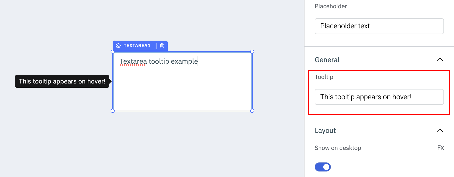
TooltipA Tooltip is commonly used to provide additional information about an element. This information becomes visible when the user hovers the mouse pointer over the respective component.
In the input field under Tooltip, you can enter some text and the component will show the specified text as a tooltip when it is hovered over.
Layout
Show on desktopUse this toggle to show or hide the component in the desktop view. You can dynamically configure the value by clicking on Fx and entering a logical expression that results in either true or false. Alternatively, you can directly set the values to {{true}} or {{false}}.
Use this toggle to show or hide the component in the mobile view. You can dynamically configure the value by clicking on Fx and entering a logical expression that results in either true or false. Alternatively, you can directly set the values to {{true}} or {{false}}.
Styles
| Property | Description | Expected Value |
|---|---|---|
| Visibility | Controls the visibility of the component. If set to {{false}}, the component will not be visible after the app is deployed. | Use the toggle button OR click on Fx to pass a boolean value or a logical expression that returns a boolean value i.e. either {{true}} or {{false}} |
| Disable | Makes the component non-functional when set to true. | Use the toggle button OR click on Fx to pass a boolean value or a logical expression that returns a boolean value i.e. either {{true}} or {{false}} |
| Border Radius | Adjusts the roundness of the component's corners. | Numeric value |
General
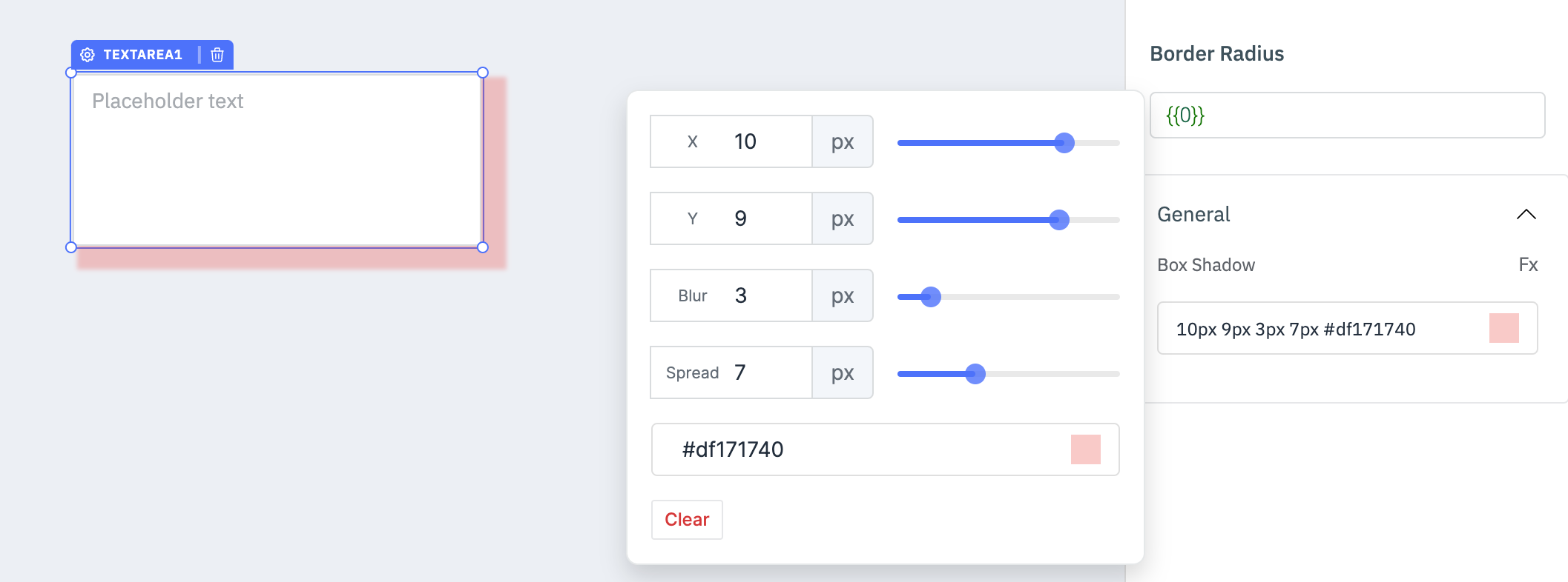
Box ShadowThe Box Shadow property is used to add shadow effects around a component's frame. You can specify the horizontal and vertical offsets(through X and Y sliders), blur and spread radius, and color of the shadow.
Exposed Variables
| Variables | Description | Expected Value |
|---|---|---|
| value | This variable holds the value entered in the text area component. | You can access the value dynamically using JS. For example, {{components.textarea1.value}} |
Component Specific Actions (CSA)
Following actions of the Textarea component can be controlled using Component-Specific Actions(CSA):
| Actions | Description |
|---|---|
| setText | Sets the text on the text area component via a component-specific action within any event handler. Additionally, you have the option to employ a RunJS query to execute component-specific actions such as await components.textarea1.setText('this is a textarea'). |
| clear | Clears the value from the text area component via a component-specific action within any event handler. Additionally, you have the option to employ a RunJS query to execute component-specific actions such as await components.textarea1.clear(). |