Number Input
The Number Input component allows users to enter numbers. It can be used as a standalone component or in form fields. In this document, we'll go through all the configuration options for the Number Input component.
Properties
| Property | Description | Expected Value |
|---|---|---|
| Default Value | Default Value is the initial value in the Number Input field when the application is loaded. It is a pre-established value that will be retrieved from the number input component if no modifications are made to it. | Any numeric value |
| Minimum value | Sets the minimum value that can be entered in the input field. | Any numerical value |
| Maximum value | Sets the maximum value that can be entered in the input field. | Any numerical value |
| Placeholder | The placeholder value is displayed when no user input has been made yet. It disappears once the user interacts with the control, such as typing a number or using the arrow keys on the right side of the component. | Enter some instructional text as the value (example: "Type number here") |
| Loading state | The loading state can be enabled to show a spinner as the content of the number input. This is commonly used with the isLoading property of queries to indicate a loading status while a query is being executed. | Use the toggle button or dynamically configure the value by clicking on Fx and entering a logical expression that results in either {{true}} or {{false}} |
| Decimal places | This controls decimal places in the number input. You pick how many decimals you want. If you choose {{2}}, any decimals will be rounded to two places. Use {{0}} for whole numbers or increase for more precision. | Any numeric value |
Events
To add an event to the Number Input component, go to the Events section and click on Add handler.
| Event | Description |
|---|---|
| On change | This event fires whenever the value of the number input component is changed. |
Check Action Reference docs to get the detailed information about all the Actions.
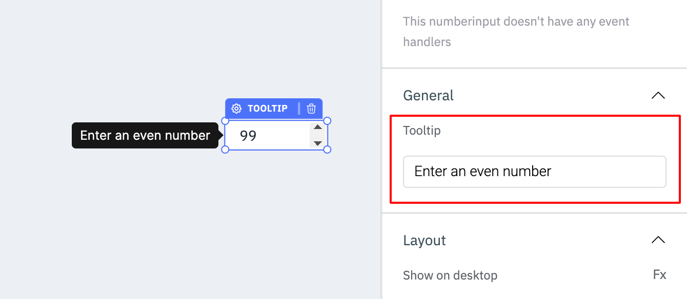
General��
TooltipA Tooltip is commonly used to provide additional information about an element. This information becomes visible when the user hovers the mouse pointer over the respective component.
In the input field under Tooltip, you can enter some text and the component will show the specified text as a tooltip when it is hovered over.
Layout
Show on desktopUse this toggle to show or hide the component in the desktop view. You can dynamically configure the value by clicking on Fx and entering a logical expression that results in either true or false. Alternatively, you can directly set the values to {{true}} or {{false}}.
Use this toggle to show or hide the component in the mobile view. You can dynamically configure the value by clicking on Fx and entering a logical expression that results in either true or false. Alternatively, you can directly set the values to {{true}} or {{false}}.
Styles
| Style | Description | Expected Value |
|---|---|---|
| Visibility | Controls the visibility of the component. If set to {{false}}, the component will not be visible after the app is deployed. | Use the toggle button or dynamically configure the value by clicking on Fx and entering a logical expression that results in either {{true}} or {{false}}. |
| Disable | Makes the component non-functional when set to true. | Use the toggle button or dynamically configure the value by clicking on Fx and entering a logical expression that results in either {{true}} or {{false}}. |
| Border radius | Adjusts the roundness of the component's corners. | Numeric value |
| Background color | Changes the background color of the number-input component. | Hex color code/choose a color using the color picker |
| Border color | Changes the border color of the component. | Hex color code/choose a color using the color picker |
| Text Color | Sets the color of the input value. | Hex color code/choose a color using the color picker |
Exposed Variables
| Variables | Description |
|---|---|
| value | This variable updates whenever a user selects a number on the number input. You can access the value dynamically using JS: {{components.numberinput1.value}} |
Component Specific Actions (CSA)
There are currently no Component-Specific Actions (CSA) implemented to regulate or control the component.