Table Properties
The Table component displays and manages data, connecting seamlessly with databases and APIs. It allows users to view and edit data directly within the table. This document goes through all the properties related to the Table component.
Data
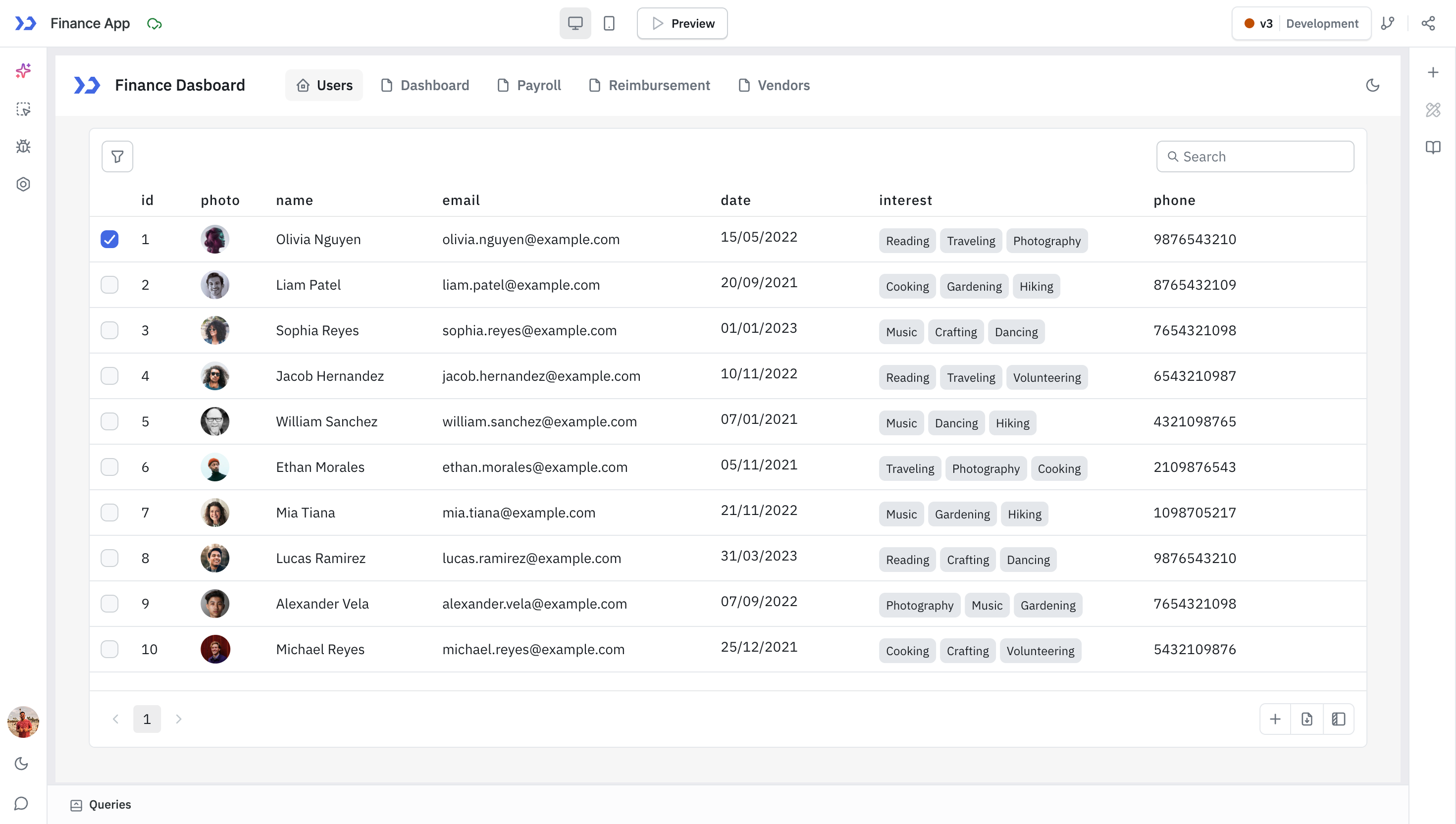
To populate the Table component with data, you need to provide the data in the form of an array of objects under its Data property. You can utilize data from queries by referring query data to populate the Table.
The Table component will automatically generate all the required columns when the data is provided. The Table also loads one level of nested data.
Example - Passing an array:
{{[{ id: 1, name: 'Sarah', email: '[email protected]', contact:{number: 8881212, address: '25, Huntley Road, Newark'} }]}}
Example - Passing a query data:
{{queries.restapi1.data}}
//replace restapi1 with your query name
Columns
Go to the Table Columns guide to know more about supported column types.
Action Buttons
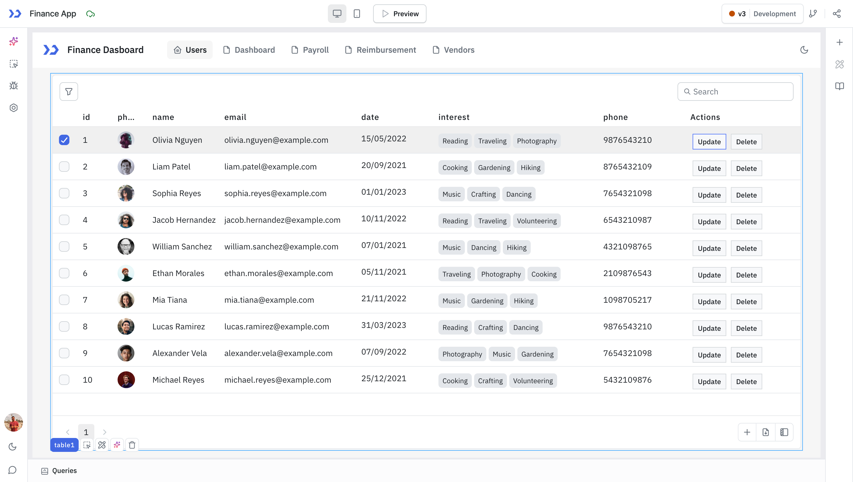
Action buttons are positioned in the Table's final column. These buttons' appearance can be customized, and specific actions can be defined for when they are clicked using the On click action. Upon clicking an action button, the selectedRow exposed variable of the Table is updated to reflect the data of the selected row.
Below are the button text properties that you can set.
Property | Description |
|---|---|
| Button text | Sets the text that you want to be displayed on the action button. |
| Button position | Sets the button position to left or right. |
| Background color | Sets the background color of the action button. |
| Text color | Sets the color of button-text of the action button. |
| Disable Action Button | Toggle on to disable the action button. You can programmatically set its value by clicking on the fx button next to it, if set to {{true}}, the action button will be disabled and becomes non-functional. By default, its value is set to {{false}}. |
| New event handler | The New event handler button lets you create an event handler to define behavior for action buttons based on the On click action. |
Events
Event | Description |
|---|---|
| Row hovered | This event is activated when the mouse pointer hovers over a row. The hoveredRowId variable captures the ID of the hovered row, and the hoveredRow variable stores the row's data in object format. |
| Row clicked | This event is triggered when a Table row is clicked. The selectedRowId and selectedRow exposed variables of the Table store the ID and data of the selected row, respectively. |
| Save changes | If any cell of the Table is edited, the Save changes button appears at the footer of the Table. Save changes event is triggered when this button is clicked. |
| Page changed | If server-side pagination is enabled, this event is fired when the current page is changed. Page changed event is triggered after updating the pageIndex variable. |
| Search | Search event is triggered when a text is entered to the search input box of the Table. searchText variable is updated before triggering this event. |
| Cancel changes | If any cell of the Table is edited, the Discard changes button appears at the footer of the Table. Cancel changes event is triggered when this button is clicked. |
| Sort applied | This event is triggered when the column name header is clicked to apply sorting. The sortApplied variable is updated with an object having column and direction values. |
| Cell value changed | If any cell of the Table is edited, the cell value changed event is triggered. |
| Filter changed | Triggeres when filter is added, removed, or updated. filters variable of the Table is updated to reflect the status of filters applied. The objects will have properties: condition, value, and column. |
| Add new rows | Triggeres when the Save button is clicked from the Add new row modal. |
Row Selection
Property | Description |
|---|---|
| Allow selection | Enables row selection using checkboxes. Disabling it removes row highlighting and bulk selection options. |
| Highlight selected row | Highlights the last clicked row. Replaces checkbox selection with visual highlight. |
| Bulk selection | Allows selecting multiple rows on the current page. Selected values are stored in the selectedRows variable. |
| Default selected row | Pre-selects a row when Allow selection is enabled. Use a key-value object like {"id": variables.x} where x is a valid variable that returns ID. |
| Select row on cell edit | Automatically selects the row being edited if column is editable. Disable to prevent auto-selection during editing. |
Search, Sort and Filter
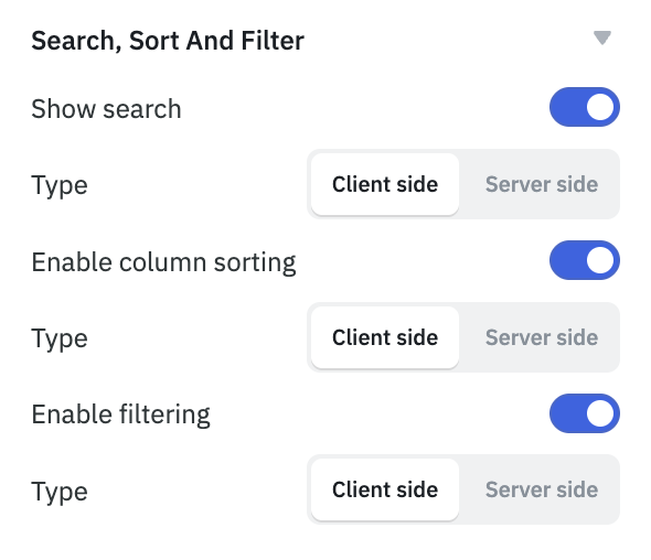
Show search
The Show search property controls the search box on the Table. Client-side search is enabled by default and server-side search can be enabled from the events section of the inspector. Whenever the search text is changed, the searchText exposed variable of the Table component is updated.
Server-side search
If server-side search is enabled, Search event is fired after the content of searchText variable is changed. searchText can be used to run a specific query to search for the records in your data source.
Enable column sorting
Disable this option to lock the sorting of columns when the users clicks on the column header.
Server-side sort
When server-side sort is enabled, clicking on the column headers will not automatically sort the table, instead, the Sort applied event will be fired and the applied sorting will be accessible in the sortApplied exposed variable. This information can be leveraged to execute queries that update the table content in accordance with the specified sorting.
Enable filtering
The filter button in the Table header is visible by default. You can choose to hide it by disabling this option.
The Table data can be filtered using the Filter data option on its top-left. You have the option to choose from various filters, such as:
- contains
- does not contain
- matches
- does not match
- equals
- does not equal
- is empty
- is not empty
- greater than
- greater than or equal to
- less than
- less than or equal to
Server-side filter
When Server-side filter is enabled, applying filters will not automatically filter the table, instead, the Filter changed event will be fired and the applied filters will be accessible in the filters exposed variables. This data can be utilized to execute queries that update the table content according to the applied filters.
Pagination
Pagination helps manage the display of large data sets by dividing them into manageable segments. Client-side pagination is enabled by default. When enabled, an additional property, Number of rows per page, becomes available to set the number of records per page. The default value is set to 10; if disabled, all records will appear on a single page.
Server-side pagination
Server-side pagination can be used to run a query whenever the page is changed. Under events section, you can use the Page changed event to execute a query and along with the pageIndex exposed variable. pageIndex can be used to query the next set of results when page is changed.
When Server-side pagination is enabled, you'll be able to set three other Table properties:
- Enable previous page button: Toggle this off to disable the previous page button from the Table.
- Enable next page button: Toggle this off to disable the next page button from the Table.
- Total records server side: Set a numerical value to display particular number of records.
Check this how-to guide to learn more about server-side pagination.
Additional Actions
Property | Description |
|---|---|
| Show add new row button | Shows a button to add new rows via a modal. New data is stored in newRows. Use the Add new rows event to save to a data source. |
| Show download button | Enables download of Table data as CSV, Excel, or PDF. Filename format: Tablename_DD-MM-YYYY_HH-mm.filetype. |
| Hide column selector button | Controls visibility of the column selector, which lets users choose visible columns. |
| Loading state | Shows a loading skeleton while data is loading. Bind it to the query’s isLoading property. |
| Show update buttons | Displays Save changes and Discard changes buttons when any cell is edited. |
| Visibility | Controls whether the Table is visible on the canvas. Can be toggled dynamically. |
| Disable | Disables interactivity of the Table when toggled off. Still visible but not usable. |
| Dynamic height | Automatically adjusts the component's height based on its content. |
Devices
Property | Description | Expected Value |
|---|---|---|
| Show on desktop | Makes the component visible in desktop view. | You can set it with the toggle button or dynamically configure the value by clicking on fx and entering a logical expression. |
| Show on mobile | Makes the component visible in mobile view. | You can set it with the toggle button or dynamically configure the value by clicking on fx and entering a logical expression. |
Styles
Column Header
Style Property | Description | Configuration Options |
|---|---|---|
| Column title | Set the color for column title. | Select a theme or choose color from color picker. |
| Overflow | Select the overflow type. | Choose from None or Wrap. |
| Header casing | Select the header casing type. | Choose from As typed or AA. |
| Background | Set the background color for column header. | Select a theme or choose color from color picker. |
Data�
Style Property | Description | Configuration Options |
|---|---|---|
| Text | Set the text color of the component. | Select a theme or choose color from color picker. |
| Row style | Selects the style of the table rows. | Choose from dropdown: Bordered, Regular, or Striped. |
| Cell height | Determines the size of the table cells. | Choose between Condensed or Regular size. |
| Max row height | Controls the maximum height of rows when Content wrap is enabled. | Select Auto or define a Custom size. |
| Action button radius | Sets the radius for all action buttons. | Enter a value (default is 0). |
For Custom Max Row Height, the minimum value depends on the Cell height setting:
- When Cell Height is set to Regular, the minimum height is 45 px.
- When Cell Height is set to Condensed, the minimum height is 39 px.
Container
Style Property | Description | Configuration Options |
|---|---|---|
| Background | Set the background color for the table. | Select a theme or choose color from color picker. |
| Border radius | Adds a radius to the borders of the table. | Enter a value (default is 6). |
| Border | Defines the border color of the Table. | Select a theme or choose color from color picker. |
| Box shadow | Sets the box shadow properties of the component. | Select the box shadow color, adjust related properties, or set programmatically using fx. |
| Padding | Sets padding inside table. | Choose between Default or None. |
Any property having fx button next to its field can be programmatically configured.