Table
Tables can be used for both displaying and editing data.
Table UI
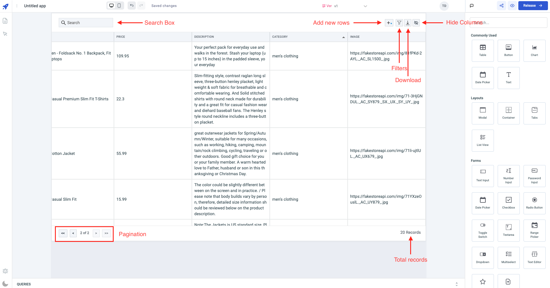
Search
At the top-left corner of the table component, there is a search box that allows users to input keywords and search for rows within the table data. You can also show/hide the search box from the table from the table properties.
Add new row
When users click on this button, a popup modal appears which enables them to insert new rows. The modal will have a single row initially, and the columns will have the same column type as those on the table. If the user inputs data into the row, it will be stored on the newRows variable of the table. If the user selects the Discard button, the data in the variable will be cleared. However, if the user closes the popup without taking any action (neither Save nor Discard), the data will still be retained, and a green indicator will appear on the Add new row button. The table has an Add new rows event handler that can be utilized to execute queries that store the data into the datasource whenever the Save button is clicked.
At present, it is not possible to include columns of type Image when adding a new row to the table.
Filters
The table data can be filtered by clicking on this button. You have the option to choose from various filters, such as:
- contains
- does not contain
- matches
- does not match
- equals
- does not equal
- is empty
- is not empty
- greater than
- greater than or equal to
- less than
- less than or equal to
You have the option to hide the filter button in the table properties.
Download
The table data can be downloaded in various file formats, including:
- CSV
- Excel
You have the option to hide the download button in the table properties.
You can utilize Component Specific Actions to retrieve the table data in the mentioned formats from the event handlers across the application.
Column selector button
You can choose which columns to display or hide in the table by clicking on this button. You also have the option to hide the column selector button in the table properties.
Table data
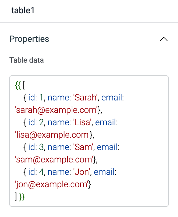
Array of objects to be displayed on the table. It is commonly used to display data from query ({{queries.restapi1.data}}). Table data expects an array of objects, example:
{{[{ id: 1, name: 'Sarah', email: '[email protected]'}]}}
The table component will auto-generate all the columns as soon as the expected table data(array of objects) is provided.
Columns
Whenever data is loaded into a table, the columns are automatically generated. You can add, remove, or modify columns by accessing the table properties under the column section.
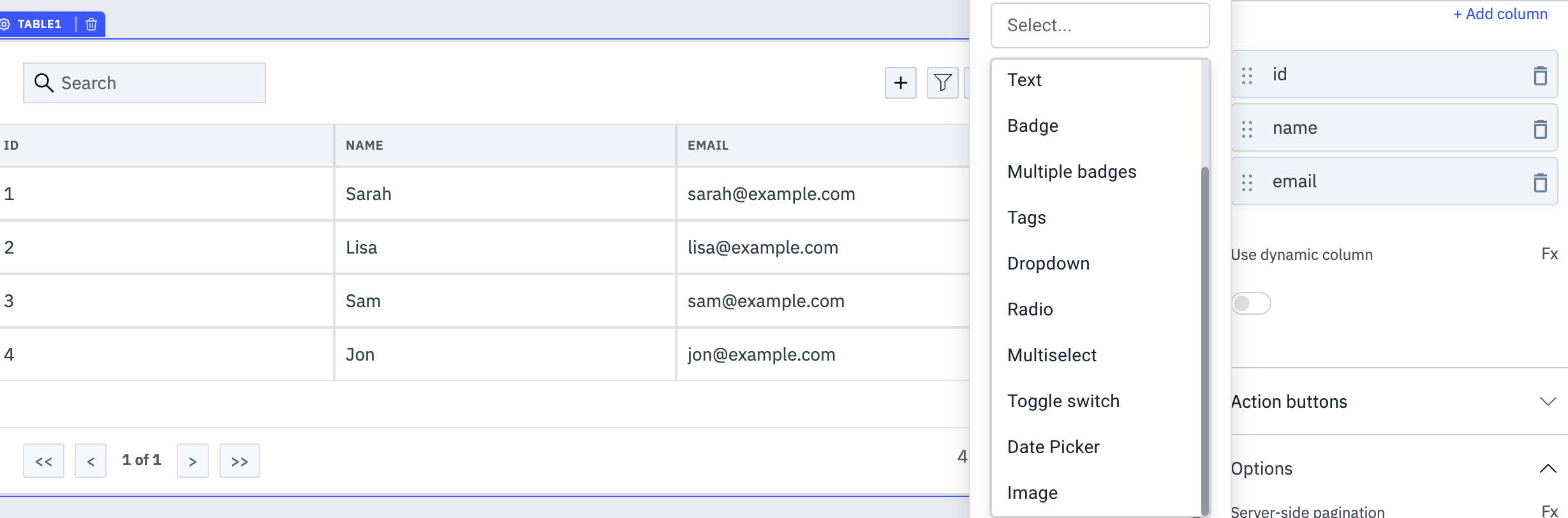
Types of Columns
The table provides different column types based on the data being displayed:
- String | Default
- Number
- Badge
- Multiple Badges
- Tags
- Dropdown
- Radio
- Multiselect
- Toggle switch
- Date Picker
- Image
String | Default
This column type is automatically selected by default when a column is added or when data is populated in the table.
| Column property | Description |
|---|---|
| Column name | Specify the name to be displayed on the table column header |
| Overflow | Manage the handling of content that exceeds the cell dimensions. Wrap wraps the content onto the next line within the cell, Scroll enables scrolling for content that exceeds the cell, and Hide conceals content that goes beyond the cell boundary. |
| Key | Specify the key name associated with the loaded data in the table. If no key is provided, the Column name is used as the key for that column. |
| Text color | Modify the color of the text in the column. You can use a hex color code or color name. The value can be dynamically assigned using JS. Refer to the how-to guide. |
| Cell background color | Adjust the background color of the cell in the column. You can utilize a hex color code or color name. The value can be dynamically assigned using JS. |
| Make editable | This option is disabled by default. Enabling it allows the column to be edited by app users. Its value can also be dynamically set to {{true}} or {{false}} to toggle it on or off. |
| Column Visibility | This option is enabled by default. Disabling it hides the column from the table. Its value can also be dynamically set to {{true}} or {{false}} to show or hide the column. |
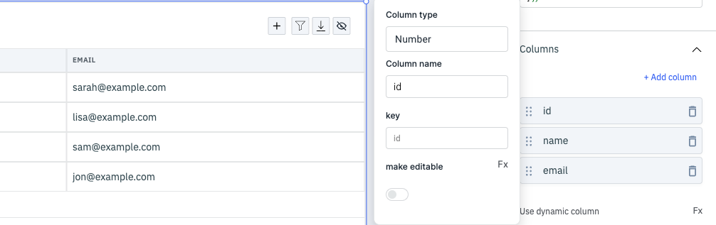
Number
Selecting the column type as Number will only load numerical data in the column cells.
| Column property | Description |
|---|---|
| Column name | Specify the name to be displayed on the table column header |
| Key | Specify the key name associated with the loaded data in the table. If no key is provided, the Column name is used as the key for that column. |
| Make editable | This option is disabled by default. Enabling it allows the column to be edited by app users. Its value can also be dynamically set to {{true}} or {{false}} to toggle it on or off. |
| Column Visibility | This option is enabled by default. Disabling it hides the column from the table. Its value can also be dynamically set to {{true}} or {{false}} to show or hide the column. |
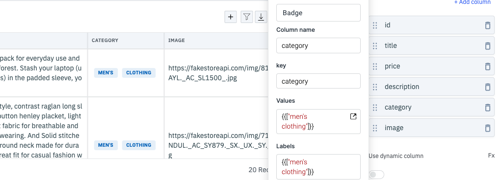
Badge
The Badge column type is utilized to exhibit labels on the columns using the column data.
| Column property | Description |
|---|---|
| Column name | Specify the name to be displayed on the table column header |
| Key | Specify the key name associated with the loaded data in the table. If no key is provided, the Column name is used as the key for that column. |
| Values | Provide the values for the badge as an array |
| Labels | Provide the labels for the values in the badge as an array |
| Make editable | This option is disabled by default. Enabling it allows the column to be edited by app users. Its value can also be dynamically set to {{true}} or {{false}} to toggle it on or off. |
| Column Visibility | This option is enabled by default. Disabling it hides the column from the table. Its value can also be dynamically set to {{true}} or {{false}} to show or hide the column. |
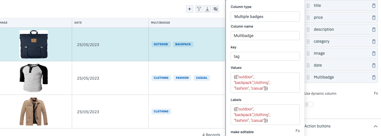
Multiple Badges
Similar to the Badge column type, the Multiple Badges type is used to display multiple badges within a column cell.
| Column property | Description |
|---|---|
| Column name | Specify the name to be displayed on the table column header |
| Key | Specify the key name associated with the loaded data in the table. If no key is provided, the Column name is used as the key for that column. |
| Values | Provide the values for the multiple badges as an array |
| Labels | Provide the labels for the values in the multiple badges as an array |
| Make editable | This option is disabled by default. Enabling it allows the column to be edited by app users. Its value can also be dynamically set to {{true}} or {{false}} to toggle it on or off. |
| Column Visibility | This option is enabled by default. Disabling it hides the column from the table. Its value can also be dynamically set to {{true}} or {{false}} to show or hide the column. |
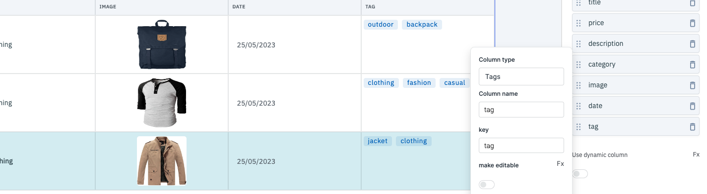
Tags
The Tags column type is utilized to display tags within the column cells using the column data. The provided key should have values in an array format.
| Column property | Description |
|---|---|
| Column name | Specify the name to be displayed on the table column header |
| Key | Specify the key name associated with the loaded data in the table. If no key is provided, the Column name is used as the key for that column. |
| Make editable | This option is disabled by default. Enabling it allows the column to be edited by app users. Its value can also be dynamically set to {{true}} or {{false}} to toggle it on or off. |
| Column Visibility | This option is enabled by default. Disabling it hides the column from the table. Its value can also be dynamically set to {{true}} or {{false}} to show or hide the column. |
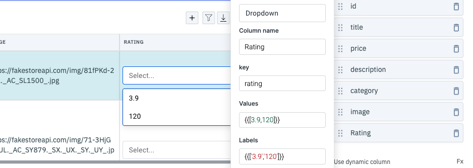
Dropdown
The Dropdown column type is used to display a dropdown in the column cells using the column data.
| Column property | Description |
|---|---|
| Column name | Specify the name to be displayed on the table column header |
| Key | Specify the key name associated with the loaded data in the table. If no key is provided, the Column name is used as the key for that column. |
| Values | Provide the values for the dropdown as an array |
| Labels | Provide the labels for the values in the dropdown as an array |
| Make editable | This option is disabled by default. Enabling it allows the column to be edited by app users. Its value can also be dynamically set to {{true}} or {{false}} to toggle it on or off. |
| Column Visibility | This option is enabled by default. Disabling it hides the column from the table. Its value can also be dynamically set to {{true}} or {{false}} to show or hide the column. |
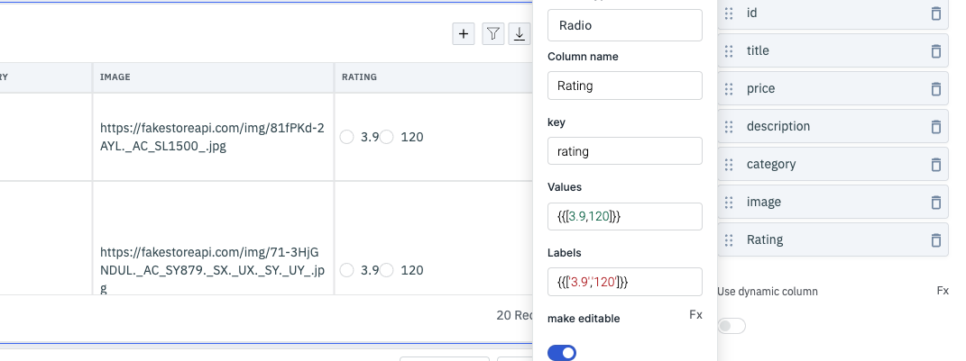
Radio
The Radio column type is used to show radio buttons in the column cells using the column data.
| Column property | Description |
|---|---|
| Column name | Specify the name to be displayed on the table column header |
| Key | Specify the key name associated with the loaded data in the table. If no key is provided, the Column name is used as the key for that column. |
| Values | Provide the values for the radio as an array |
| Labels | Provide the labels for the values in the radio as an array |
| Make editable | This option is disabled by default. Enabling it allows the column to be edited by app users. Its value can also be dynamically set to {{true}} or {{false}} to toggle it on or off. |
| Column Visibility | This option is enabled by default. Disabling it hides the column from the table. Its value can also be dynamically set to {{true}} or {{false}} to show or hide the column. |
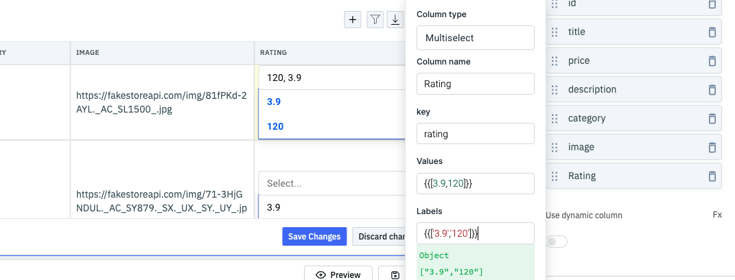
Multiselect
The Multiselect column type is used to show a multiselect dropdown in the column cells using the column data.
| Column property | Description |
|---|---|
| Column name | Specify the name to be displayed on the table column header |
| Key | Specify the key name associated with the loaded data in the table. If no key is provided, the Column name is used as the key for that column. |
| Values | Provide the values for the multiselect as an array |
| Labels | Provide the labels for the values in the multiselect as an array |
| Make editable | This option is disabled by default. Enabling it allows the column to be edited by app users. Its value can also be dynamically set to {{true}} or {{false}} to toggle it on or off. |
| Column Visibility | This option is enabled by default. Disabling it hides the column from the table. Its value can also be dynamically set to {{true}} or {{false}} to show or hide the column. |
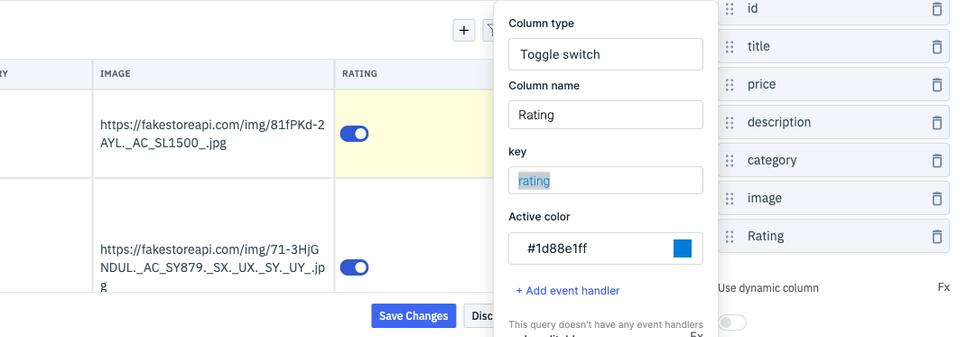
Toggle Switch
The Toggle Switch column type is used to display a toggle switch in the column cells using the column data. The provided key should be a boolean value, either true or false.
| Column property | Description |
|---|---|
| Column name | Specify the name to be displayed on the table column header |
| Key | Specify the key name associated with the loaded data in the table. If no key is provided, the Column name is used as the key for that column. |
| Active color | Set the color of the toggle switch when it is active using this property. |
| + Add Event Handler | Add an event handler to perform actions whenever the toggle switch is turned on or off. |
| Make editable | This option is disabled by default. Enabling it allows the column to be edited by app users. Its value can also be dynamically set to {{true}} or {{false}} to toggle it on or off. |
| Column Visibility | This option is enabled by default. Disabling it hides the column from the table. Its value can also be dynamically set to {{true}} or {{false}} to show or hide the column. |
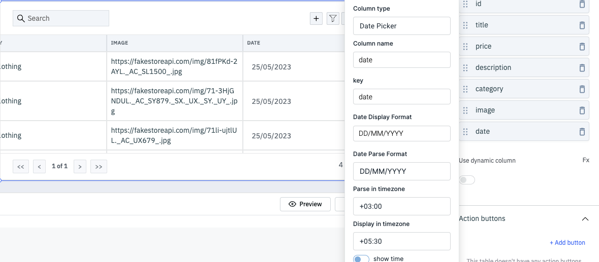
Date Picker
The Date Picker column type is used to display a date picker in the column cells using the column data.
| Column property | Description |
|---|---|
| Column name | Specify the name to be displayed on the table column header |
| Key | Specify the key name associated with the loaded data in the table. The provided key should hold a date value. |
| Date Display Format | Determines how the date should be displayed in the table |
| Date Parse Format | Specifies the format in which the date is stored in the database. |
| Parse in timezone | The timezone of the time stored in the database. Only required if the Show time option is enabled. |
| Display in timezone | The timezone in which the date should be displayed. Only required if the Show time option is enabled. |
| Show time | Displays the time along with the date. |
| Make editable | This option is disabled by default. Enabling it allows the column to be edited by app users. Its value can also be dynamically set to {{true}} or {{false}} to toggle it on or off. |
| Column Visibility | This option is enabled by default. Disabling it hides the column from the table. Its value can also be dynamically set to {{true}} or {{false}} to show or hide the column. |
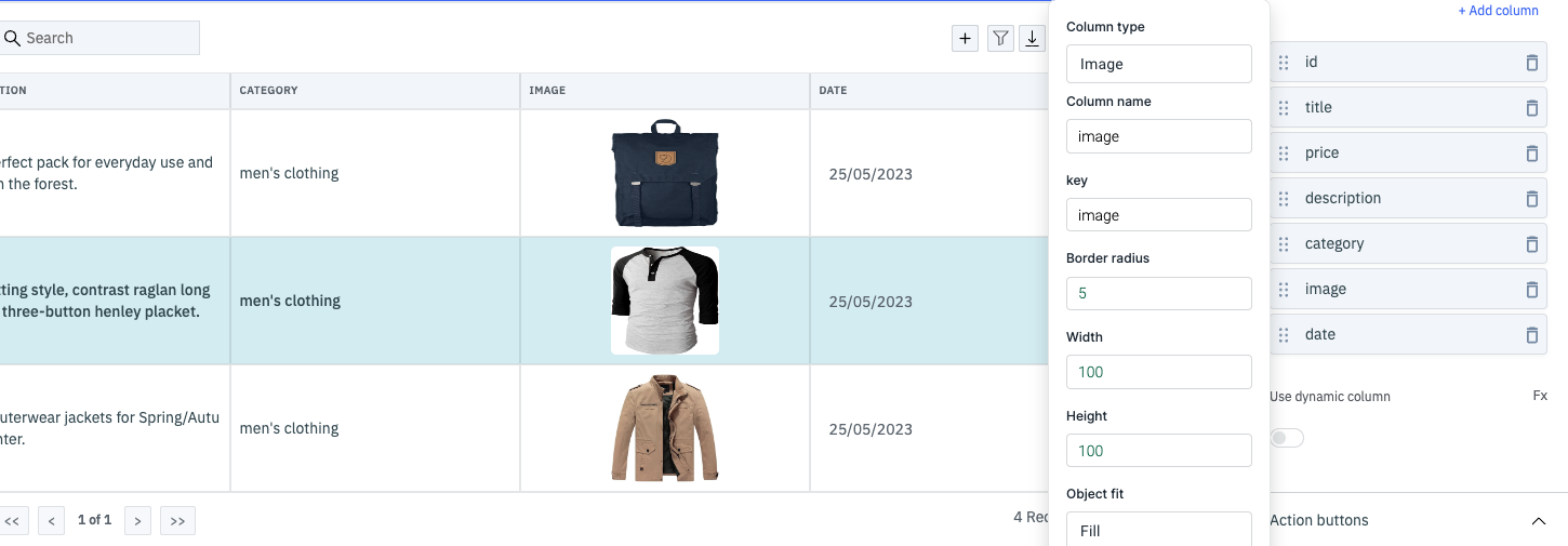
Image
The Image column type is used to display images in the column cells using the column data.
| Column property | Description |
|---|---|
| Column name | Specify the name to be displayed on the table column header |
| Key | Specify the key name associated with the loaded data in the table. The provided key should hold a URL for the image to be loaded in the column cells. |
| Border radius | Set a border radius for the image loaded in the column cell. The field accepts a numerical value from 0 to 100. |
| Width | Set a width for the image loaded in the column cell. The field accepts a numerical value from 0 to 100. |
| Height | Set a height for the image loaded in the column cell. The field accepts a numerical value from 0 to 100. |
| Object fit | This option allows you to choose how the image should be fitted within its container. The available options are: Cover, Contain, and Fill. Cover maintains the aspect ratio of the image but may crop or clip parts of it to cover the container's width, Contain maintains the aspect ratio and resizes the image to fit within the given dimensions while displaying the entire image, and Fill stretches the image to cover 100% of the width. |
| Column Visibility | This option is enabled by default. Disabling it hides the column from the table. Its value can also be dynamically set to {{true}} or {{false}} to show or hide the column. |
For a guide on dynamically changing the color of text in a row and column in the table, refer to this how-to guide.
Displaying Data
The data object should be an array of objects. Table columns can be added, removed, rearranged from the inspector. key property is the accessor key used to get data from a single element of a table data object. For example:
If the table data is:
[
    {
        "review": {
            "title": "An app review"
        },
    "user": {
            "name": "sam",
            "email": "[email protected]"
        },
    }
]
To display email column, the key for the column should be user.email.
Saving data
Enable editable property of a column to make the cells editable. If a data type is not selected, string is selected as the data type.
You can programatically enable/disable the make editable field in the columns property by clicking on the Fx button.
If the data in a cell is changed, changeSet property of the table object will have the index of the row and the field that changed.
For example, if the name field of second row of example in the 'Displaying Data' section is changed, changeSet will look like this:
{
    2: {
        "name": "new name"
    }
}
Along with changeSet, dataUpdates property will also be changed when the value of a cell changes. dataUpdates will have the whole data of the changed index from the table data. dataUpdates will look like this for our example:
[{
    "review": {
        "title": "An app review"
    },
    "user": {
        "name": "new name",
        "email": "[email protected]"
    },
}]
If the data of a cell is changed, "save changes" button will be shown at the bottom of the table. This button when clicked will trigger the Bulk update query event. This event can be used to run a query to update the data on your data source.
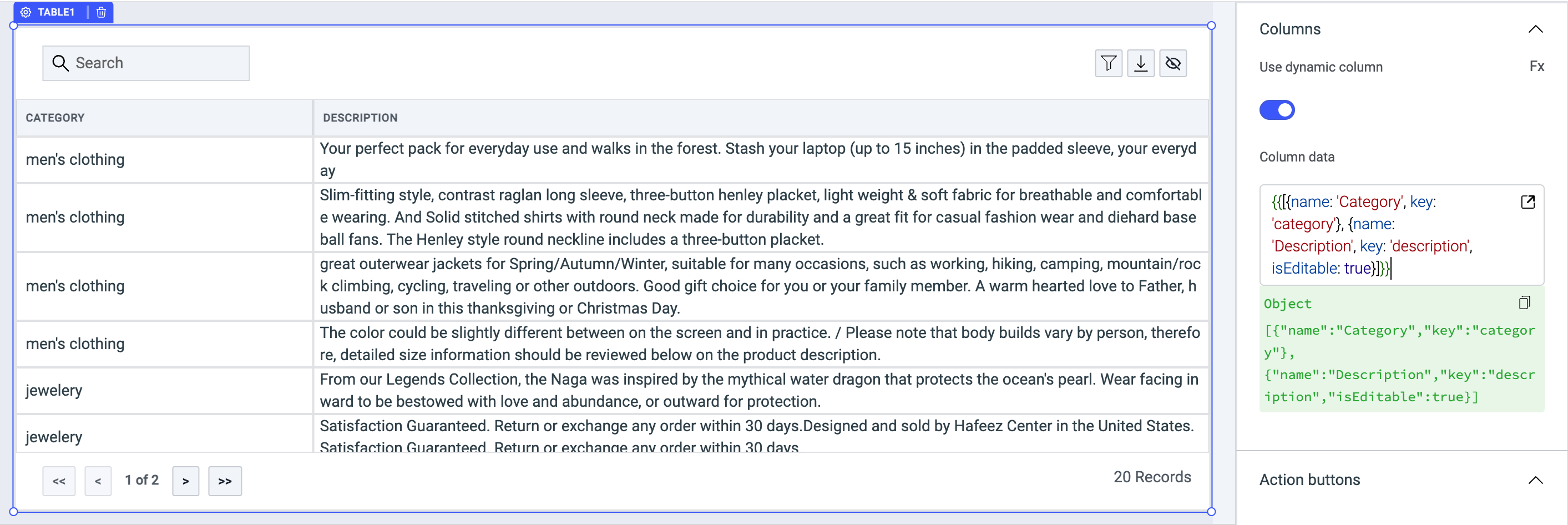
Use dynamic column
Enabling the Use dynamic column toggle will allow users to set the Column data where users can link the column data dynamically from a query.
The column data field expects a JSON value:
{
   "name":"Name",
   "columnType":"string",
   "key":"first_name",
   "cellBackgroundColor":"#000",
   "textColor":"#fff",
   "isEditable":true,
   "regex":"",
   "maxLength":10,
   "minLength":5,
   "customRule":""
}
Validation
Under column properties, expand the detailed view of a column type to access a toggle button called make editable. You can toggle it ON to apply the validations for each column respectively using the following.
Regex
Use this field to enter a Regular Expression that will validate the password constraints.
Min length
Enter the number for a minimum length of password allowed.
Max length
Enter the number for the maximum length of password allowed.
Custom validation
If the condition is true, the validation passes, otherwise return a string that should be displayed as the error message. For example: {{components.passwordInput1.value === 'something' ? true: 'value should be something'}}
Action buttons
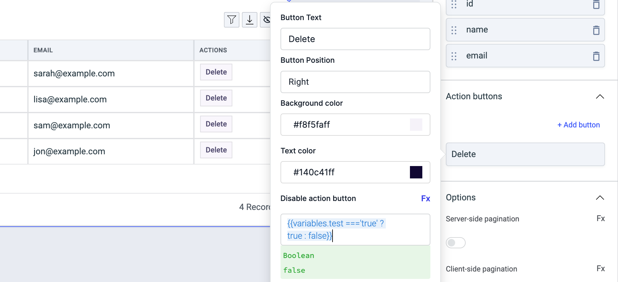
Action buttons will be displayed as the last column of the table. The styles of these buttons can be customised and on click actions can be configured. when clicked, selectedRow property of the table will have the table data of the row.
| Property | Description |
|---|---|
| Button text | Set the text that you want to be displayed on the action button. |
| Button position | Set the button position to the left or right |
| Background color (Action Button) | Background color of the action button. |
| Text color (Action Button) | Color of button-text of the action button. |
| Disable Action Button | Toggle on to disable the action button. You can programmatically set its value by clicking on the Fx button next to it, if set to {{true}}, the action button will be disabled and becomes non-functional. By default, its value is set to {{false}}. |
Options
Any property having Fx button next to its field can be programmatically configured.
Server-side pagination
Server-side pagination can be used to run a query whenever the page is changed. Go to events section of the inspector and change the action for on page changed event. Number of records per page needs to be handled in your query. If server-side pagination is enabled, pageIndex property will be exposed on the table object, this property will have the current page index. pageIndex can be used to query the next set of results when page is changed.
When Server-side pagination is enabled, you'll be able to set three other table properties:
- Enable previous page button: When server-side pagination is enabled, this button is enabled by default. Toggle this off to disable the previous page button from the table.
- Enable next page button: When server-side pagination is enabled, this button is enabled by default. Toggle this off to disable the next page button from the table.
- Total records server side: Set a numerical value to display particular number of records.
Client-side pagination
Client-side pagination is enabled by default. When the client-side pagination is enabled({{true}}), another property Number of rows per page will be shown that can be used to set the number of records per page. By default, the value is set to 10 and if it is disabled({{false}}) then it will show all the records in the single page.
Server-side search
If server-side search is enabled, on search event is fired after the content of searchText property is changed. searchText can be used to run a specific query to search for the records in your data source.
Show download button
The download button in the table header is visible by default. You can choose to hide it by disabling this option. You can dynamically set the value to {{true}} or {{false}} to show or hide the download button by clicking on the Fx button.
Hide column selector button
The column selector button on the table header is visible by default. You can choose to hide it by disabling this option. You can dynamically set the value to {{true}} or {{false}} to show or hide the column selector button by clicking on the Fx button.
Show filter button
The filter button in the table header is visible by default. You can choose to hide it by disabling this option. You can dynamically set the value to {{true}} or {{false}} to show or hide the filter button by clicking on the Fx button.
Show add new row button
The Add new row button in the table header is visible by default. You can choose to hide it by disabling this option. You can dynamically set the value to {{true}} or {{false}} to show or hide the Add new row button by clicking on the Fx button.
Show update buttons
It's enabled by default. Table footer will show two update buttons Save changes & Discard changes whenever a cell is edited. Toggle off to hide update buttons.
Allow selection
This option is active by default. Enabling this functionality allows users to choose a row in the table by utilizing checkboxes placed next to each row. If this option is disabled, the ability to highlight selected rows and perform bulk selection will not be accessible.
Highlight selected row
Activate this option to visually emphasize the last clicked row. Enabling this feature will alter the row selection appearance of the table from a checkbox-based theme to a highlighting-based theme.
Bulk selection
To enable the selection of one or more rows from the current page of a table, you can activate the 'Bulk selection' setting in the inspector. The values of the selected rows will be exposed as 'selectedRows'.
Disable sorting
Enable this option to lock the sorting of columns when clicked on column name.
Server-side sort
When Server-side sort is enabled, clicking on the column headers will not automatically sort the table, instead, the Sort applied event will be fired and the applied sorting will be exposed as sortApplied. You can use this data to run any query that feeds data to the table in a manner that reflects the sorting applied.
Server-side filter
When Server-side filter is enabled, applying filters will not automatically filter the table, instead, the Filter changed event will be fired and the applied filters will be exposed as filters. You can use this data to run any query that feeds data to the table in a manner that reflects the filters applied.
Show search box
It can be used to show or hide Table Search box. Client-side search is enabled by default and server-side search can be enabled from the events section of the inspector. Whenever the search text is changed, the searchText property of the table component is updated. If server-side search is enabled, on search event is fired after the content of searchText property is changed. searchText can be used to run a specific query to search for the records in your data source.
If you don't wish to use the search feature altogether, you can disable it from the inspector.
Loading state (Boolean)
Loading state shows a loading skeleton for the table. This property can be used to show a loading status on the table while data is being loaded. isLoading property of a query can be used to get the status of a query.
Events
- Row hovered
- Row clicked
- Save changes
- Cancel changes
- Page changed
- Search
- Sort applied
- Cell value changed
- Filter changed
- Add new rows
Row hovered
This event is triggered when the mouse pointer is moved over a row in the table. The hoveredRowId exposed variable of the table will include the id of the latest hovered row and hoveredRow property of the table will have the data of the hovered row in the object format.
Row clicked
This event is triggered when a table row is clicked. The selectedRowId exposed variable of the table will include the id of the selected row and the selectedRow property of the table object will have the table data of the selected row.
Save changes
If any cell of the table is edited, the save changes button appears at the footer of the table. Save changes event is triggered when this button is clicked.
Cancel changes
If any cell of the table is edited, the Discard changes button appears at the footer of the table. Cancel changes event is triggered when this button is clicked.
Page changed
If server-side pagination is enabled, this event is fired when the current page is changed. This event is triggered after updating the pageIndex variable.
Search
This event is triggered when a text is entered to the search input box of the table. searchText variable is updated before triggering this event.
Sort applied
This event is triggered when the column name header is clicked to apply sorting in asc or desc. The sortApplied variable is updated with an object having column and direction values.
Cell value changed
If any cell of the table is edited, the cell value changed event is triggered.
Filter changed
This event is triggered when filter is added, removed, or updated from the filter section of the table. filters property of the table is updated to reflect the status of filters applied. The objects will have properties: condition, value, and column.
Add new rows
This event is triggered when the Save button is clicked from the Add new row modal on the table.
Styles
| Style | Description |
|---|---|
| Text color | Change the color of the text in table by providing hex color code or choosing one from the picker |
| Action button radius | This field can be used to give a radius to all action buttons. The default value is 0 |
| Table type | Select a type of table from the dropdown. |
| Cell size | This decides the size of table cells. You can choose between a Compact size for table cells or a Spacious size |
| Visibility | Toggle on or off to control the visibility of the widget. You can programmatically change its value by clicking on the Fx button next to it. If {{false}} the widget will not visible after the app is deployed. By default, it's set to {{true}}. |
| Disable | Toggle on to lock the widget. You can programmatically change its value by clicking on the Fx button next to it, if set to {{true}}, the widget will be locked and becomes non-functional. By default, its value is set to {{false}}. |
| Border radius | Use this property to modify the border radius of the button. |
Any property having Fx button next to its field can be programmatically configured.
Exposed variables
| variable | description |
|---|---|
| currentData | Data that is currently being displayed by the table ( including edits if any ) |
| currentPageData | Data that is displayed on the current page if pagination is enabled ( including edits if any ) |
| pageIndex | Index of the current page, starting from 1 |
| changeSet | Object with row number as the key and object of edited fields and their values as the value |
| dataUpdates | Just like changeSet but includes the data of the entire row |
| selectedRow | The data of the row that was last clicked. selectedRow also changes when an action button is clicked |
| searchText | The value of the search field if server-side pagination is enabled. |
| newRows | The newRows variable stores an array of objects, each containing data for a row that was added to the table using the "Add new row" button. When the user clicks either the "Save" or "Discard" button in the modal, this data is cleared. |
Component specific actions (CSA)
Following actions of the component can be controlled using the component specific actions(CSA):
| Actions | Description |
|---|---|
| setPage | Set the page on the table via component-specific action within any event handler. Additionally, you have the option to employ a RunJS query to execute component-specific actions such as await components.table1.setPage(2) |
| selectRow | Select the row on the table using via component-specific action within any event handler. Additionally, you have the option to employ a RunJS query to execute component-specific actions such as await components.table1.selectRow('id','11') |
| deselectRow | Deselect the row on the table via component-specific action within any event handler. Additionally, you have the option to employ a RunJS query to execute component-specific actions such as await components.table1.deselectRow() |
| discardChanges | Discard the changes from the table when a cell is edited via component-specific action within any event handler. Additionally, you have the option to employ a RunJS query to execute component-specific actions such as await components.table1.discardChanges() |
| discardNewlyAddedRows | Discard the newly added rows from the add new row popup on the table via component-specific action within any event handler. Additionally, you have the option to employ a RunJS query to execute component-specific actions such as await components.table1.discardNewlyAddedRows() |
| downloadTableData | Retrieve the data from the table in the PDF, CSV, or Excel sheet by using a component-specific action within an event handler. Furthermore, you have the choice to utilize a RunJS query to execute component-specific actions. For downloading the table data as a PDF, you can use the following code: await components.table1.downloadTableData('pdf'). Similarly, for downloading as a CSV: await components.table1.downloadTableData('csv'), and for downloading as an Excel sheet: await components.table1.downloadTableData('xlsx'). |