Color Picker
Color Picker widget is used to select the desired color from the color picker
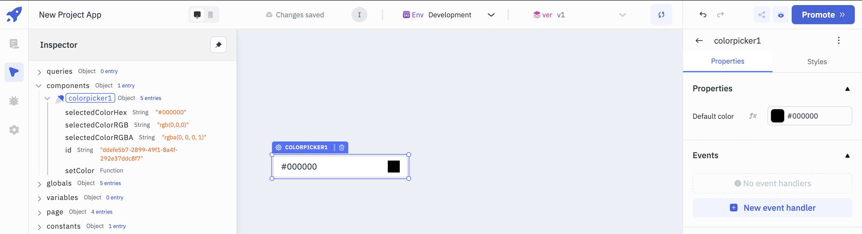
Properties
Default color
The data needs to be an valid hex color
- One can change default color either from color picker or using
fx(need to provide only respective hex value)
Example:
Valid color : #000000 or #000
Invalid Color : #0000, "black" , rgb(0,0,0) ,
Events
To add an event to a color-picker component, click on the widget handle to open the widget properties on the right sidebar. Go to the Events section and click on + Add handler.
Event | Description |
|---|---|
| On change | On change event is triggered when the color is changed on the color-picker |
Component Specific Actions (CSA)
The following actions of the component can be controlled using component specific actions(CSA):
Actions | Description | How To Access |
|---|---|---|
| setColor | Set a color on the color component via a component-specific action within any event handler. | Employ a RunJS query to execute component-specific actions such as await components.colorpicker1.setColor('#64A07A') |
Exposed Variables
Variables | Description | How To Access |
|---|---|---|
| selectedColorHex | Gets updated with HEX color code whenever a user selects a color from the color picker. | Access the value dynamically using JS: {{components.colorpicker1.selectedColorHex}} |
| selectedColorRGB | Gets updated with RGB color code whenever a user selects a color from the color picker. | Access the value dynamically using JS: {{components.colorpicker1.selectedColorRGB}} |
| selectedColorRGBA | Gets updated with RGBA color code whenever a user selects a color from the color picker. | Access the value dynamically using JS: {{components.colorpicker1.selectedColorRGBA}} |
Layout
Layout | Description | Expected Value |
|---|---|---|
| Show on desktop | Toggle on or off to display desktop view. | Programmatically determine the value by clicking on Fx to set the value {{true}} or {{false}} |
| Show on mobile | Toggle on or off to display mobile view. | Programmatically determinine the value by clicking on Fx to set the value {{true}} or {{false}} |
Styles
Style | Description | Expected Value |
|---|---|---|
| Visibility | Toggle on or off to control the visibility of the widget. | Programmatically change its value by clicking on the Fx button next to it. If {{false}} the widget will not visible after the app is deployed. By default, it's set to {{true}} |
Actions
Action | Description | Properties |
|---|---|---|
| setColor | Set the color. | color eg - #ffffff |
info
Any property having Fx button next to its field can be programmatically configured.
Example: Selecting/changing color from the color picker and getting respective hex, rgb and rgba value of selected color
- Let's start by creating a new app and then dragging the Color Picker widget onto the canvas.
- Click on the Color Picker widget, a picker pop-up will appear, one can select desired color from the picker.
- In order to close the appeared picker pop-up, one need's to move away mouse from the picker pop-up and picker pop-up will fade away.
- In the Inspector, inside component, look for colorpicker, where one can get respective hex, rgb and rgba color