Dropdown
The Dropdown component can be used to collect user input from a list of options.
Events
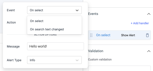
Event: On select
On select event is triggered when an option is selected.
Event: On search text changed
This event is triggered whenever the user searches through the options by typing on the dropdown's input box. The corresponding search text will be exposed as searchText.
Properties
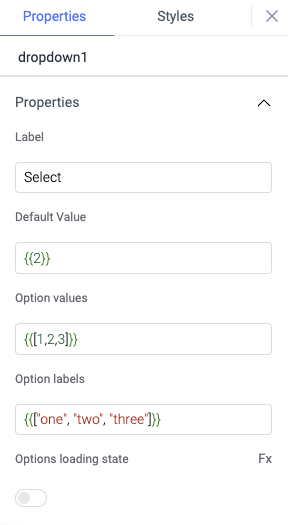
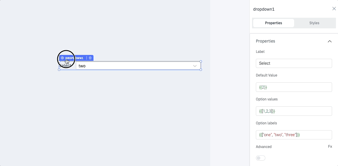
Label
Set the value of the label in the dropdown. The value can also be set dynamically using JavaScript. For example, set the Label value to Select the {{components.text1.text}}
Default value
Specify the default selected option in the dropdown.
Option value
The option values correspond to the different options available in the dropdown. Dynamically set the option values based on your query, for example: {{queries.datasource.data.map(item => item.value)}}.
Option labels
The option labels represent the displayed labels for each value in the dropdown list. Dynamically set the option labels based on your query, for example: {{queries.datasource.data.map(item => item.value)}}.
Advanced
Configure the dropdown options and manage them by providing an array of objects as data. You can dynamically generate this data using JavaScript.
For example:
{{[ {label: 'One',value: 1,disable: false,visible: true},{label: 'Two',value: 2,disable: false,visible: true},{label: 'Three',value: 3,disable: false,visible: true} ]}}
Each object in the array should include the following key-value pairs:
| Key | Value |
|---|---|
| label | Option label |
| value | Option value |
| disable | Set to true to disable the option for selection, and false to keep it enabled |
| visible | Set to true to display the option in the dropdown list, and false to hide it |
Options loading state
Enable this property to display a loading state in the widget. By default, it is turned off. You can programmatically toggle it by setting the values to {{true}} or {{false}} using the Fx button.
Default placeholder
Set a placeholder value that appears in the dropdown when no default option is selected or set.
Validation
Custom validation
Add a validation for the options in dropdown widget using the ternary operator.
General
Tooltip
A Tooltip is often used to specify extra information about something when the user hovers the mouse pointer over the widget.
Under the General accordion, you can set the value in the string format. Now hovering over the widget will display the string as the tooltip.

Layout
Show on desktop
Toggle on or off to display the widget in desktop view. You can programmatically determine the value by clicking on Fx to set the value {{true}} or {{false}}.
Show on mobile
Toggle on or off to display the widget in mobile view. You can programmatically determine the value by clicking on Fx to set the value {{true}} or {{false}}.
Styles
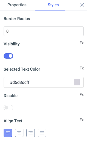
Border Radius
Use this property to modify the border radius of the dropdown. The field expects only numerical value from 1 to 100, default is 0.
Visibility
This is to control the visibility of the widget. If {{false}} the widget will not visible after the app is deployed. It can only have boolean values i.e. either {{true}} or {{false}}. By default, it's set to {{true}}.
Selected text color
Change the text color of the selected option in the widget by providing the HEX color code or choosing the color from color picker.
Disable
This property only accepts boolean values. If set to {{true}}, the widget will be locked and becomes non-functional. By default, its value is set to {{false}}.
Align text
You can align the text inside the widget in following ways: left, right, center, justified
Any property having Fx button next to its field can be programmatically configured.
Exposed variables
| Variable | Description |
|---|---|
| Value | This variable holds the value of the currently selected item on the dropdown. Value can be accesed using {{components.dropdown1.value}} |
| searchText | This variable is initially empty and will hold the value whenever the user searches on the dropdown. searchText's value can be accesed using{{components.dropdown1.searchText}} |
| label | The variable label holds the label name of the dropdown. label's value can be accesed using{{components.dropdown1.searchText}} |
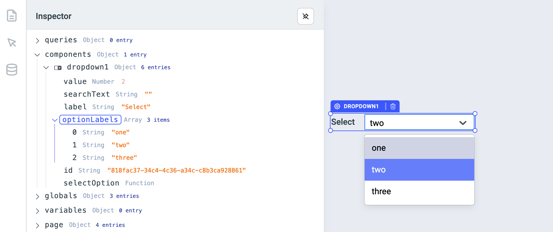
| optionLabels | The optionLabels holds the option labels for the values of the dropdown. optionLabels can be accesed using{{components.dropdown1.optionLabels}} for all the option labels in the array form or {{components.dropdown1.optionLabels[0]}} for particular option label |
| selectedOptionLabel | The variable holds the label of the selected option in the dropdown components. The selected option label can be accessed dynamically using {{components.dropdown1.selectedOptionLabel}} |
Component specific actions (CSA)
| Actions | Description |
|---|---|
| selectOption | You can set an option on the dropdown component via a component-specific action within any event handler. Additionally, you have the option to employ a RunJS query to execute component-specific actions such as await components.dropdown1.selectOption(1) |