Form
Form component can be used to get input from the user and store it in the connected datasource. Form component serves as a parent widget that can store different widgets like texts, input box, dropdown to allow selection, and a button for triggering the event.
Properties
| Properties | description | Expected value |
|---|---|---|
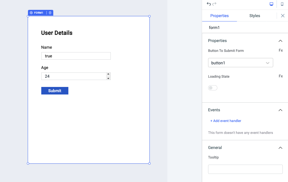
| Button To Submit Form | The dropdown can be used to select the button that will be used as the submit button for the form | Any button that will be added as a child component inside the form component can be selected from the dropdown |
| Loading state | Loading state can be used to show a spinner as the form content. Loading state is commonly used with isLoading property of the queries to show a loading status while a query is being run. | Switch the toggle On or click on fx to programmatically set the value {{true}} or {{false}} |
Events
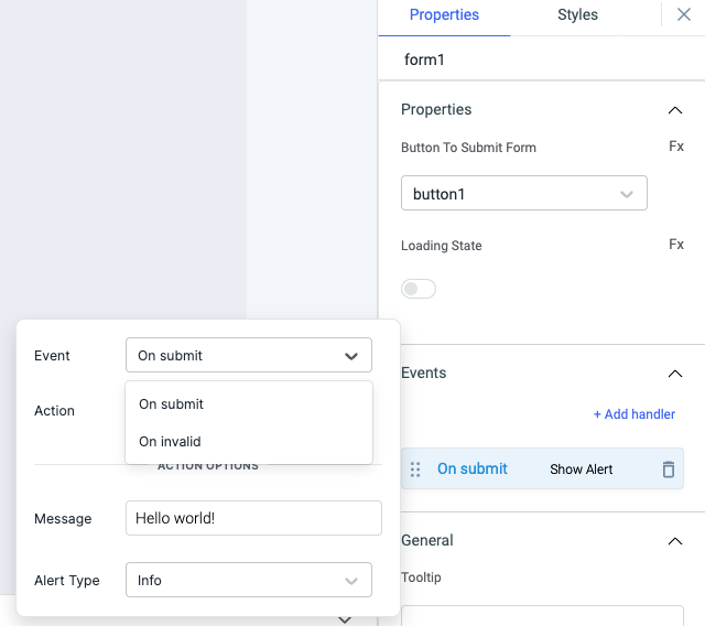
To add an event to a button group, click on the widget handle to open the widget properties on the right sidebar. Go to the Events section and click on Add handler.
On submit
On submit event is triggered when the button on the form component is clicked. Just like any other event on ToolJet, you can set multiple handlers for on submit event.
On invalid
On invalid event is triggered when the input on the form is invalid.
Check Action Reference docs to get the detailed information about all the Actions.
General
Tooltip
A Tooltip is often used to specify extra information about something when the user hovers the mouse pointer over the widget. Under the General accordion, you can set the value in the string format. Now hovering over the widget will display the string as the tooltip.
Layout
| Layout | description | Expected value |
|---|---|---|
| Show on desktop | Toggle on or off to display desktop view. | You can programmatically determine the value by clicking on Fx to set the value {{true}} or {{false}} |
| Show on mobile | Toggle on or off to display mobile view. | You can programmatically determine the value by clicking on Fx to set the value {{true}} or {{false}} |
Styles
| Style | Description |
|---|---|
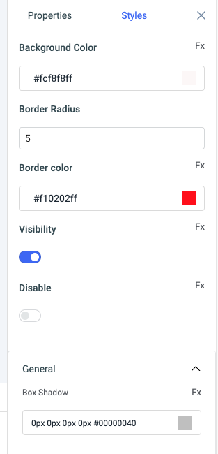
| Background color | You can change the background color of the form by entering the Hex color code or choosing a color of your choice from the color picker. |
| Border radius | Use this property to modify the border radius of the form component. |
| Border color | You can change the color of the border of the form by entering the Hex color code or choosing a color of your choice from the color picker. |
| Visibility | Toggle on or off to control the visibility of the form. You can programmatically change its value by clicking on the Fx button next to it. If {{false}} the widget will not visible after the app is deployed. By default, it's set to {{true}}. |
| Disable | Toggle on to lock the widget. You can programmatically change its value by clicking on the Fx button next to it, if set to {{true}}, the widget will be locked and becomes non-functional. By default, its value is set to {{false}}. |
| Box shadow | This property adds a shadow to the widget. |
Any property having Fx button next to its field can be programmatically configured.