List view
List view widget allows to create a list of repeatable rows of data. Just like a container widget, you can nest other widgets inside of it and control how many times they repeat.
How To Use List view Widget
Events
Row clicked
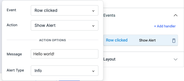
To add an event to a button, click on the widget handle to open the widget properties on the right sidebar. Go to the Events section and click on Add handler.
Row clicked event is triggered when the button is clicked. Just like any other event on ToolJet, you can set multiple actions for a row clicked event.
Check Action Reference docs to get the detailed information about all the Actions.
Properties
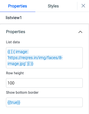
| Properties | description | Expected value |
|---|---|---|
| List data | Enter the data that you want to display into the widget. Data in the form of an array of objects or data from a query that returns an array of objects. | {{ [ {id: 0, name: ABC, email: [email protected]}, {id: 1, name: XYZ, email: [email protected]} ] }} or {{queries.xyz.data}} |
| Row height | Enter a numerical value to set the row height accordingly. | Any number between 1 to 100 |
| Show bottom border | This property allows you to show or hide the row bottom border. | By default its {{true}}, set {{false}} to hide the border |
General
Tooltip
A Tooltip is often used to specify extra information about something when the user hovers the mouse pointer over the widget.
Under the General accordion, you can set the value in the string format. Now hovering over the widget will display the string as the tooltip.

Layout
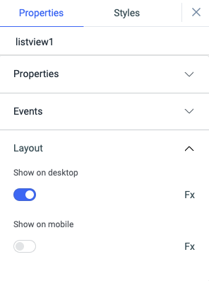
| Layout | description | Expected value |
|---|---|---|
| Show on desktop | Toggle on or off to display the desktop view. | You can programmatically determine the value by clicking on Fx to set the value {{true}} or {{false}} |
| Show on mobile | Toggle on or off to display the mobile view. | You can programmatically determine the value by clicking on Fx to set the value {{true}} or {{false}} |
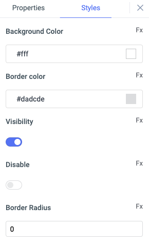
Styles
| Style | Description |
|---|---|
| Background Color | You can change the background color of the widget by entering the Hex color code or choosing a color of your choice from the color picker. |
| Border Color | You can change the border color of the listview by entering the Hex color code or choosing a color of your choice from the color picker. |
| Visibility | This is to control the visibility of the widget. If {{false}} the widget will not be visible after the app is deployed. It can only have boolean values i.e. either {{true}} or {{false}}. By default, it's set to {{true}}. |
| Disable | This property only accepts boolean values. If set to {{true}}, the widget will be locked and becomes non-functional. By default, its value is set to {{false}}. |
| Border radius | Use this property to modify the border radius of the list view. The field expects only numerical value from 1 to 100, default is 0. |
Any property having Fx button next to its field can be programmatically configured.
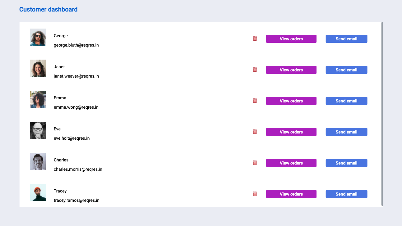
Example: Displaying data in the list view
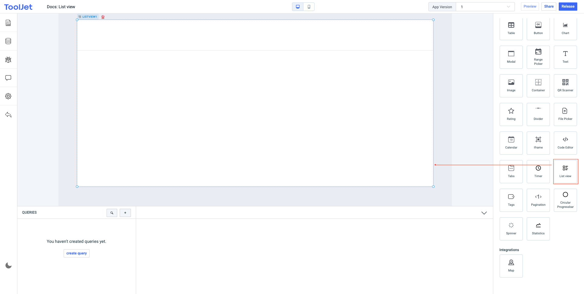
- Let's start by creating a new app and then dragging the List view widget onto the canvas.
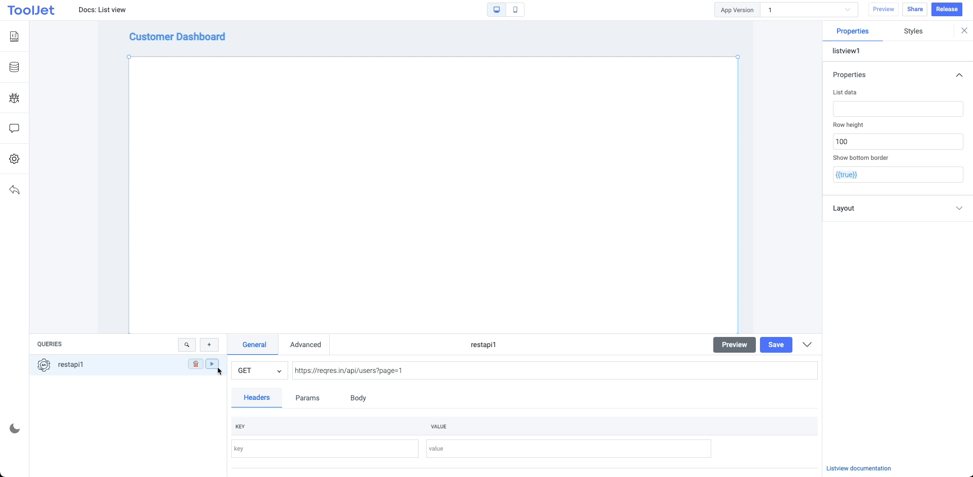
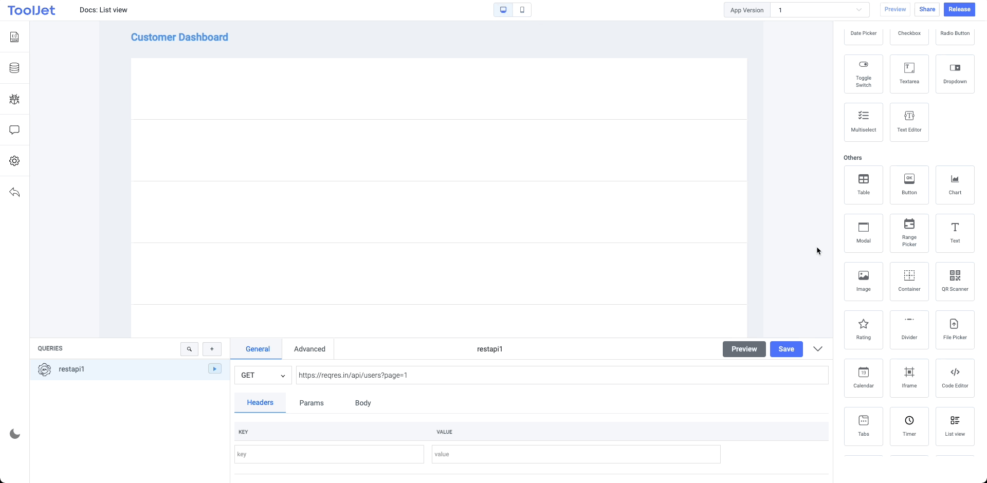
- Now lets create a query and select the REST API from the datasource dropdown. Choose the
GETmethod and enter the API endpoint -https://reqres.in/api/users?page=1. Save this query and fire it. Inspect the query results from the left sidebar, you'll see that it resulted in thedataobject having an array of objects.
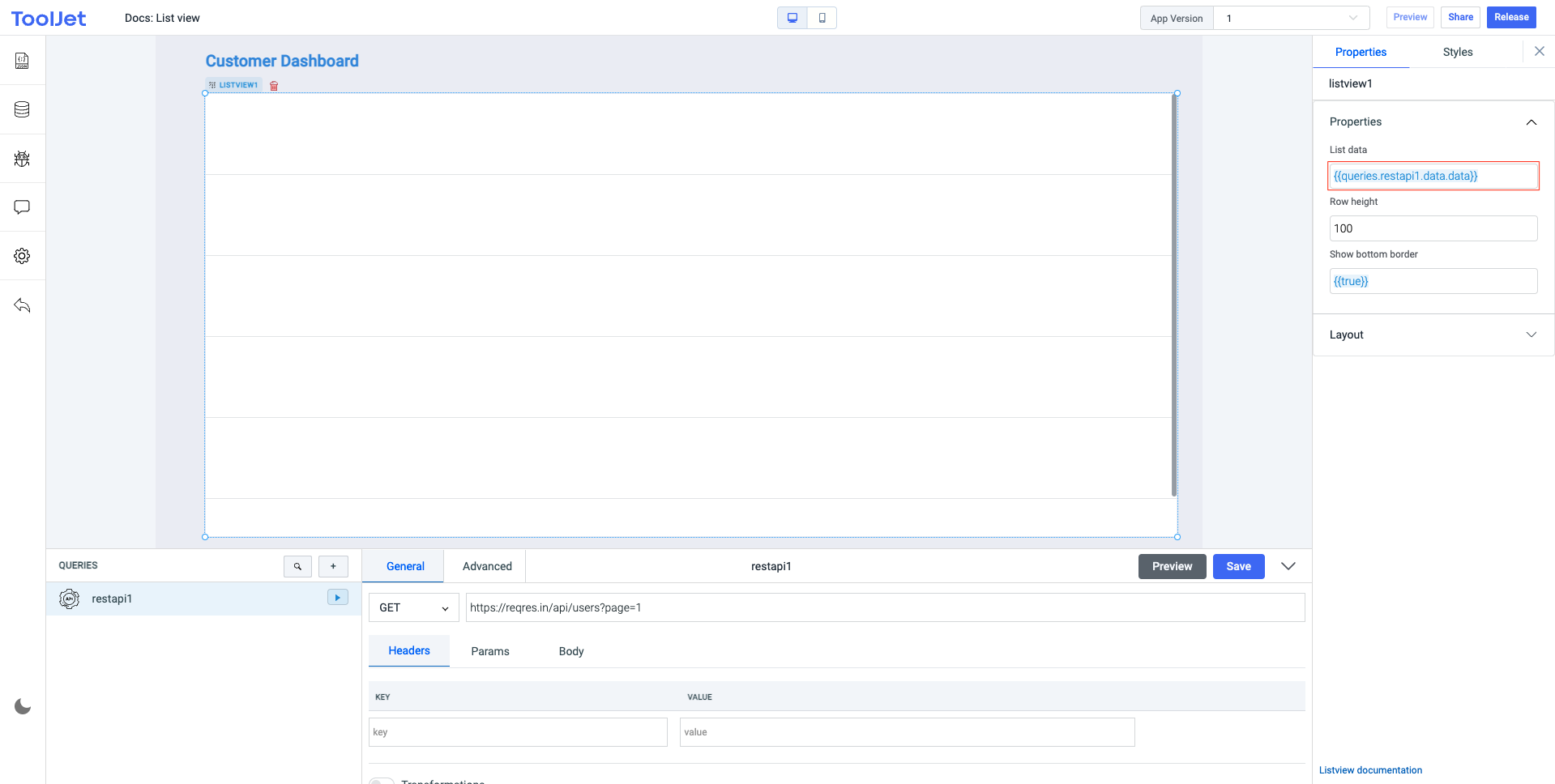
- Now lets edit the
List dataproperty of the list view widget for displaying the query data. We will use JS to get the data from the query -{{queries.restapi1.data.data}}. Here the lastdatais a data object that includes an array of objects, the firstdatais the data resulted from therestapi1query. This will automatically create the rows in the widget using the data.
- Finally, we will need to nest widgets into the first row of list view widget and the widget will automatically create the subsequent instances. The subsequent rows will appear the same way you'll display the data in the first row.
Use {{listItem.key}} to display data on the nested widgets. Example: For displaying the images we used {{listItem.avatar}} where avatar is one of the key in the objects from the query result.