Multiselect
Multiselect widget can be used to collect multiple user inputs from a list of options.
Events
On select
On select event is triggered when an option is selected.
Check Action Reference docs to get the detailed information about all the Actions.
Properties
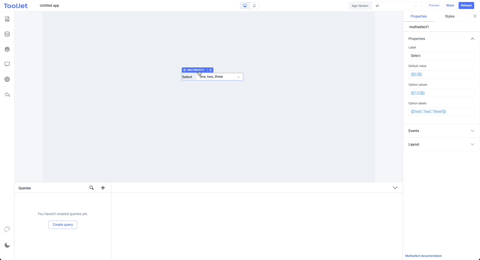
Label
The text is to be used as the label for the multiselect widget.
Default value
The value of the default option. This should always be an array.
Option values
Values for different items/options in the list of the multiselect.
Option labels
Labels for different items/options in the list of the multiselect.
General
Tooltip
A Tooltip is often used to specify extra information about something when the user hovers the mouse pointer over the widget.
Under the General accordion, you can set the value in the string format. Now hovering over the widget will display the string as the tooltip.

Layout
Show on desktop
Toggle on or off to display the widget in desktop view. You can programmatically determine the value by clicking on Fx to set the value {{true}} or {{false}}.
Show on mobile
Toggle on or off to display the widget in mobile view. You can programmatically determine the value by clicking on Fx to set the value {{true}} or {{false}}.
Styles
Border radius
Add a border radius to the multiselect using this property. It accepts any numerical value from 0 to 100.
Visibility
Toggle on or off to control the visibility of the widget. You can programmatically change its value by clicking on the Fx button next to it. If {{false}} the widget will not be visible after the app is deployed. By default, it's set to {{true}}.
Disable
This is off by default, toggle on the switch to lock the widget and make it non-functional. You can also programmatically set the value by clicking on the Fx button next to it. If set to {{true}}, the widget will be locked and becomes non-functional. By default, its value is set to {{false}}.
Exposed Variables
| Variables | Description |
|---|---|
| values | This variable holds the values of the multiselect component in an array of objects where the objects are the options in the multiselect. You can access the value dynamically using JS: {{components.multiselect1.values[1]}} |
Component specific actions (CSA)
await components.multiselect1.clearSelections() await components.multiselect1.deselectOption(2)
Following actions of multselect component can be controlled using the component specific actions(CSA):
| Actions | Description |
|---|---|
| selectOption | Select an option on the multiselect component via a component-specific action within any event handler. Additionally, you have the option to employ a RunJS query to execute component-specific actions such as await components.multiselect1.selectOption(3) |
| deselectOption | Deselect a selected option on the multiselect component via a component-specific action within any event handler. Additionally, you have the option to employ a RunJS query to execute component-specific actions such as await components.multiselect1.deselectOption(3) |
| clearOptions | Clear all the selected options from the multiselect component via a component-specific action within any event handler. Additionally, you have the option to employ a RunJS query to execute component-specific actions such as await components.multiselect1.clearSelections(2,3) |