Text
The Text component can be used to create headers/sub-headers, add labels next to various input fields and more. In this document, we'll go through all the configuration options for the Text component.
How To Use Text Component
Properties
| Properties | Description | Expected Value |
|---|---|---|
| Text | This property sets the content/text inside the Text component. | Text input OR Refer query data with dynamic variables - {{queries.datasource.data.text}} |
| Show loading state | This property lets you set the condition for loading state of the text. | Use the toggle button or dynamically configure the value by clicking on Fx and entering a logical expression that results in either {{true}} or {{false}} |
General
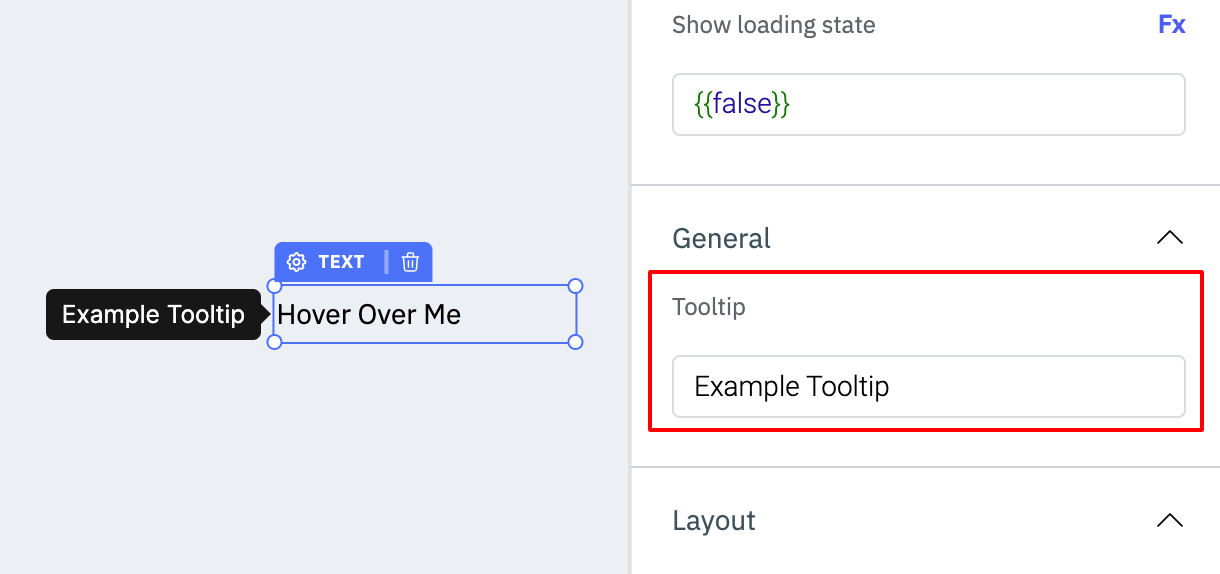
TooltipA Tooltip is commonly used to provide additional information about an element. This information becomes visible when the user hovers the mouse pointer over the respective component.
In the input field under Tooltip, you can enter some text and the component will show the specified text as a tooltip when it is hovered over.
Layout
Show on desktopUse this toggle to show or hide the component in the desktop view. You can dynamically configure the value by clicking on Fx and entering a logical expression that results in either true or false. Alternatively, you can directly set the values to {{true}} or {{false}}.
Use this toggle to show or hide the component in the mobile view. You can dynamically configure the value by clicking on Fx and entering a logical expression that results in either true or false. Alternatively, you can directly set the values to {{true}} or {{false}}.
Styles
| Style | Description | Expected Value |
|---|---|---|
| Font Weight | Determines how bold or light your text will appear. | normal (default), bold, lighter, bolder |
| Text Decoration | Adds an underline, overline, line-through, or a combination of lines to selected text. | none(default), overline, line-through, underline, overline underline |
| Text Transformation | Dictates the capitalization of an element's text. It allows for all-uppercase or all-lowercase rendering. | none (default), uppercase, lowercase, capitalize |
| Font Style | Allows you to apply styles like italic or normal, altering the overall look of the text content. | normal(default), italic, oblique |
| Line Height | Determines the vertical space between lines of text within an element. It controls the amount of space above and below each line of text. | Enter a number as the value (example: 1.5) |
| Text Indent | Commonly used to create an indentation effect, like when starting a paragraph with some space before the first word. | Enter a number as the value (example: 10) |
| Letter Spacing | Refers to the adjustment of the space between individual characters within a block of text. | Enter a number as the value (example: 2) |
| Word Spacing | Controls the amount of space between words within a block of text. | Enter a number as the value (example: 2) |
| Font Variant | Allows you to customize the visual appearance of text and helps achieve specific typographic styles or formatting requirements. | normal (default), small-caps, initial, inherit |
| Text Size | Dimensions of the characters in a font, typically measured in units like pixels, points, ems, or percentages. It determines how large or small the text appears on a screen or in print. | Any number between 1-100 |
| Background Color | Sets the background color of the component. | Hex color code/choose a color using the color picker |
| Text Color | Sets the color of the text. | Hex color code/choose a color using the color picker |
| Align Text | Sets the alignment of the text. | left, right, center, justified |
| Visibility | Controls the visibility of the component. If set to {{false}}, the component will not be visible after the app is deployed. | Use the toggle button OR click on Fx to pass a boolean value or a logical expression that returns a boolean value i.e. either {{true}} or {{false}} |
| Disable | Makes the component non-functional when set to true. | Use the toggle button OR click on Fx to pass a boolean value or a logical expression that returns a boolean value i.e. either {{true}} or {{false}} |
General
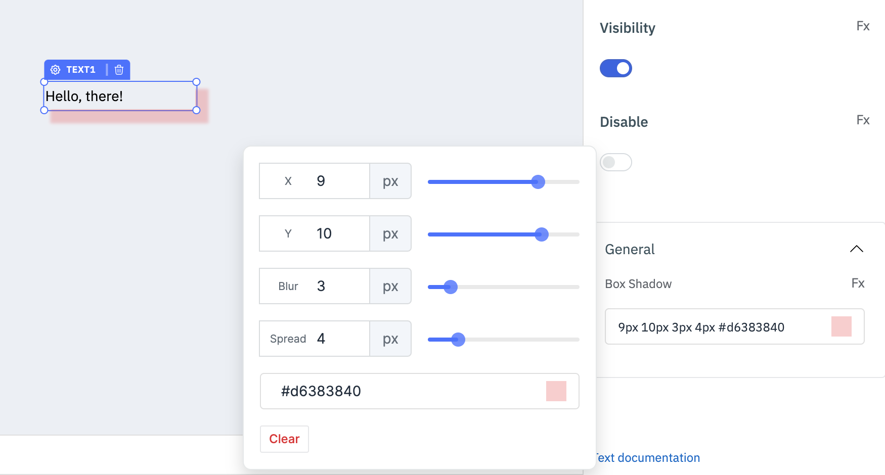
Box ShadowThe Box Shadow property is used to add shadow effects around a component's frame. You can specify the horizontal and vertical offsets(through X and Y sliders), blur and spread radius, and color of the shadow.
Component Specific Actions (CSA)
Following actions of the Text component can be controlled using Component-Specific Actions(CSA):
| Actions | Description |
|---|---|
| visibility | Sets the visibility of the text via a component-specific action within any event handler. Additionally, you have the option to employ a RunJS query to execute component-specific actions such as await components.text1.visibility(false). |
| setText | Sets a text value on the text component via a component-specific action within any event handler. Additionally, you have the option to employ a RunJS query to execute component-specific actions such as await components.text1.setText('this is a text'). |