Modal
Modal widget renders in front of a backdrop, and it blocks interaction with the rest of the application until the modal is closed. It can be used to add dialog boxes to your app for lightboxes, user notifications, forms, etc.
In order to avoid excessively complex situations, certain components, namely Calendar and Kanban, are restricted from being placed within the Modal component using drag-and-drop functionality.
If the builder attempts to add any of the aforementioned components inside the Modal, an error message will be displayed:
<Restricted component> cannot be used as a child component within the Modal.
How To Use Modal Widget
Add widgets to Modal
To add widgets to the Modals please refer to Tutorial - Adding widgets to a modal
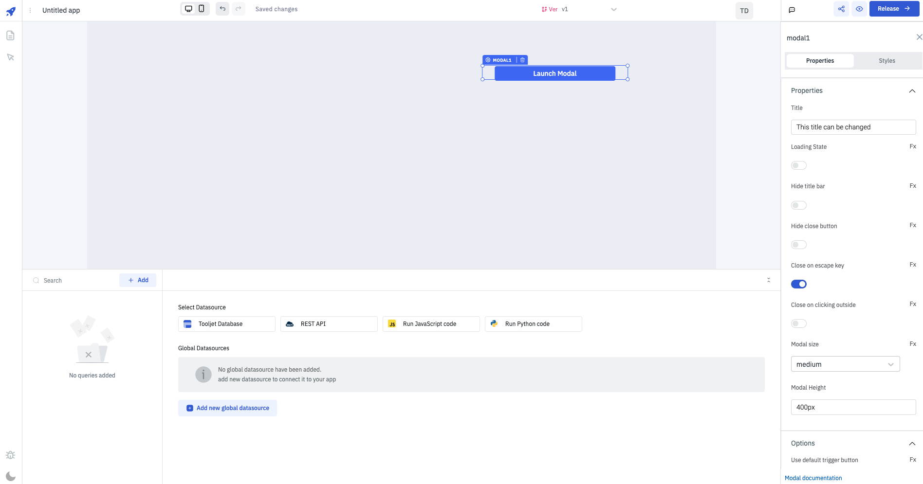
Properties
Title
Title that should be shown on the header of the modal.
Loading State
Loading state can be used to show a spinner on the modal content. Loading state is commonly used with isLoading property of the queries to show a loading status while a query is being run. Enable the toggle On or click on fx to programmatically set the value {{true}} or {{false}} .
Hide title bar
Enabling this option hides the title bar in the modal. The value {{true}} or {{false}} can be set programmatically by clicking on the Fx button next to it.
Hide close button
By enabling this option, the close button within the modal will be hidden. The value can be programmatically set to either {{true}} or {{false}} by clicking the adjacent Fx button.
Close on escape key
Enabling this option will cause the modal to close whenever the escape key is pressed. The value can be programmatically set to either {{true}} or {{false}} by clicking the adjacent Fx button. This property is enabled by default.
Close on outside click
Enabling this feature will result in the modal closing when clicked outside of its boundaries. The value can be programmatically set to either {{true}} or {{false}} by clicking the adjacent Fx button.
Modal size
Determines the size of the modal. Available options include medium, small, and large, with the default set to medium. The value can also be programmatically configured by clicking the Fx button and setting it to sm, md, or lg.
Modal height
Specifies the height of the modal, with the default height set to 400px. The modal's height can also be dynamically set using JS binding by utilizing the {{components.xyz.data.key === 'Sun' ?? '600px' : '300px'}} syntax.
Options
Use default trigger button
The default trigger button is enabled by default, this button can be used to show the modal. The value {{true}} or {{false}} can be set programmatically by clicking on the Fx button next to it.
A modal can be triggered using the default trigger button, action or via JavaScript.
Trigger button label
It can be used to set the label of the trigger button.
Events
Modal supports the following two events:
- On open
- On close
Just like any other event on ToolJet, you can set multiple handlers for the events supported by Modal. Check all the actions here.
Layout
Show on desktop
Toggle on or off to display the widget in desktop view. You can programmatically determine the value by clicking on Fx to set the value {{true}} or {{false}}.
Show on mobile
Toggle on or off to display the widget in mobile view. You can programmatically determine the value by clicking on Fx to set the value {{true}} or {{false}}.
Styles
| Style | Description | value |
|---|---|---|
| Header background color | Change the background color of the header in modal | Enter the Hex color code or choose a color of your choice from the color picker |
| Header title color | Change the color of the Title in modal | Enter the Hex color code or choose a color of your choice from the color picker |
| Body background color | Change the background color of the body in modal | Enter the Hex color code or choose a color of your choice from the color picker |
| Visibility | Toggle on or off to control the visibility of the default trigger button that comes with modal | You can programmatically change its value by clicking on the Fx button next to it. If {{false}} the button will not visible after the app is released. By default, it's set to {{true}}. |
| Disable | Toggle on to disable the default trigger button that comes with modal | You can programmatically change its value by clicking on the Fx button next to it, if set to {{true}}, the button will be locked and becomes non-functional. By default, its value is set to {{false}}. |
| Trigger button background color | Change the background color of the default trigger button of modal | Enter the Hex color code or choose a color of your choice from the color picker |
| Trigger button text color | Change the color of the label in default trigger button of modal | Enter the Hex color code or choose a color of your choice from the color picker |
Trigger Button styles are only visible when Use default trigger button under Options is toggled on.
Exposed variables
There are currently no exposed variables for the component.
Component specific actions (CSA)
Following actions of modal component can be controlled using the component specific actions(CSA):
| Actions | Description |
|---|---|
| open | Control the opening and closing of the modal componennt via a component-specific action within any event handler. Additionally, you have the option to employ a RunJS query to execute component-specific actions such as await components.modal1.open() |
| close | Control the closing of the modal componennt via a component-specific action within any event handler. Additionally, you have the option to employ a RunJS query to execute component-specific actions such as await components.modal1.close() |