Button
Button widget can be used to take actions.
Properties
To add an event to a button, click on the widget handle to open the widget properties on the right sidebar. Go to the Events section and click on Add handler.
Events
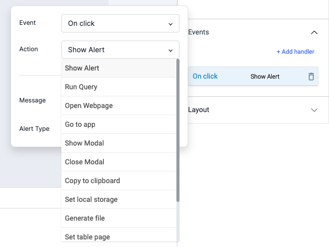
On click
On Click event is triggered when the button is clicked.
On hover
On hover event is triggered when the mouse cursor is moved over the button. Just like any other event on ToolJet, you can set multiple handlers for on click event.
Check Action Reference docs to get the detailed information about all the Actions.
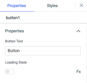
Properties
| Properties | description | Expected value |
|---|---|---|
| Button Text | It can be used to set the label of the button. | Any String value: Send Message, Delete, or {{queries.xyz.data.action}} |
| Loading state | Loading state can be used to show a spinner as the button content. Loading state is commonly used with isLoading property of the queries to show a loading status while a query is being run. | Switch the toggle On or click on fx to programmatically set the value {{true}} or {{false}} |
General
Tooltip
A Tooltip is often used to specify extra information about something when the user hovers the mouse pointer over the widget.
Under the General accordion, you can set the value in the string format. Now hovering over the widget will display the string as the tooltip.

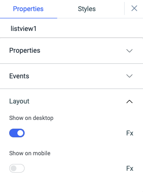
Layout
| Layout | description | Expected value |
|---|---|---|
| Show on desktop | Toggle on or off to display desktop view. | You can programmatically determine the value by clicking on Fx to set the value {{true}} or {{false}} |
| Show on mobile | Toggle on or off to display mobile view. | You can programmatically determine the value by clicking on Fx to set the value {{true}} or {{false}} |
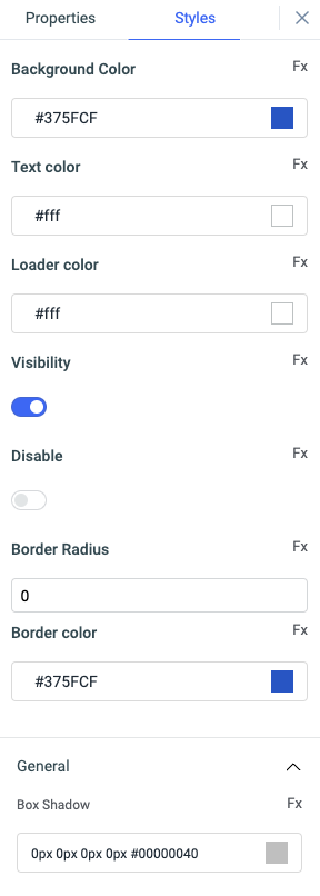
Styles
| Style | Description |
|---|---|
| Background color | You can change the background color of the widget by entering the Hex color code or choosing a color of your choice from the color picker. |
| Text color | You can change the color of the Text in button by entering the Hex color code or choosing a color of your choice from the color picker. |
| Loader color | You can change the color of the loader in button by entering the Hex color code or choosing a color of your choice from the color picker. This will only be affective if the loading state property of the button is enabled. |
| Visibility | Toggle on or off to control the visibility of the widget. You can programmatically change its value by clicking on the Fx button next to it. If {{false}} the widget will not visible after the app is deployed. By default, it's set to {{true}}. |
| Disable | Toggle on to lock the widget. You can programmatically change its value by clicking on the Fx button next to it, if set to {{true}}, the widget will be locked and becomes non-functional. By default, its value is set to {{false}}. |
| Border radius | Use this property to modify the border radius of the button. |
| Border color | Add a color to the border of the button using this property. |
Any property having Fx button next to its field can be programmatically configured.
Exposed variables
| Variable | Description |
|---|---|
| buttonText | This variable stores the text displayed on the button. Its value can be accessed dynamically through JavaScript using the following syntax: {{components.button1.buttonText}} |
Component specific actions (CSA)
Following actions of button component can be controlled using the component specific actions(CSA):
| Actions | Description |
|---|---|
| click | You can regulate the click of a button via a component-specific action within any event handler. Additionally, you have the option to employ a RunJS query to execute component-specific actions such as await components.button1.click() |
| setText | button's text can be controlled using component specific action from any of the event handler. You can also use RunJS query to execute component specific actions: await components.button1.setText('New Button Text') |
| disable | button can be disabled using the component specific action from any of the event handler. You can also use RunJS query to execute this action: await components.button1.disable(true) or await components.button1.disable(false) |
| visibility | button's visibility can be switched using the component specific action from any of the event handler. You can also use RunJS query to execute this action: await components.button1.disable(true) or await components.button1.disable(false) |
| loading | The loading state of the button can be set dynamically using the component specific actions from any of the event handler. You can also use this action from RunJS: await components.button1.loading(true) or await components.button1.loading(false) |